hey, I wasn’t sure where to ask this. I noticed last night while working in Pages that the small caps seems to be shrinking regular caps in a typeface I have actually made small cap glyphs for. (I think. however it’s doing it, the small caps are lighter.) in Pages, the small caps were invoked by hitting the gear icon in the sidebar, then selecting small caps.
The small cap glyphs are invoked with c2sc and .smcp. however, in InDesign etc, everything’s going as it should—see comparison image showing InDesign vs Pages. has anyone else run across this & know how to properly address features like small caps in Pages? absolutely no clue if I did something wrong.
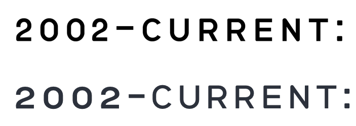
top is InDesign, correctly calling small caps figures. (the numbers are correct.) bottom is Pages, calling normal numbers, and squishing caps down.
Pages has two modes to select small caps. One that makes fake small caps and one that uses the small caps of the font.
The fake small caps are enabled in the inspector:
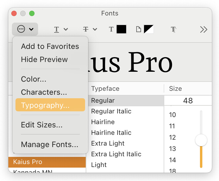
For the real, font-provided small caps, choose Format → Font → Show Fonts (⌘T). In the font panel that opens, choose Typography… from the actions menu:
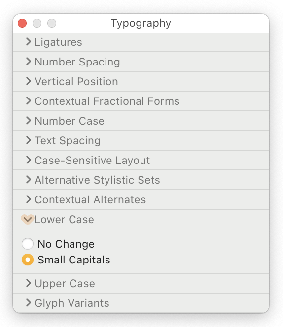
The Typography palette opens. Expand the Lower Case section and – with some text in Pages selected – choose the Small Capitals option.
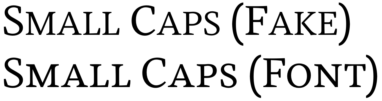
Here is the difference, both lines in Pages, the top with fake small caps, bottom with real, font-provided small caps:
For capitals to small caps, expand the Upper Case section in the Typography palette and do the same.
2 Likes
ugh, thanks. that is so stupid.
I went poking around in the typography panel and found exactly what you’re talking about before you posted it, but wsn’t sure if I was seeing two ways to do this.
I’d expect Apple, of all companies, to at least TRY and have something consistent and understandable, but oh well.