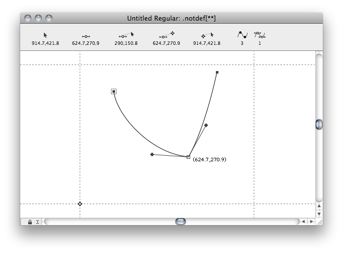
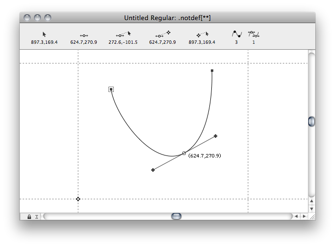
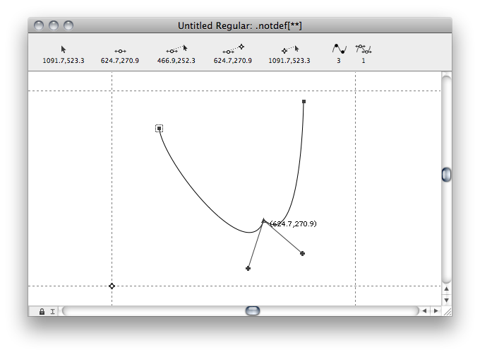
When converting a corner point into a smooth point (double click) the point does indeed turn green and round, but the on and off curve points do not snap into alignment, which basically means the point is not smooth, eventhough it says it is. Only when I grab one of the handles the three points align.
The same happens when applying a transformation to one selected handle of a smooth node. The transformation is applied to the handle, effectively breaking the alignment of the handles while the node is still represented as ‘smooth’.
Apart from the fact that these behaviours seem less than ideal to me it also means that Glyphs’ representation of nodes cannot be trusted, which is a (much) bigger problem because it may (and will) cause me to overlook potential trouble with the outlines.
Is this a bug or is it intended behaviour? If it is the latter, I would like to understand why and whether there is a way I can work around it?
Of course. There is no way of telling which handle should snap into which alignment until you move one of them. Glyphs cannot draw your paths for you because it cannot take that decision for you.
There is a script in my repository called Paths > Realign Handles in Current Glyph which goes through your handles and moves them back and forth a little. This is intended for slightly out of tune handles, not for the case you show up there.
I feel that even a wrong decision made by Glyphs would be far better than no decision at all in this respect, mainly because node representation is now incorrect which may give you the false impression that everything is fine with your contour while in fact it isn’t.
Automatic alignment could simply be an average of handle positions positioned around the on curve point, no? It would be OK if that is not exactly what I want, at least I could trust what I see.
It is not incorrect. You misunderstand the point of the green/blue distinction. What you mean is probably Jens Kutilek’s Red Arrows reporter plugin. And if you want an automated way of guessing an alignment, try the script I mentioned before.
I am pretty sure making Glyphs guess and randomly change your outlines is a pretty bad idea.
If you are lucky, in 1% of the cases. Depending on the design, it will usually have to align to one side or horizontally amor vertically, if it is supposed to be an extremum point. Which, again, no software can guess for you.
Well, what exactly is the the point of the green/blue distinction if not for this? But OK, I will look into the Red Arrows plugin.
That would indeed be a bad idea and that’s certainly not what I meant. What I do mean is how these things have always worked in apps that deal with corner/smooth nodes (like Fontographer or FontLab). They do guesswork as well and most of the time they guess wrong but that is fine. At least it’s consistent and reliable and that’s more important than guessing right.
To see what I mean:
corner
smooth
even tangent (which is rather silly, but still preferable because you immediately see something is wrong)
Blue = move handle independent of point behind the next on-curve node.
Green = not independent, either other handle gets moved, or snaps into the angle of the next two on-curve nodes, when node or nearest on-curve is moved.
Glyphs has a different paradigm of treating BCPs, so copying the way ‘things have worked in some other apps’ is not an argument. And your example shows that with the old paradigm, it is too easy to create inferior curves (two zero handles, no extremes on just two segments). It would take more steps to fix that curve now, as opposed to have a pristine curve right away. IOW I do not see the advantage of the old paradigm.
I couldn’t agree more with trashing old paradigms and I must admit that you guys did an amazing job by doing so. So don’t get me wrong, I think Glyphs is truly wonderful.
But old is not always bad and new is not always better. And I can think of no paradigm in which giving false visual feedback is a good thing.
This is only true when dragging a handle. When applying a transformation to a handle you get a really really bad curve and that shouldn’t be possible with a smooth node.
Making good curves is the job of the designer and the software should help him/her do that. This node behaviour is definitely not helping. It’s even counterproductive. It’s a flaw in an otherwise brilliant piece of software.
And looking at the Fontographer screendumps it turns out Glyphs doesn’t have to guess at all. All it needs to do is rotate the handles in equal amounts around the on curve point until the angle between them is 180°. The lengths of the handles can remain as they were.
In case of a tangent point the handles need to point exactly opposite to the neighbouring nodes. Makes perfect rational sense, no guessing.
Maybe you could make us both happy and let the user decide in the preferences which behaviour he prefers.
It is not false. The colors are not indicators of the current smoothness of the junction, but of the editing behavior of the node.
Or the on-curve, in the case of a tangent.
Not sure about that. If a user specifically selects just the handle, and applies a coordinate transformation, what should happen? This is a more difficult case,
That FOG example you gave shows that the method you propose helps creating bad curves. You can still achieve that in Glyphs if you like, but it is easier to get the good curve right away.
This strikes me as random behavior. It could be exactly what a user needs in a very rare case, but you have to admit, in most cases, it will be off and will require additional path manipulations. The current implementation gives you more control over path editing, as it does not move nodes you have not told to move.
Sorry for being such a pain, but this is no trivial matter to me as you may have guessed by now.
Connection display is not just important when editing outlines (mere tool behaviour), but even more so when checking for bad outlines and bad connections (actual connection status), especially since, as I’ve shown above, good outlines can turn into bad outlines pretty easily in Glyphs.
The FOG-examples given are not intended to show good curves, they are intended to show logical, understandable, predictable and therefor desirable connection display and behaviour. I don’t expect software to do my curves for me, that’s my job, but I do expect software to help me do my job as best as I can. Having predictable bezier editing and giving me accurate feedback are essential parts of that.
The Glyphs-Handbook 2.2 itself speaks of a CONNECTION being either smooth or a corner. No word about this being no more than just tool behavior, limited to just manual editing.
In my book that means we’re talking connection status here, which would be consistent with other status indicators used, like open path ends, first node and path direction. In short: if a connection is displayed as being smooth we should be able to rely on that information. Or the other way round: if a connection is not smooth then it shouldn’t be displayed as being smooth.
I suppose to be consistent, either the connection behaviour/display should change or the manual should. Changing the manual would probably be easier, but changing connection behavior/display would be better because that’s what everyone expects and what, as the manual suggests, seems to have been the intention all along.
And it would really make Glyphs the tool without competition that it almost is.
For checking the connection status, there is a plugin called Red Arrows by Jens Kutilek. Amongst other things, it warns you about kinks in smooth connections.
You can also customize your view with a simple Reporter plugin.
After reading all this, I think the issue is to decide whether it is a CONNECTION or a CONNECTOR.
Only to the extent that it is a smooth CONNECTOR. It can be a smooth CONNECTOR but be at the wrong place on a path thus distorting the outline. It’s up to the user to make that determination and adjust it to make sure its position is in the right place on the path. It’s been that way across different editors since the beginning. In fact, Letraset’s Font Studio didn’t even have smooth connectors, just nodes and handles. Try doing it that way sometime if you want a real challenge.
I really have to doubt that; I never have.
Bottom line: change the word in the manual from CONNECTION to CONNECTOR. Or don’t. It’s fine as it is. The other choice is for the user to turn off snap-to-grid.