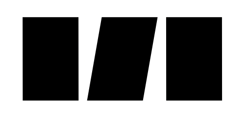
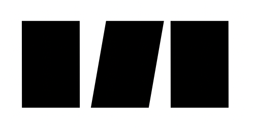
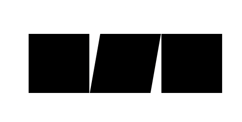
How does italic sidebearings work? Is it as if the box itself is slanted and calculated as such?
I’m finding that while working on fonts that were created in apps without slanted boxes, the sidebearings are odd, i.e. asymmetrical where it would have been symmetrical in another app.
Yes, the side bearings are calculated from the slanted bounding box.
In what case you get useful symmetric side bearings for a italic font without slanting the BBox?
Coming back to this old thread now because I’m getting a little confused: Due to the way glyphs app is calculating Italic sidebearings, it means that if I have the exact same shape but italicised between the 2 same upright shapes around it, it’s not actually centered? Why should Glyphs app take that as the default approach?
For example:
This is an italic italic shape centered on upright sidebearings, between 2 upright shapes, and the middle glyph is centered:

This is when it is centered according to the italic sidebearings, it’s not actually centered between the 2 glyphs… I find this disconcerting:

Ah I think I realise what’s going on, for shapes that are at the x-height they will be centered:

I discussed that to great extent with another type designer. Trying to “fix” the problem with slightly misaligned Uppercase italics inside upright Caps will mess up the spacing if normal italic Upright+lowercase. And as the former is a very rare case and the second happens all the time…
This is solvable only for one height. The problem in a typeface is that you have many heights, x-height, cap height, ascender, descender, baseline, small cap height, petit cap height, etc. Glyphs italicizes with half of the x-height as pivotal point, so aligning will already work for letters that span between baseline and x-height, but not for others.
Wouldn’t it be nice if we could specify a y coordinate from which the bounding box is slanted?
Depending on your design, the current system is forcing a solution that may not always be ideal: for example, the smaller the x-height is, the bigger the offset of capitals will be.
The way I see it, a designer should have a way to control the fitting of his italic with its roman counterpart.
I did a little bit of research on several fonts and while the most used approach seems to be that italics are spaced to be centered between Roman lowercases, I found more than enough examples of other strategies (rotation at half cap height, or somewhere between half x-height and half cap height).
In the current situation, the easiest way I can think of is to add a x shift filter to all glyphs at export so that one can keep the easier spacing provided by the slanted bounding box while still being able to control the overall fitting of italics vs romans.
Only toward a following upright cap.