Hi.
I’ve been using Glyphs for some time now and today I finally decided to dig into hinting.
I normally do not hint my fonts because in most cases they’re geometrical (no overshoots etc) and are made to work at large sizes, I can say that they’re all quite experimental and definitely for display (not text).
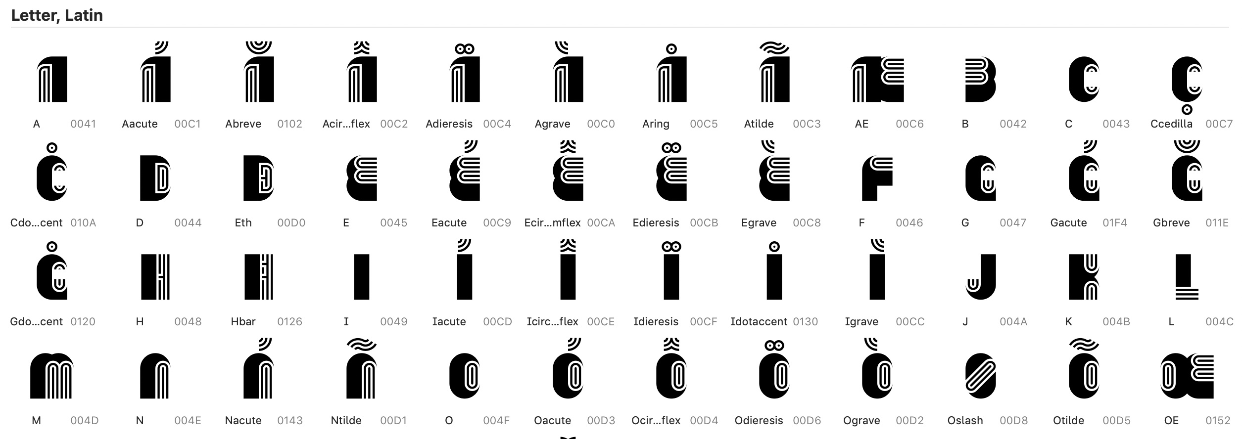
I’m working on a multiline font as shown in the attached image:
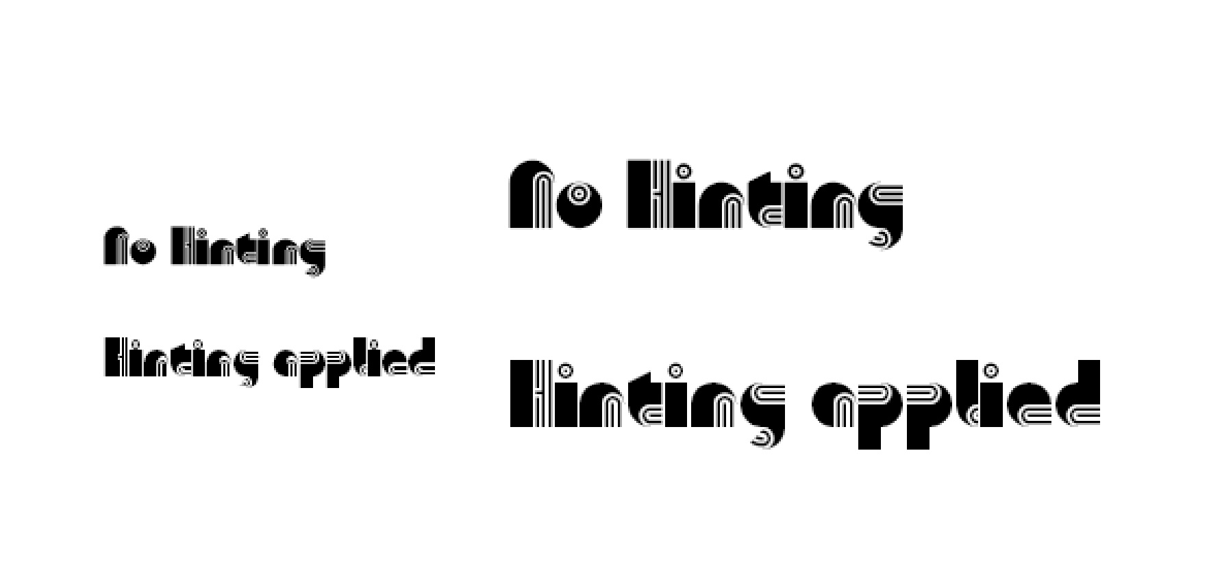
So I thought why not try to hint it. But now I have a dilemma: When hinted, it renders beautifully at small sizes, but looks unbalanced at large. By unbalanced I mean the thinner lines keep moving
Without hinting, you can barely see anything at small sizes, but overall glyphs look better and consistent at larger sizes.
Here’s the comparison image, notice how at larger sizes (when hinted), the lines are not equally distributed:
So my thinking is if I could apply hinting only for small sizes and ignore for larger sizes, is it possible? Some kind of a workaround or compromise? Do these type of fonts even need hinting?
The paths are all tidy, with extremes, coordinates are round and direction is correct.
I gave priority to the thicker stem (and not the thinner multilines), so my vertical stem values are written as firstly 224 and then 32. I tried doing the opposite (priority to thinner lines) but the result looked awkward.
Thank you!