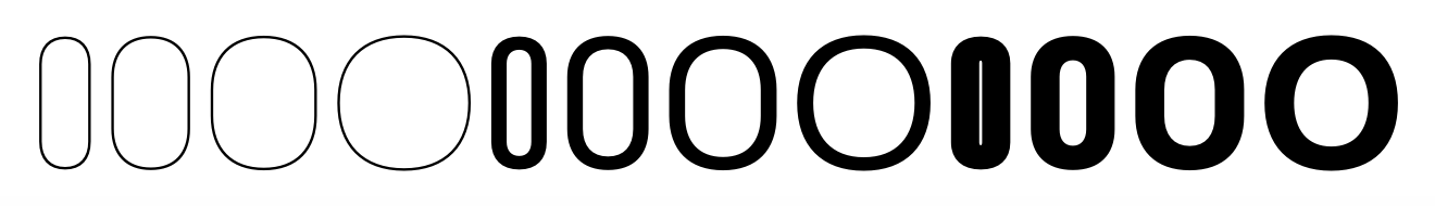
Hi all, we’re designing a multi width grotesque (condensed, normal, extended) with 5 weights each.
All Condensed round letters such as “o” and “c” should have the vertical stems fully straight, whereas all others instances should be rounder (a little like Robert Slimbach’s Acumin) » see “C” curves in https://acumin.typekit.com/design/.
We have 4 masters (light/black condensed, light/black extended) and different possible strategies:
Bracket Trick - resulting in all round letters having 8 masters (square and round versions)
Dotted Suffix - same number of drawings, but more manageable in the font view)
Designing everything rounded and after finishing everything, going back to condensed weights and straightening all up.
Is there any other, simpler way to solve this in Glyphs?
I believe this is still not optimal, Georg. Some of the medium to extended end up still being squarish. Can you explain also what the zero line length meant? You mean to overlap, on the extended masters, the points that make up the straights on the condensed?
There are two points on top if each other, indicated by a red dot. As I said, the interpolation might not be what you want.
Otherwise you need to draw two sets of outlines. If you use bracket layers or individual glyph is up to you. I usually prefer bracket layers but they don’t work optimally with the width axis. I need to look into this.