It seems to me that they have exactly the same effect. Have I missed something?
Is this is the case, how do I decide which one to use? Are there pros and cons? Or even other ways to do it also?
The two tutorials you refer to are both about contextual alternates. If contextual substitutions are placed in the calt feature, which is meant for exactly that, it is on by default and the user can disable it. The alternate is triggered by a context of glyphs, hence the name.
Stylistic alternates, or simply ‘alternates’, usually placed in one of the stylistic set features (ss01-ss20), are usually simple one-to-one substitutions (no context) and of course off by default. The user can enable them.
OpenType features can be on or off by default. calt should be on by default.
A feature can contain rules and lookups. What you pasted above are so-called rules which need to be put into a lookup or into a feature. The Feature you put it in (e.g. calt) decides how the user can access it. Different apps support different features differently, though. There are official recommendations on how which feature should be treated (they are listed on the Microsoft page containing the spec), but there is no guarantee that all app developers actually stick to the spec. So I cannot spare you from testing in the apps you want your font to work in.
Thanks!
Regarding alt versions of ligatures, how would we write that?
For example, for A_B.liga, would the alt version be… which of these?: A_B.alt
or: A_B.liga.alt
It works fine in Glyphs app when typing it, so long as I click on ‘calc’ on the drop down menu on the bottom left. But in Pages and TextEdit, it doesn’t work at all. And nowhere can I find any calc option to click in Pages, nor in TextEdit. I went deep into the menus there after googling, but still no luck, and I can’t find mention of calc in this context online.
Ah sorry @mekkablue, it was totally my fault. I named the feature calc instead of calt! Took me a lot of googling before I realised that! No wonder I wasn’t getting useful hits searching ‘calc’ feature! And now I know what it stands for
This one is still not working properly:
I think I have it kerning too much. In the glyphs app it doesn’t kern at all. In Pages it kerns a little too much. And in TextEdit it makes r_e.liga and @hyphen_class (1st and second of the triplet) line up just how I want, but makes @parenright_class (the one in the middle) way too far left. I must be diong something wrong.
I have a kern group called re. Can I put kern groups in the code? Like instead of:
can I replace the -346 with the re kern group? How to write that? Just like this, or need something more special? pos r_e.liga [@parenright_class@number_DEFAULT]’ re @hyphen_class;
[/quote]
Also since I did not understand this part, is this still something that could be causing problems?:
Just to let you know, I’m experimenting changing that kern number. None of the changes show up in Glyphs app. Even when I click ‘compile’, and ‘update’, and even after exporting. It just doesn’t apply any kern. However, when I export it, the changes do take place in Pages. None of the changes in kern from that script are taking place in TextEdit, I now realise. It was never doing anything. Am I doing something wrong? Or is this normal, to not be able to see the changes from within Glyphs?
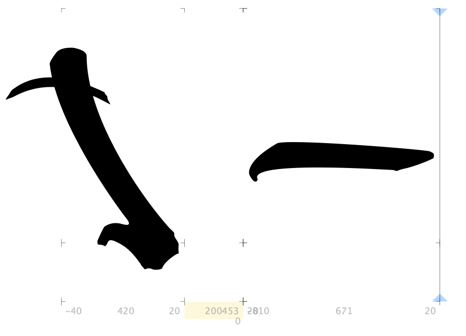
I have an idea what it might be perhaps? I think I kerned it so hard that I was asking the 3rd letter to start further left than the 2nd glyph’s left boundary (although not the actual image of the glyph, which is far left of that, perfectly positioned).
So, I have decided to try to change the right boundary of the 2nd glyph, moving it right by 100 (i.e. removing the -100 I had on its right boundary, by setting it to 0). And then make the position correct again using kerning. Hopefully this will solved this issue.
So I wanted to keep the individual kerns this glyph has, and then add -100 kern to it with regard to all glyphs. This should in theory make the actual positioning all the same as I previously had it.
I thought the easiest way to do this would be via the kern part in features.
So, in classes, I went to +, then created the group All, which filled itself automatically. And I made this script in the kern feature:
pos r_e.liga’ -100 @All;
But in the preview window in Glyphs, it’s not kerning at all! I even put it up to -700, clicked compile and update, but no change. I see the changes in Pages though, so, I will try the triplet in accordance with this new change and see if it fixes it…
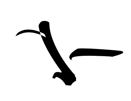
This is how I actually want it to appear. Great!
One problem though - zooming in (only when zoomed in quite a lot does this happen), Pages makes the overlap white! TextEdit and Glyphs do not do this. Any solution to that? Here’s what I mean:
Now, here’s how it appears on TextEdit:
The second glyphs is moved too far to the left! Which thus makes the 3rd glyph also too far to the left also.
Here the second glyph is too far right, and the 3rd glyph is far too far right. Which means it’s ignoring both of the kerning scripts added in features, as discussed above. Also, what is the yellow region indicating?
It’s so difficult to move forwards with all 3 apps behaving differently from one another!
Thanks!
Ah thanks, that’s very helpful! I corrected that now.
Aside from that issue and regarding kerning, any ideas on why it’s showing 3 different ways in 3 different apps? And what I can do about it?
The kerning added with the regular kerning UI and the manually written kerning will both be applied. There seem to be some inconsistencies. Or you have a font cache problem?
And I don’t really understand what you are trying to do. Maybe make the middle glyph a mark and position it with anchors and then have regular spacing/kerning between the other two?
I now changed the kerning so it’s not so hard, worked a way around it. It has fixed the inconsistencies
Although there’s one ordinary kern, done the ordinary way (not code - I actually deleted all the code from kern code in features) that works in Glyphs and Pages but strangely not in TextEdit. I’m really hoping for this font to be useable on as many apps as possible and even on Windows machines. Any tips on how I can identify this problem?
So what I do is, I go to ‘info’, change the name of the font, then export it. Then in Pages and TextEdit, I copy and paste text, then select the new font. I was under the impression that this should cause no cache issues. And, almost everything is right in all apps. This is the only inconsistency left that I have identified.