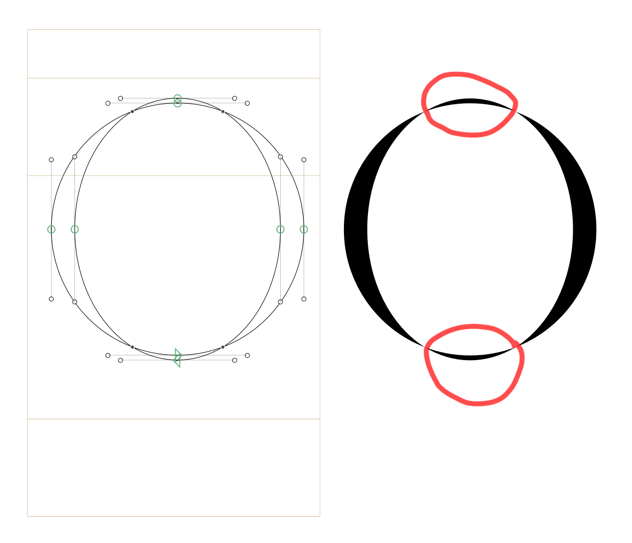
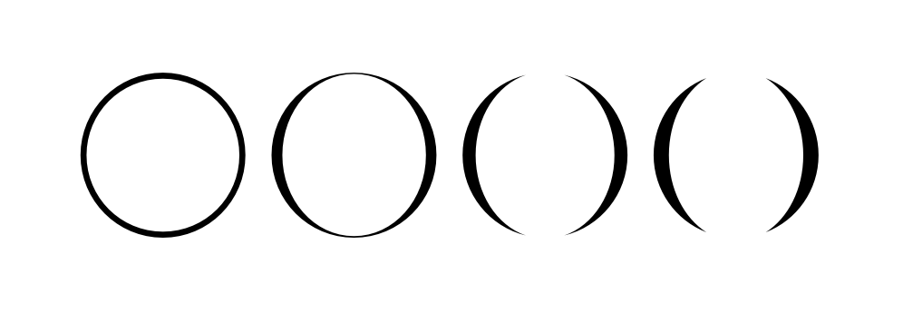
The variable font Exposure by 205TF manages to subtract areas where paths overlap.
Visible by outlining in illustrator:

Is this possible in Glyphs? Or any other font software? Is this magic?
The variable font Exposure by 205TF manages to subtract areas where paths overlap.
Visible by outlining in illustrator:
Is this possible in Glyphs? Or any other font software? Is this magic?
If you draw it that way it will output that way. It is not magic.
When I draw the /o in this way the top and bottom overlap are visible instead of being knocked out.
What am I missing?
For clarity, I know I could manually subtract those sections from the shape. I am asking how this can be done non-destructively in a variable font like the reference.
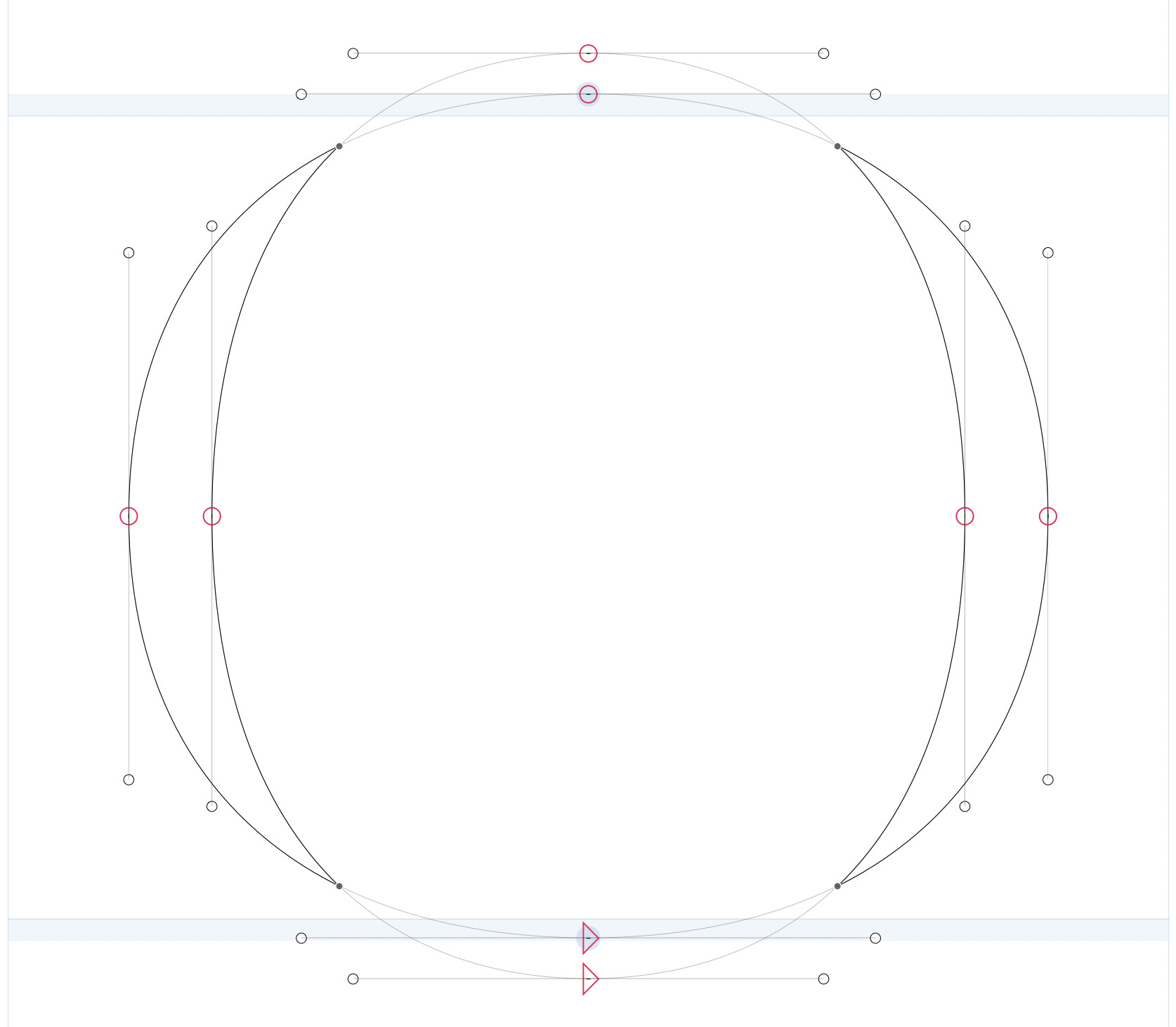
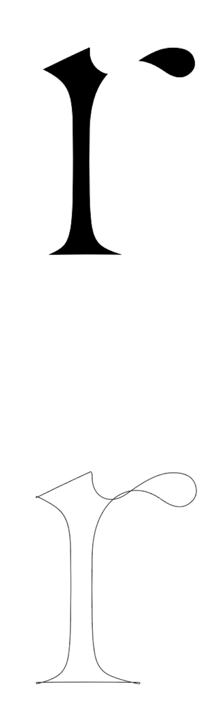
Set your paths up like this (note the path direction, it is the same for both):
Then set the inner path to “Mask” in the Attributes panel in the bottom-right corner.
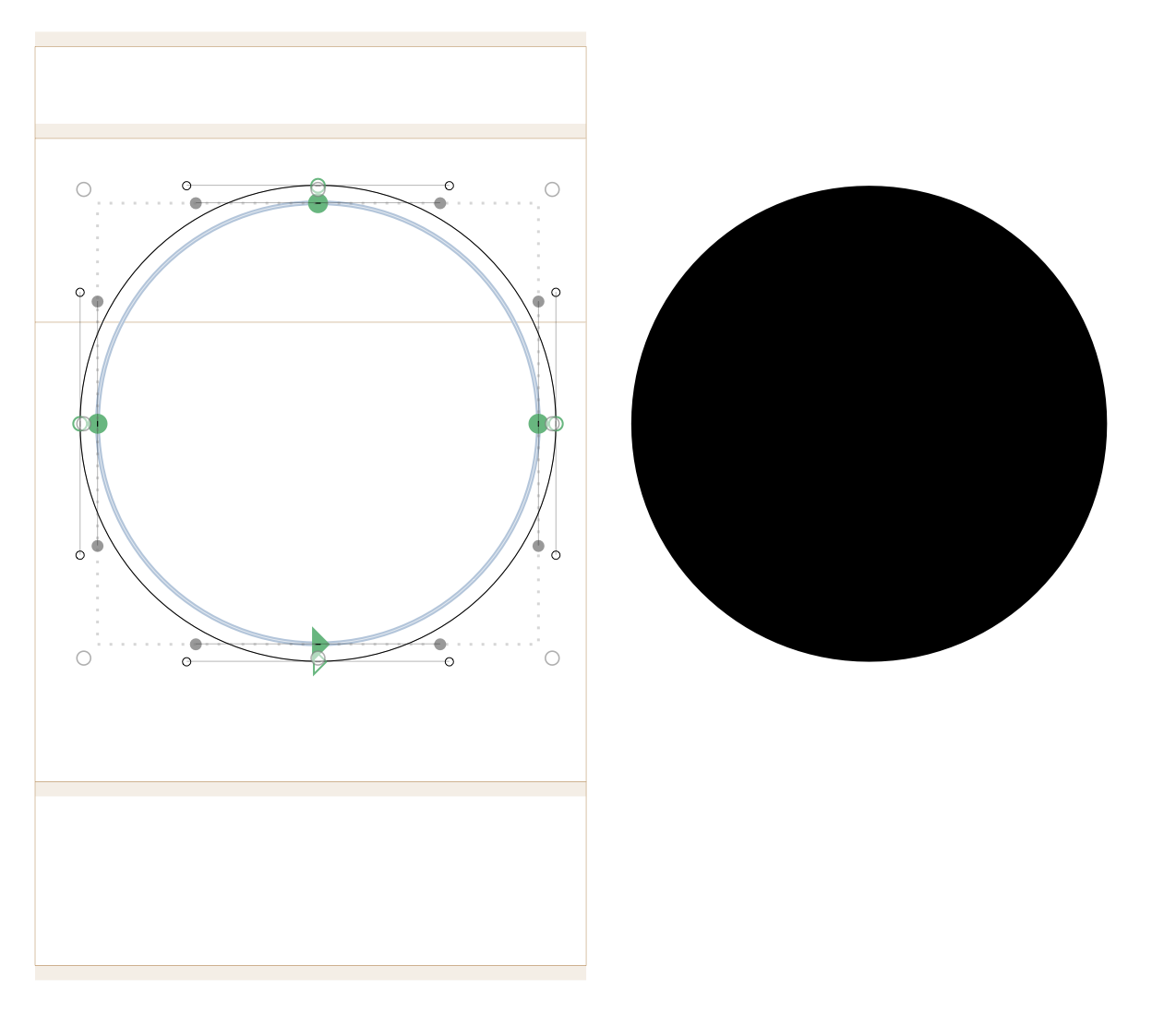
That works for one master yes:
But for the master with no overlap the masking method doesn’t hold up:
I had always suspected masking for variable fonts in this way wasn’t possible until seeing this font.
Works for me. Are you sure you set the attributes correctly?
And yes, indeed, Exposure is an absolutely fantastic project, not only stylistically, but also technically. Thanks for the reminder!
Ah yes, I didn’t have the mask activated on the other master. My bad.
This works for instancing but can you export this as a variable font that works like this?
You can’t export that as a variable font like this as the shapes are not compatible after the mask is applied.
You need to set up two versions of each glyph (either as two glyphs+feature variations or as bracket layers).
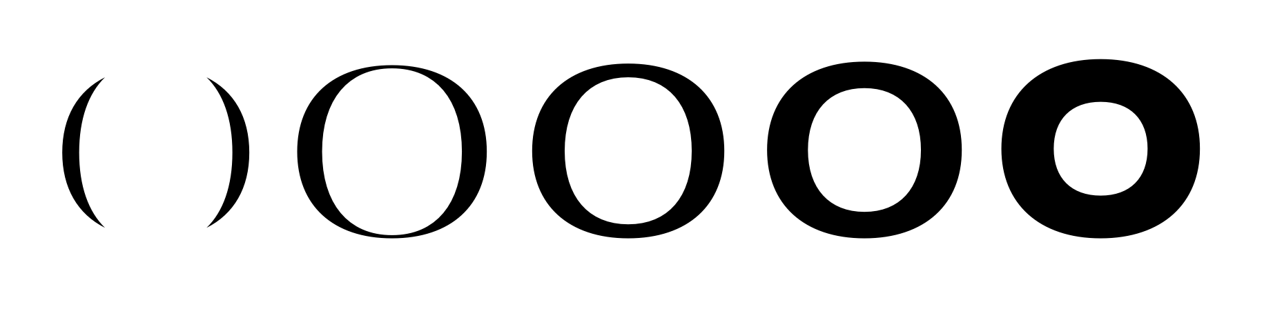
Do you think that is how Exposure was made? With bracket layers for each overlap? That would be ridiculously complicated… Why do the screenshots posted here show overlapping paths in the variable font? It seems to work.
Maybe I misunderstood you. Could you detail a bit more?
The designer Federico Parra Barrios must have found a way because that’s how his font appears to work.
Download the trial variable font here and see for yourself.
It looks like he uses Glyphs here.
I have sent him a message directly. Not entirely expecting him to give away his secret sauce of course ![]()
Wait, @GeorgSeifert I think I understand what you are saying now. Makes sense.
The effect just looks so believable I didn’t think it could work like that.
Big credit to Federico Parra Barrios!