Hi there.
I am struggling with the following:
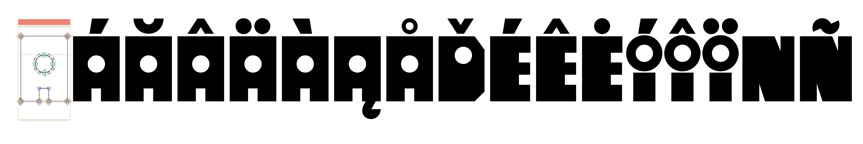
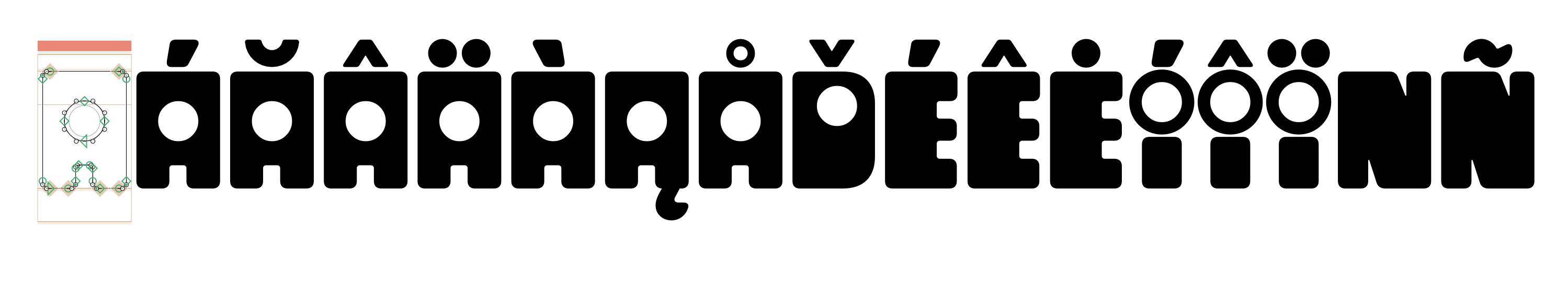
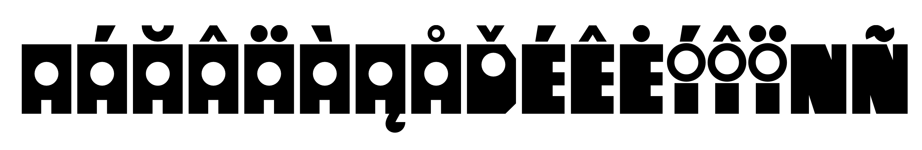
I’ve created a display font (all caps only). It has four different styles, they are pretty similar, the differences being that the first style has rounded corners, the second is sharp, and then there’s another version of both but with bigger counters (it’s a geometric kinda font where all of the counters are circles).
Been working on a while, am still learning Glyphs, quite possible I’ve gone about this all wrong. For eg the original font had rounded corner (which I’ve rounded manually) then I had the idea to add these other things.
Originally the files were separate, but I’ve moved them all into one using layers (masters) for each. But when trying to export I am having all sorts of errors, such as:
— ‘The font has more than one master but no axes defined’
with this one, I’m unsure whether defining different axes makes sense, I’m not creating a font with italics, bold etc, it’s more different styles ie. it’s a fun playful font. I’ve tried to find answers to this specific to my needs, but remain confused about exactly what’s required here in terms of settings.
— I’ve also tried exporting as a variable font, and now I have the message “Incompatible outlines. This can be caused by outside transparent overlaps”
I am wondering if my “styles” are too different to work in this way ie. all within the same font file, and I’d be better off having separate files / exporting as separate font files. Am I trying to use a function that is not fit for this purpose?
I will add screenshots to show what I mean by each “style” with a few example letters.
Is there just a huge gap in my knowledge, or am I being too ambitious trying to set up this kind of font in this way?
Thanks so much in advance for any advice