I decided to dust off some of my older code and make it into a Glyphs plug-in. I’m not yet sure how widely useful it’ll be.
Available on GitHub:
https://github.com/maciejratajski/Superelliptify
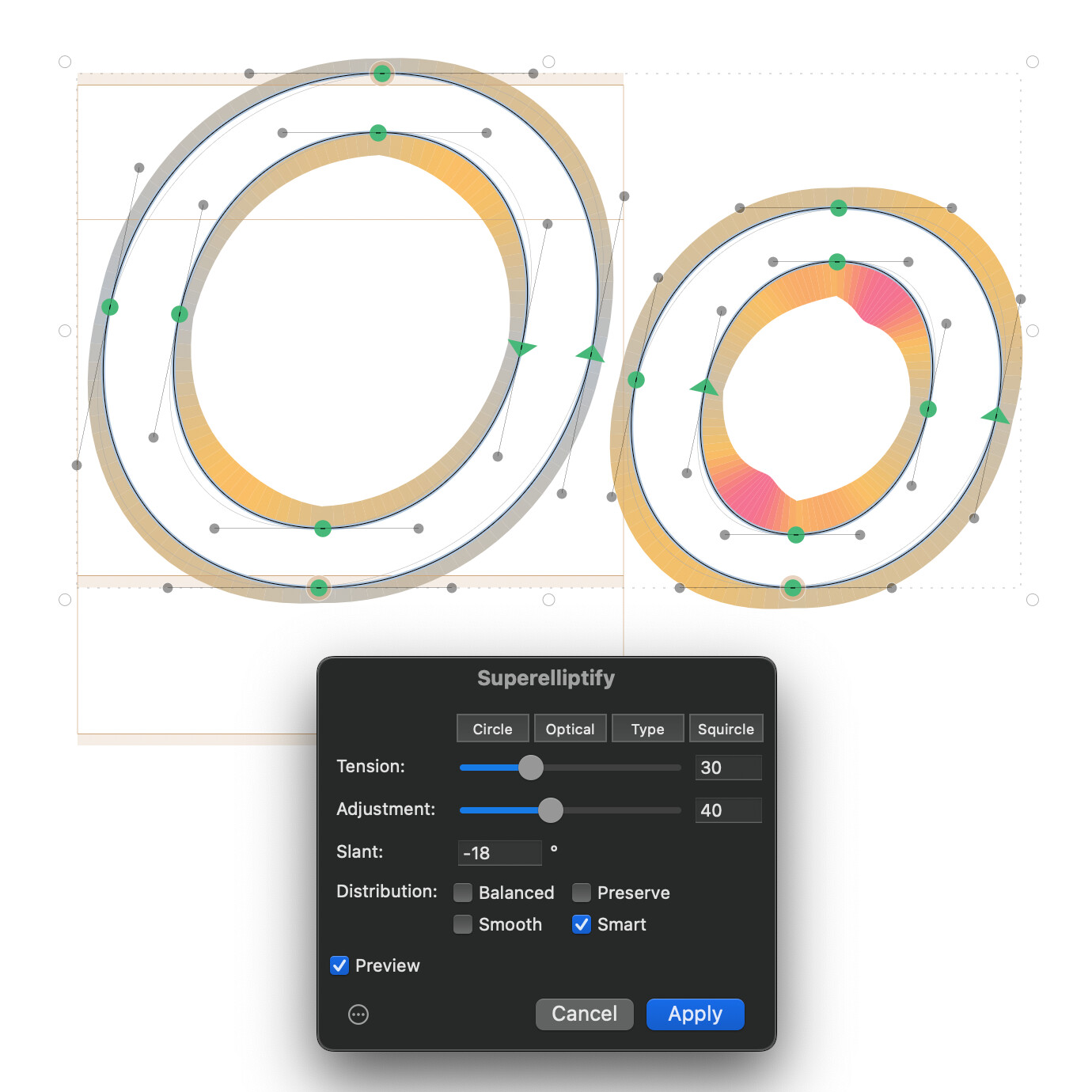
It is a filter plugin that adjusts cubic Bézier curve handles along the circle–squircle approximation spectrum using the Tension parameter.
The optional Adjustment parameter allows for adaptive curve Tension application that follows segment geometry. It increases Tension for more oblong shapes, reflecting a pattern found across many typefaces and font families.
The algorithm scales its effect to the turning angle of each segment. Shorter curve segments receive proportionally less change, preserving shapes defined by deliberately placed on-curve points. This allows for less destructive application to multiple shapes at once (e.g. for prototyping).
- Tension (0–100) — controls the superellipticity. 0 = exact circle approximation, 13 = optically correct circle, 20 = a good starting point for type design, 100 = full squircle.
- Adjustment (0–100) — eccentricity compensation. At higher values, more oblong shapes are pushed further toward squircle-like forms. This reflects a pattern observed across many typefaces: narrow shapes tend to resemble rounded rectangles rather than squished circles.
A specific balance of the two parameters can be applied among multiple glyphs of the same font family.
After computing new handle lengths, the plugin offers four distribution modes that control how handles and nodes are arranged:
- Balanced — Default. Distributes handle lengths equally on both sides of each segment. On-curve points stay fixed.
- Preserve — Applies the same overall tension but restores the designer’s original handle-length ratio within each segment. Useful when the original imbalance was intentional.
- Smooth — Balanced tension plus G2 curvature continuity at smooth nodes. Adjusts handle lengths at junctions between segments so curvature flows without breaks.
- Smart — Balanced tension with handles fixed in place, then moves on-curve smooth nodes to achieve G2 continuity. Produces the cleanest handle positions at the cost of slightly shifting node locations.
The Slant parameter (-45° to 45°) makes Superelliptify work better on slanted and italic letterforms. Setting it to the same angle as the slanted glyphs produces results equivalent to superelliptifying upright contours and slanting them afterwards (thus introducing similar problems to slanting the upright contours).
For shapes with slanted “italic extremes”, using a negative value of roughly 1.5× the actual italic angle, combined with Smart distribution, pushes slanted ovals closer to the optically corrected target. So if your font uses an italic angle of 12°, try setting Slant to around -18° and see if this helps you get in the right ballpark.
For shapes with correctly placed upright horizontal extremes, using the same Slant value as the italic angle combined with Smart distribution should produce best results.
Any feedback would be much appreciated.