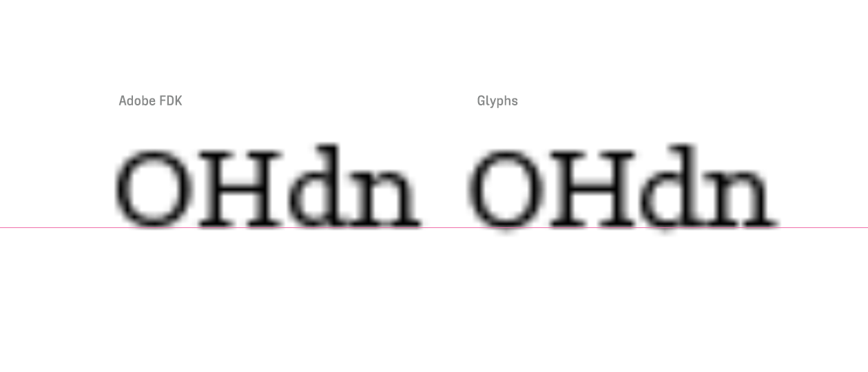
I’m remastering some fonts that were originally build in FontLab and hinted with the Adobe FDK autohinter, but I can’t seem to suppress the overshoot. The image is an enlargement of the old font on the left side and a new otf exported from Glyphs with autohinting enabled on the right side, set in 12 pt in InDesign. Screen capture made on 100%.
Alignment zones, vertical and horizontal stems seem to be set correctly. I’m using default blueScale.
Yes, I double checked outlines (zero handles, path direction) and added a blueScale parameter.
To be fair, the zone sizes are on the diverse end of the spectrum (similar or same sizes in all zones do make it easier), and that may have caused the difference between the renderings at x-height and baseline. But the blueScale knocked everything down anyway.
1
Actually different shapes need different amounts of overshoot, so by making all overshoots identical, the design might suffer. This error already happened in the analog drawing rooms of big type foundries, where rooms full of drawing ladies were instructed to snap everything to guidelines, destroying many optical subtleties that for instance Frutiger had applied to his drawings.
2
When a few glyphs need a bit more overshoot than most, you can set BlueFuzz to 1 or 2, keep in mind this increases the minimal distance between two zones. Value 0: min. dist. = 1, value 1: min. dist. = 3, value 2: min. dist. = 5. BlueFuzz catches those bigger overshoots without overshoot taking place at a smaller size. Something Adobe had forgotten it seems.
yes, but in sizes where overshoot is suppressed, the “round side” of a zone is used for rounding to the grid, so when the x-height zone is 40, the x-height will be rendered bigger in many small sizes. Which can be good or look grotesque.
Keeping zones that belong together (baseline, cap height, x-height) at the same thickness makes sure they start to overshoot at the same size, but zones for superiors or ascender/descender can definitely be narrower.