For years, it was standard practice to add extrema points when designing italics. Is that still the case? What are the pros and cons?
Extremes at top and bottoms are still required. Extremes on vertical stems are not required and sometimes even hurting the shape. So you can skip them.
1 Like
I will copy my answer from this recent TypeDrawers thread:
I don’t advise adding extreme points in slanted styles. Unless you find it easier to draw and manage shapes (which I highly doubt, given a bit of familiarisation, if necessary), I don’t think there is any good reason to add them. Extrema in obliques only add problems: more difficult drawing (in my opinion), incompatibility, outline distortion (in comparison to the original slanted/corrected shape)…
The only objective reason I ever hear about adding extremes in italics is hinting. You can safely disregard this, unless you are doing manual hinting and know exactly why you are doing so. Hinting for italics is virtually impossible (again, unless you do it manually and know exactly what you’re doing), and adding extremes would only help for vertical stems, which, by definition, don’t exist in italics.
Bear in mind that fonts on Apple devices are hinted on the fly by the system, the font-internal hinting is disregarded. The same applies (to a lesser degree) on Android devices.
Another argument for the use of angled extremes instead of vertical extremes is that of algorithmic correction of curves. I might be rather biased, since I am working on algorithmic oblique correction at the moment, but it is mathematically much, much less headache-inducing to use slanted extremes instead of calculation based on using vertical extremes (which inevitably leads to unsolvable cases).
1 Like
The interpolation between Roman and Slant is slightly different depending if you slant the handles or not.
The first part uses straight handles; the second uses handles aligned to the italic angle.
2 Likes
Thank you all very much. This has been most informative.
So interpolation is harmed with adding extrema to the vertical slants? I see I now have to go back and fix all the harm I have done.
I quite agree that it is much easier to draw and to see the curves properly with slanted handles. Extrema can cause kinking as well as distorting what you see. Thank you for your clear explanation.
It depends on the shape — without extremes, if the handles dramatically change relative lengths in upright and italics, then you can get stuff like this in the middle:
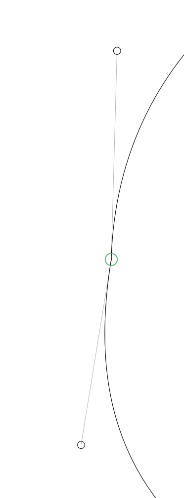
That is an eye-opening visual. It perfectly illustrates your point.
This is called a kink. Read about it in the second multiple master tutorial. In short, if a constellation points (e.g. handle-node-handle) fulfills all of these three criteria:
- The masters have differing angles (e.g. horizontal vs 20 degrees),
- The masters have a different proportion of distances between the points (e.g. short-long vs long-short),
- It consists of three or more points in a line,
…then you will have a kink in interpolation. You can avoid a kink by eliminating one of them. Sticking to extremes means you are fixing the angle condition. That is one of the reasons why extremes may be the better choice in a pinch.
However, avoid short or shallow (i.e. only a few units deep or wide) segments and shallow point constellations because their interpolation will always be ugly. In those cases it can help to remove an extreme (on the right in an upright lowercase e for instance).
If you abandon extremes in an italic (depends on the style really, but in most cases it is probably better to not force extremes at all costs), make sure to do so in every master, otherwise you are changing angles of a point constellation and inviting kinks. And check for kinks with the Kink Finder script.
1 Like
Thanks, Erich!
I am always careful about matching masters and avoiding short segments. When I add an extrema, I delete the diagonal point near it. Before I do, I copy the glyph into the background to make sure the curves match.
I will look at that tutorial.
1 Like
Thanks for reminding me about Typedrawers! I used to be a founding member, but had lost track of it since. I have now just renewed my membership, thanks!
And I forgot to mention the great Show Kinks plug-in by @harbortype. Shows you in realtime if there’s a visible kink or not.
1 Like
Thanks, Erich! I didn’t know about that one!