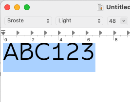
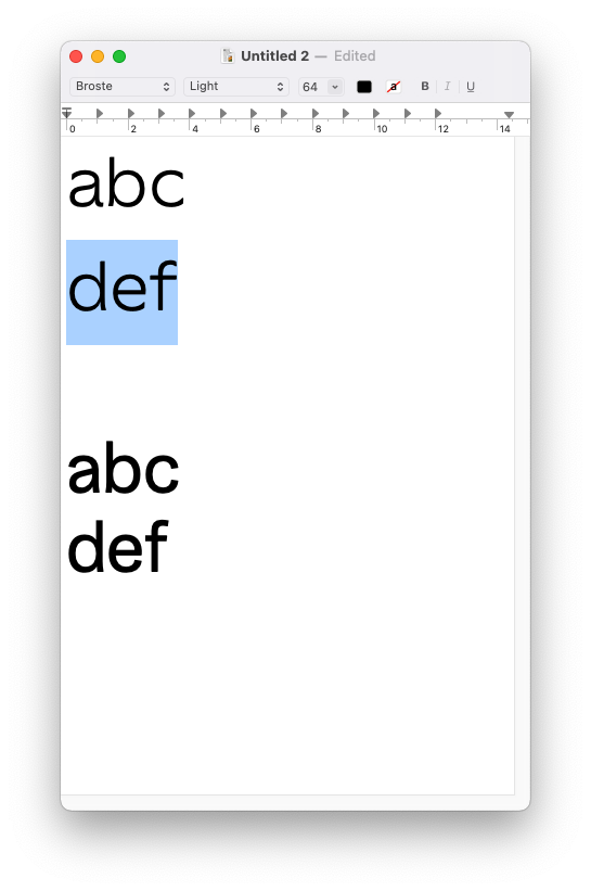
I cannot figure out why my typeface displays at the very top of the text frame in TextEdit and Pages, like so:
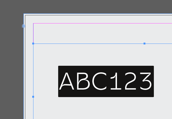
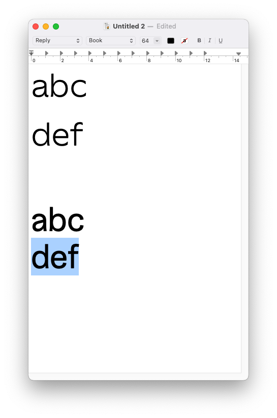
But in a program like InDesign it’s vertically centered in the text frame:
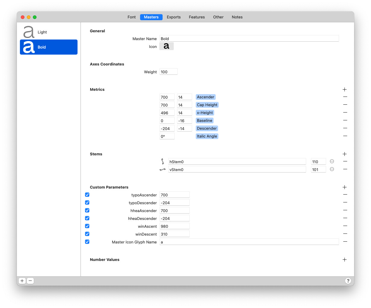
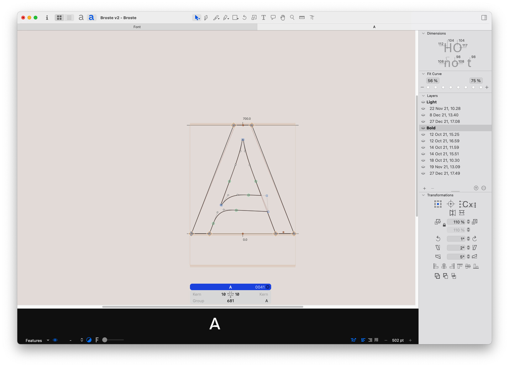
I’ve followed the Glyphs vertical metrics tutorial; My hheaAscender, hheaDescender, typoAscender & typoDescender correspond to the typefaces vertical metrics while the winAscent and winDescent (both set in positive values) correspond to the upper and lower extrema of the font incl. diacritics. I’ve used mekkablue’s script to find the highest and lowest glyphs.
The typo/hhea ascender values are too low; you should fit at least the cap diacritics into it. I suggest you follow the Webfont Strategy described in the tutorial.
These values are taken for the first baseline offset in office apps, hence the appearance in TextEdit and similar apps.
The position in InDesign is done with app settings and has (almost) nothing to do with the values you enter here.
There’s a few things I struggle to understand though. Previous fonts I’ve made, I used the ascender and descender sizes to define hhea/typo and I haven’t had this problem in those fonts.
However, I’ve now done as suggested and set typo/hhea ascenders to fit the cap diacritics (made it similar to winAscent). The tallest character in the font is 997u while the lowest is -297u.
This fixed the lack of space above the letters, but there still seems to be too much space below, which causes the line-height to be too big. See screenshots below where I compare this font to one of my older ones (the bolder one).
The latter, by the way, has vertical hhea/typo ascenders defined in accordance with the top of the ascenders and not the top extreme point.
My question in a nutshell: Can it be explained why there is such a large margin between the bottom of the character /g and the edge of the text frame, even if my winDescent, hhea & typo descenders all are defined to match the bottom of the /g?