Hi there,
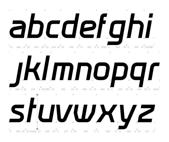
I did this lower case font for a client of mine. the whole range of letters is based on a few logo characters, which I designed years ago. The aim is now to create a real font in glyphsapp for client usage. As graphic designer, I have a knowledge about spacing and kerning, but more in a final habit of design.
So I am wondering if there are some good videos or info, which explain the starting point to make accurate spacing through a font design and even some special kerning setting where it’s needed.
Best, Alex
