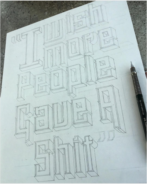
Hi this could be a stupid question. I’m looking for advice in setting up my glyphs file. I’m looking to digitize a large lettering lockup (attached). Which method is better for my digitization process?
Should I design each word in the lockup separately? Using the same sketch proportions, I would draw each of the 7 words as their own letter in a glyphs file. And then go in illustrator and arrange the words in a comfortable lockup such as my sketch.
Or
Should I build the entire lockup on one character file in Glyphs? This would be preferred but is there drawbacks to having one massive character?
The entire sketch is 10x14, and the x-height and capheight are the same for each word in the lockup.
Great addition to the app I had no idea Glyphs offered this. So now that I’m using layers in the design. Should i layout the entire piece in one giant character? Or should I split this up between multiple sections?
Do you actually need Glyphs to do the job ? If this is a lettering without the goal of using the letters to make a font, programs like Illustrator, Inkscape or Affinity Designer might be more suited.
Good point. But Glyphs having things like two handled paths, components, and streamlined modularity make it seem like a better option. I still finish projects in illustrator. Glyphs just feels much more exact, and easier to edit when it comes to letter construction. However the drawback of this program is that there isn’t a streamlined way to letter large lockups. Which is why I finally posted this forum looking for insight. I’ve never heard of Inkscape or Affinity Designer.
Drawing compositions like this is much easier in Glyphs because the node handling is better suited to draw shapes like this.
I personally would put each glyph in one cell. Then you can a duplicate some of them and try different version. And, if you need some other words, you can just type them.
Hey Tosche I’m not familiar with those terms is that the the grid you see when you zoom in all the way? I find this grid sometimes working against me because I can’t get the nodes exactly lined up because each grid module is to large. What is a way around this problem? And what’s the purpose of disabiling that will help me designing all under one glyph?
Yes. There are two ways to solve this problem. One way is to make the glyph so large in the first place. To do it, you go to Font Info and set UPM to much larger value, like 10000 (in Font tab). The second option is to go to Other Settings tab in Font Info, and set Grid Spacing to zero. You will have completely grid-free canvas, but you might lose accuracy. Actually, the third way is to leave grid spacing to 1 but subdivision to 10. This way, you can set grid to 1/10 of grid spacing (effectively 0.1 unit step, and effectively same accuracy of 10000 UPM).