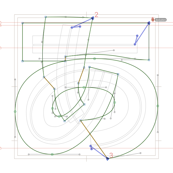
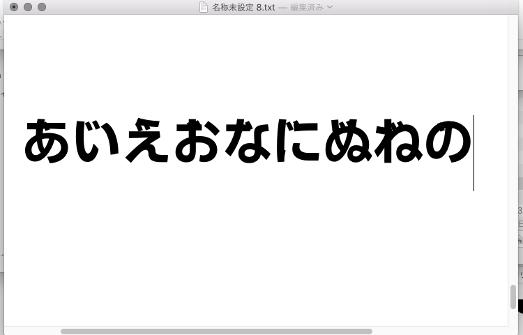
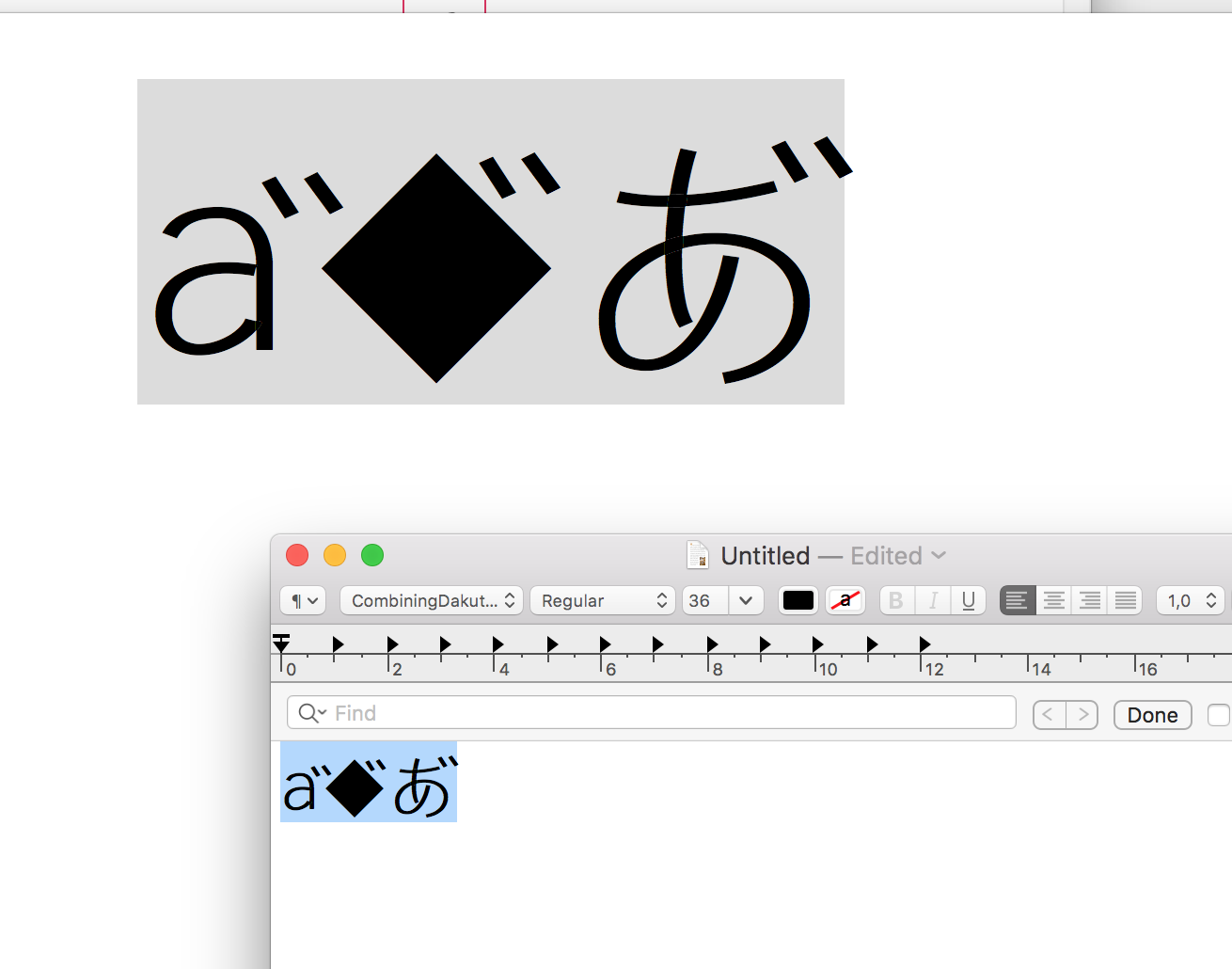
Dakuten (voiced sound marks) are placed at the top right corner of base glyphs. So I added anchors named “dakuten” to all my hiragana, and made sure voicedcomb-kana and semivoicedcomb-kana have anchors named “_dakuten”. But the exported font doesn’t place the combining marks at desired positions on TextEdit nor on Chrome.
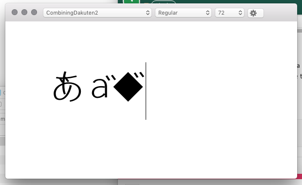
I noticed that the glyph whiteCircle, which I gave a “dakuten” anchor just the same way as hiragana for an experiment, behaved as expected (dakuten at the top right corner where the anchor is placed).
I haven’t read these particular tutorials. I’ve just tested this problem on the TextPreview app, and the result is the same as on TextEdit.
I include a revision number in my font family name and increment it every time I export the font, so problems pertaining to font cache is, to my understanding, mostly avoided.
Regrettably I don’t have access to adobe apps currently.
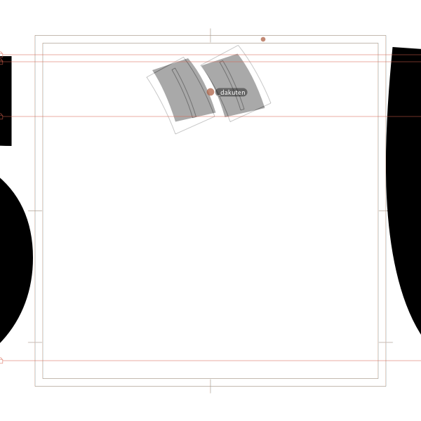
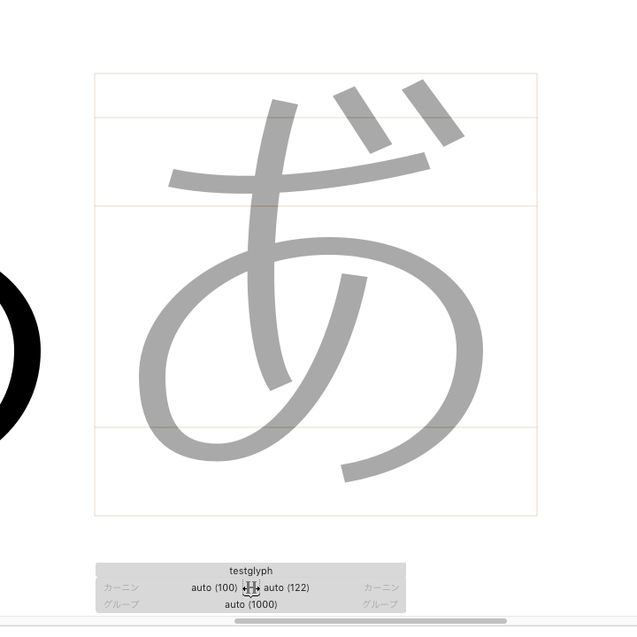
In the above image I made a glyph named testglyph with a recipe “a-hira+voicedcomb-kana=testglyph”. It shows how this combination should look like when automatically aligned. General positions of being at the top right are similar, but the exact placements differ significantly.
I suspect that CoreText just places combining dakuten according to prior assumptions about where they should be and ignores what the font tells it to do. Probably the difference between my result and yours is because of differing OS versions (I’m still on OS X 10.11.6).
I wonder if there are any way I can control the exact positions… Well, probably defining all combinations as separate ligature glyphs will work. I want to avoid that if possible, though.
Oh really? Then it is just that my version doesn’t support this yet, I suppose. Which is really hard to believe, because putting combining dakuten marks on hiragana characters is a very natural usage. I wonder how OS‐bundled Japanese fonts implement this feature…
You can move the outlines (with the anchor) more to the top right. Then the default position is less bad.
You can test in Chrome, it has its own OpenType layout so you are not depending on the old code in macOS. The OpenType support was greatly improved in 10.12
Yeah, I tweaked the default position. It is much better than before even when glyph repositioning is disabled. Chrome (up to date, 73.0.3683.103) seems to ignore the anchor placement at least on my Mac, but the default position is now somewhat acceptable.
In the end, I figured it is mostly harmless to have all combinations (all hiragana & katakana × dakuten & handakuten) as ligatures and went for it. Slight increase in file size, but the font now gained more compatibility, I think.