Hi, I’m not sure if this is a problem with Glyphs or, a misunderstanding of TTF zones and how rounding works in Glyphs 3. More often than not, I think it’s safe to assume the latter, but let’s see how this goes anyway
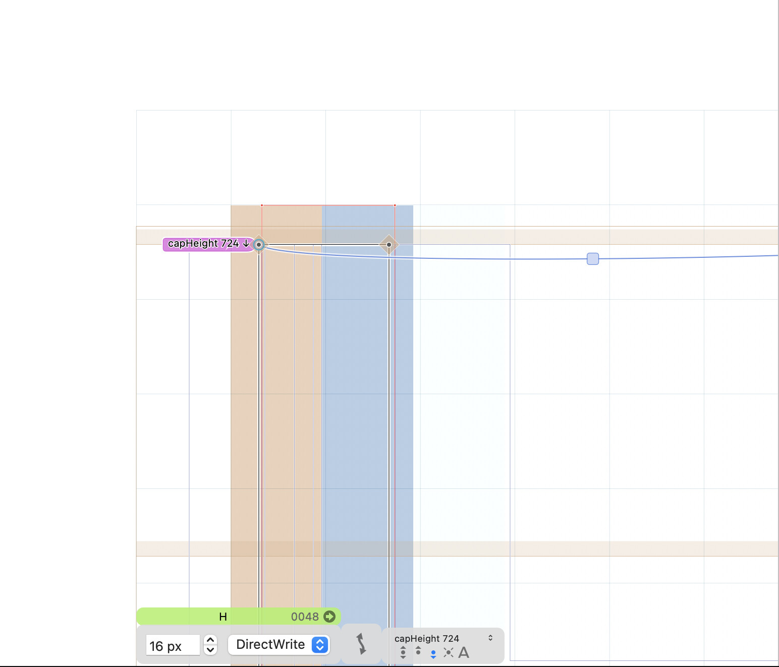
Let’s say I have a font with a cap height of 724UPM, and 10UPM of overshoot. So, my master metrics look like this:
Now, I go to hint the font, where, if I understand correctly, I’m trying to get the red lines as accurate/close to my actual drawn outlines as possible:
But I would have expected rounding down on the cap height zone to have the same effect.
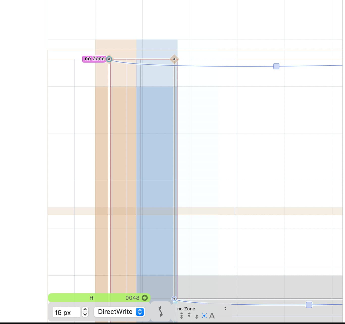
Should I ignore the overshoot of the red line when using the cap height zone? Should I set glyphs without overshoots to use “no zone”? I could also add another TTFStem, something like “capNoOverShoot” with values of 724 0, and align to that zone. Is any of these three strategies more sensible than the other?
I think the zones don’t react to the round up/down setting, because they are global for all glyphs. If you want to round a zone differently in certain ppm sizes, you need to set deltas for the zones:
Add a TTFZones custom parameter in the first master and click it to edit the zones, then click the delta symbol to the right side of a zone, there you can set up/down for each ppm size in each style.
Jens is right. The deltas in TTFZones are the way to go. They are very powerful and important, and I always set them with great care. It’s worth it as it’s just one setting for the whole font (okay, for one style for one ppem but it’s still worth it).
If at a certain size, the cap height gets rounded up and the x-height happens to be rounded down (by pure chance) then it’s usually worth tweaking one or the other. Similarly for the ascenders and descenders, of course. I always set up a temporary glyph that’s practically a ligature T-k-p and then analyse whether the inevitable rounding errors compared to the designed vertical proportions are in line, so as to retain the overall impression.
Another thing I’d treat with great care is consistency between styles. I have an html document that shows the different weights side-by-side, as a waterfall, and it’s usually necessary to add zone deltas to certain weights so as to avoid e.g. the bold having a different x-height than the regular. From a certain size upwards (which one is up to you to decide), you’d allow for different x-heights, of course.
I had been avoiding deltas after watching this video in which Rainer recommended not using them (first video, around 23 minutes in): glyphs_hinting – Google Drive - I wonder if he meant only in some circumstances (single-style fonts), or maybe he was referring to the case without the TTFZones parameter?
Being 56 styles deep on this font already (wght and opsz) with plenty more to go, that is a pretty big “okay” Still, I’m happy to do it if it has good results. I will give the TTFZones parameters a try, and see how it all goes. Thanks everyone!
I also find the behaviour of the “Only round in Cleartype/GDI” option a bit confusing. Played around with it, in different rendering environments, but it didn’t help create consistent results.
Also, the preview in Glyphs is not entirely reliable. I always use a real Windows computer to check the TT rendering of my fonts. Unfortunately, it has recently become extremely difficult to get real Cleartype/GDI in a browser. Firefox seems to be disrespecting the parameter that’s supposed to enforce GDI. The only way to test real GDI rendering is to add my font to the list of GDI-rendered families (in Firefox) and install it on the computer. Tried even several older Firefox versions, without success.
That said, I have nearly given up optimizing for real GDI. You can see results similar to GDI by setting the GASP parameter do do hinting and asymmetric, as a basic check whether the rendering on old Windows versions with GDI will look acceptable.
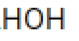
Btw, seeing your HOH samples: I recommend to set the TTFOvershootSuppressionBelowPPM extremely carefully, as it can practically make a font useless for certain sizes if it doesn’t have the right value. And it’s really just one setting for the whole font family (without any “okay” attached).
The features provided by modern font editors tempt us into offering such large families because it’s not much work, you don’t have any per-instance effort. If you provide manually hinted TT fonts, though, it’s a per-instance business (even though Glyphs allows to add instructions only for the first master – I remember hinting our JAF Bernini Sans in FontLab, each of the 40 styles in a separate file!).
Maybe you can re-consider the family set-up? Are really all of the styles useful? You could also decide to publish only a subset of the styles as TTF.
This is great feedback. I will take a second look at my overshoots generally as well; it could always be a problem with the drawing.
Have you compared your real Windows machine against a Mac running Windows in a VM locally? I just took advantage of the “Show preview address” feature to look at the results as rendered in Windows 10 running on Parallels. This could be a great workflow, but only if it reflects what a standard Windows environment would also look like. RE: Cleartype/GDI specifically, I appreciate the Firefox tip! I wonder what the data is like on # of people still using those older systems
They are probably not all useful, no I am testing a theory that optical sizes tied to point sizes (rather than large categories, of, say, “Display” and “Text”) similar to metal type sizing is something people might use, but I’d been thinking of that in the context of a variable axis. You are right that a smaller subset of styles would make the static instances more manageable… I’ll have to think about this.
I wonder if that’s why @mekkablue downplayed the use of deltas in that video, actually — because they’re useless in variable fonts?