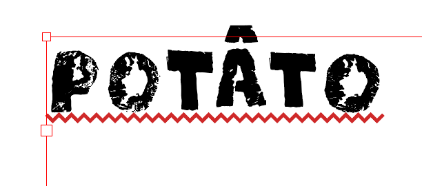
Hi - any idea why the type (in magenta) sits high in the Indesign text box?
It is in the correct position as regards the baseline and cap height in Glyphs.
Thanks, all

Are your vertical metrics set correctly? https://glyphsapp.com/tutorials/vertical-metrics

It seems to be an issue with the first line being offset upwards. I remember this used to happen in FontLab and I never did find out why. I assume the first line is dropped from the ascender height?
Do you have any custom parameters?
No, nothing. How does the font get the info from which it calculates the drop of the first line? I assume it’s from the ascender? I also see there’s a custom parameter you can set, though I don’t have one in this font, so it’s not taking the info from that… Happy New Year, btw!
Is this Illustrator or Indesign? Illustrator uses the top bounds of the letter “d”…
Indesign
Depends on what your settings are. Press Cmd B in InD and experiment with the settings for the first baseline Offset.
Aha, that does move it up and down… but I’m mystified as to why it had that offset in the first place? It seems to be set to the x-height?
Maybe that was your (accidental) setting in InDesign? Happens.
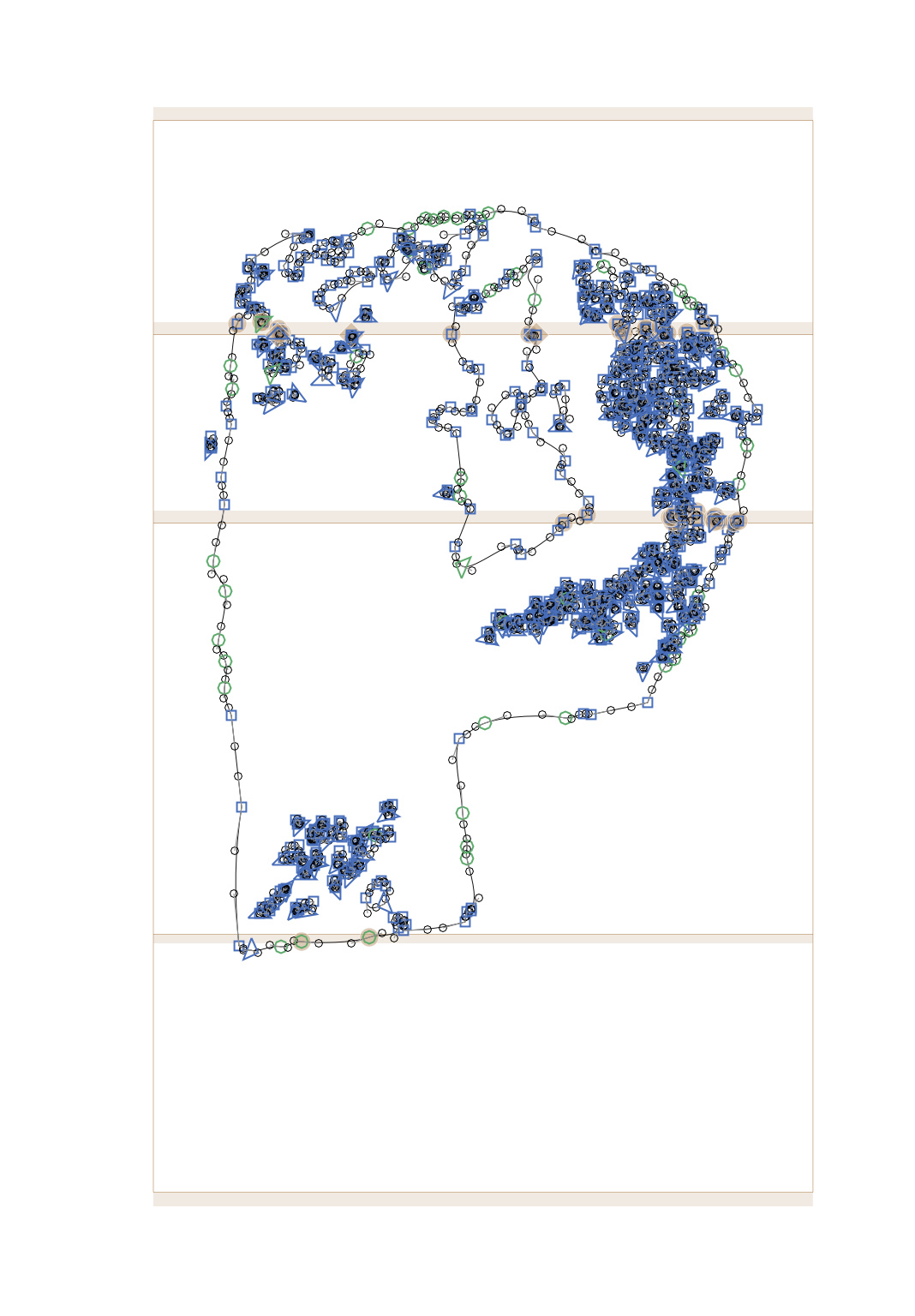
I have been watching this thread with curiosity. The total units add up to 1251 and the P, as shown, is about 850 units above the baseline. What would be the point of setting a cap height at 700 if the top of the P sits so far above it? And what is the need for an ascender to be 250 above that? The large descender space is another puzzle since none of the letters have descenders. If these metrics are so far off, I would suspect that other metrics, like winAscent and winDescent could be off too, especially if this font originated in Fontlab. Could they be factors? The experts are already giving advice, and I am not an expert, but I see some things that make me curious–like what does the rest of the Masters tab look like? Are there custom parameters?
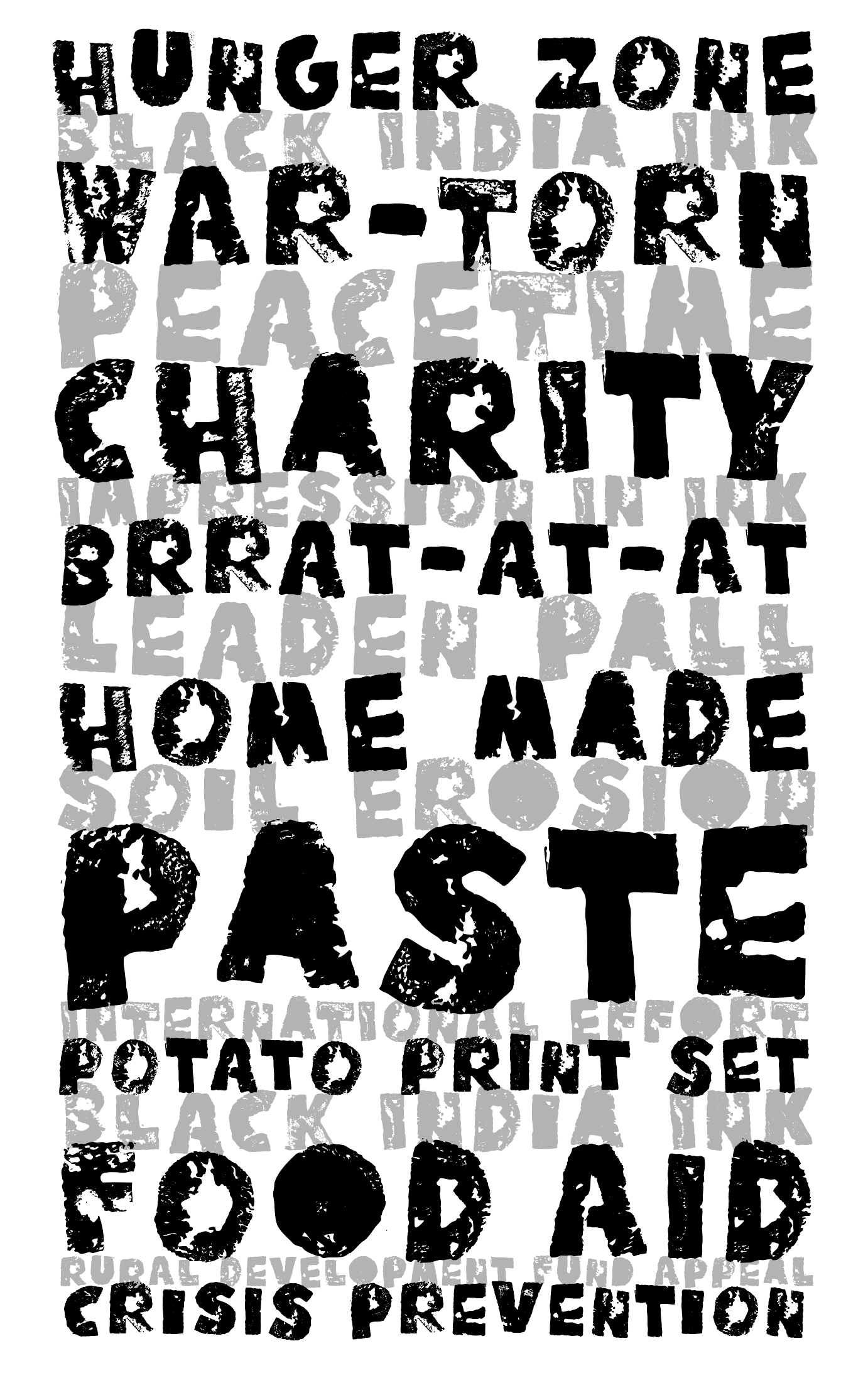
I did experiment with adding a custom winAscent parameter to see if that would override the strange positioning. The font is scanned from potato prints, turned to paths, then imported from Illustrator using FontSelf. My guess is that that’s where some strange custom setting was introduced. The font is so uneven that the cap height and ascender positions
(there are no lower case letters) are pretty arbitrary.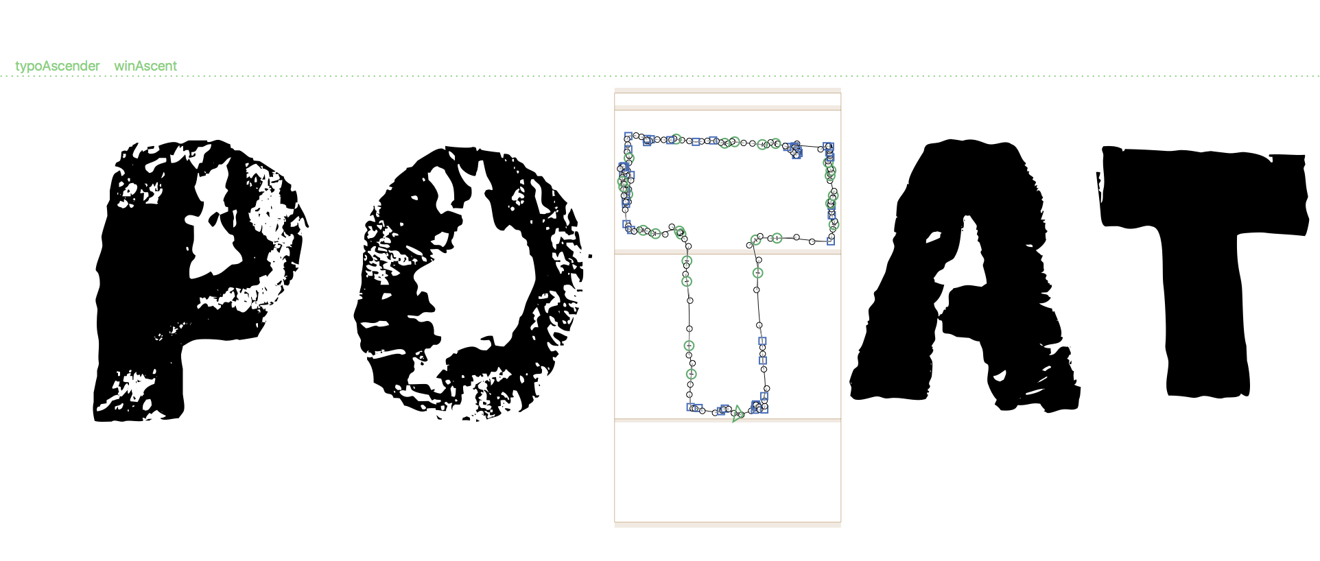
The numbers you originally posted are different from the image you just uploaded. What does the entire Masters tab look like from font info? I realize that all the letters are caps, but what is in the lowercase slots? Are they identical to the uppercase glyphs?
Hi Russ - I moved the cap height up and added the custom parameter
(0therwise its its the same, I think) which bumped it down in the text box. Lowercase slots have alternate caps (and there are another two sets so it cycles through different forms). Rereading your previous comment, the P is actually on the baseline, not above.
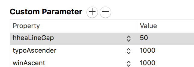
Anyway, all seems to be OK now. I wonder where that weird setting originated?
I’m glad you got it working. None of the snippets show enough context for me to make sense of it. That is why I wanted to see the entire panel. No biggie. You got it working to your satisfaction. That is what matters.
1 Like