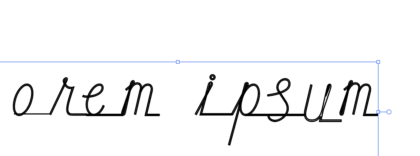
I made my monoline typeface in Glyphs and applied a filter-“offset curve” to it, but some characters appear strange when I type it in the font book after exported.
this is how it looks in glyph

and after exported:
I made my monoline typeface in Glyphs and applied a filter-“offset curve” to it, but some characters appear strange when I type it in the font book after exported.
this is how it looks in glyph
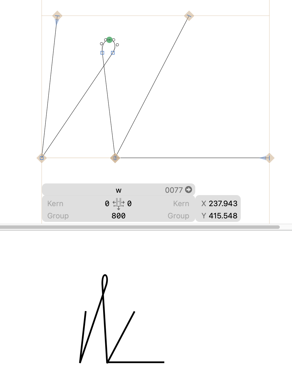
Can you show a screenshot from the edit view of one of the worst looking letters?
From what I can see in the small screenshot, you need to add extreme points (the loops on top of the w need extra points. With the drawing tool, hold down Shift and click on the top of that curve.
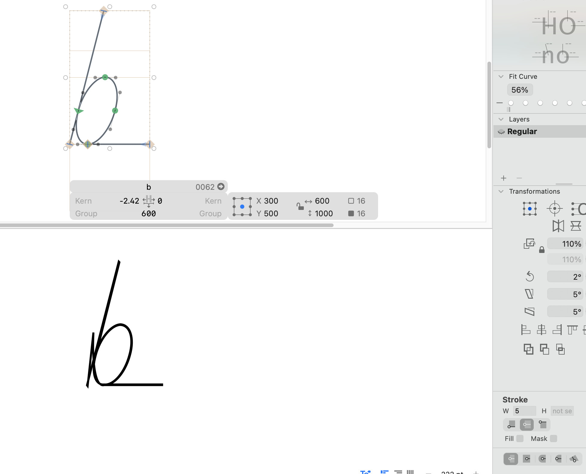
And when you like to draw a monoline font, I would only draw one center line and not a thin shape as you did. Apply a stroke width from the lower right sidebar.
Thank you for your help!
I tried adding the extra points to other letters and it works out. But the W still looks different, is it the issue with the paths?
Thanks again!
Can you send me the .glyphs file?
When you use the strokes, you don’t need the offset filter any more.
The paths right now do not have offset filter applied, they are just lines.
Should I probably redraw the shapes?
The instance still has the “Filter” custom parameter.
Can I get rid of it?
Just remove it.