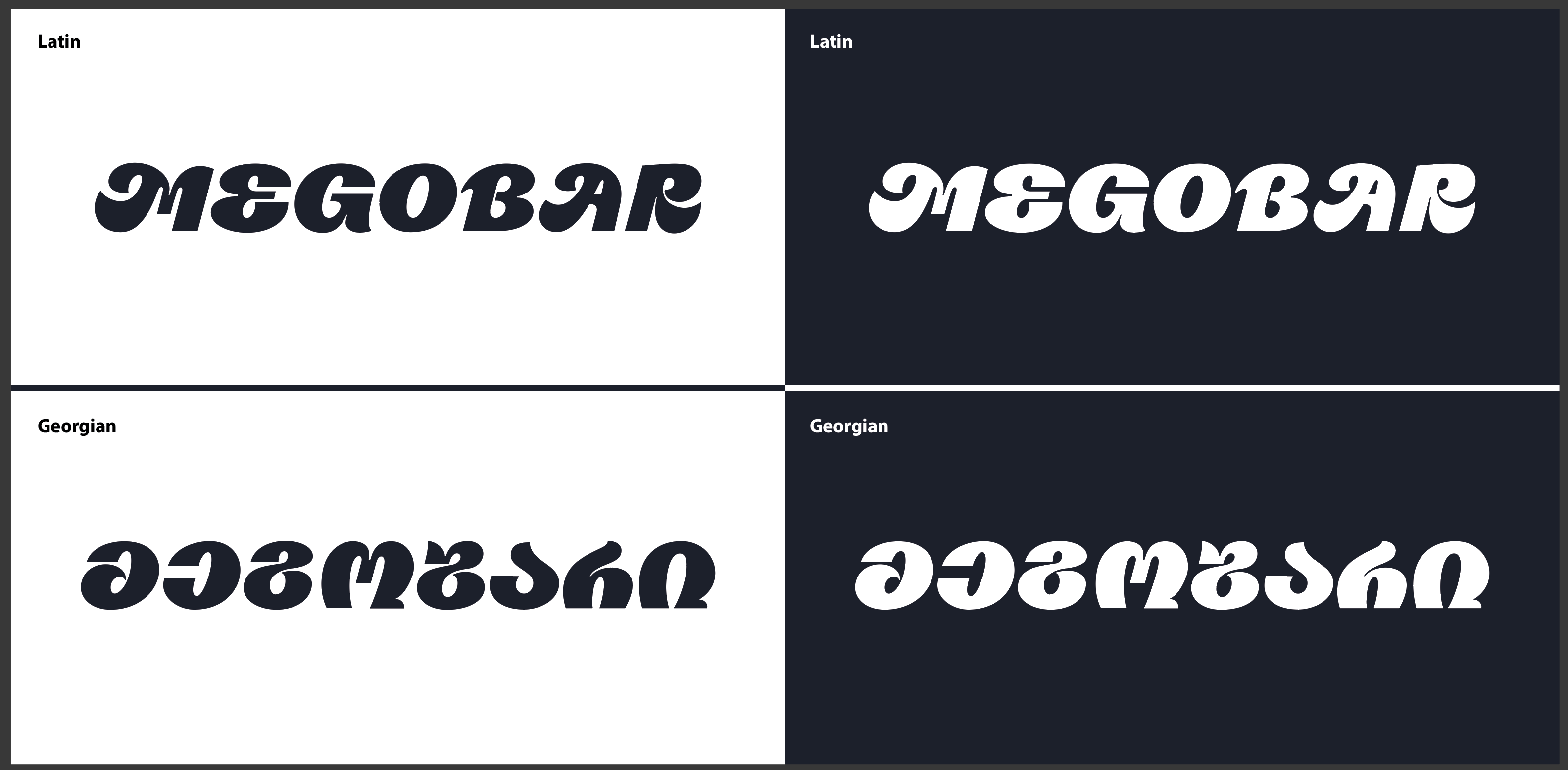
This is the typography I am working on right now, made in Glyphs3.
It is kind of technically right but something is off, I can’t really recognise any details what is off, but I know something is not right, as you can see there is Latin and Georgian versions of the typography, and I think it really needs a fresh look.
I Really really hope you can help me with some feedback and tips !
I’ll only comment on Latin. I think each individual letter is nicely drawn, and they have loosely similar levels of energy, but they could be a bit more consistent in order to work together as a typeface. MEGO is more successful than BAR in my eyes. B and R share almost nothing in terms of how each detail is handled, and A is a little too loud for a letter in that position (a more advanced solution would be to make an initial and non-initial version of A, the latter is less swashy. Same goes for M. And you can make them appear automatically using OpenType features). The distribution of internal white spaces is a little off too; A and R’s crossbar is quite high, but other letters have the middle bars more at the centre.