Thanks @alexs !
I succeeded in solving all my weird letters thanks to you @alexs… but one !
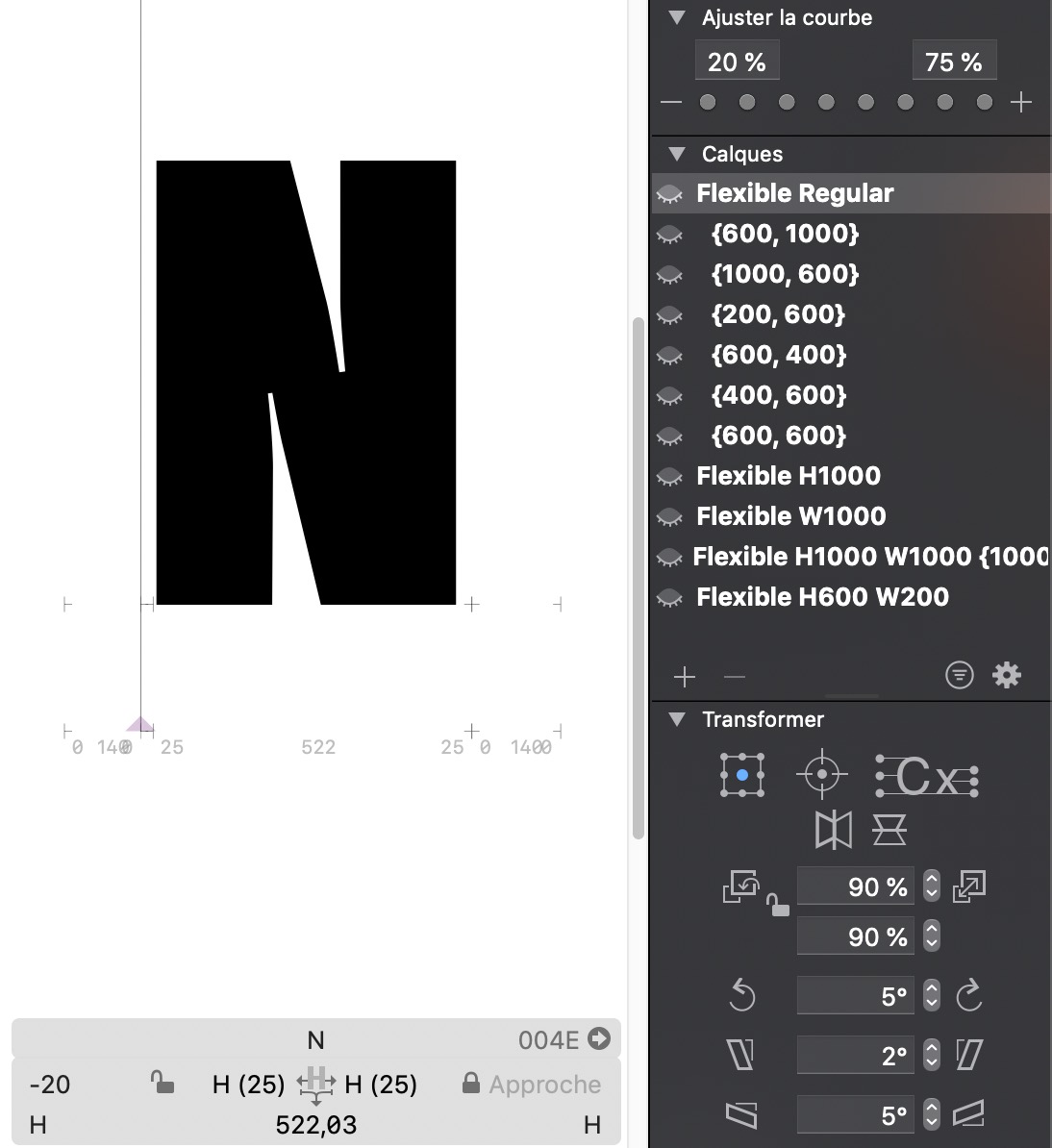
The “N” letter is still an issue.
I had to add several intermediate layers for that letter because of the diagonal stroke that was not consistent when changing the axis values.
I tried to keep a rectangular designspace, but this strange thing still happens ![]()
When I slide any axis, the letter doesn’t change before the value of 400…
Do you know what did I do wrong ?
That doesn’t seem rectangular. If you draw it as a graph, intervals can be different, but every intersection needs a master, kind of like this (circles represent masters):
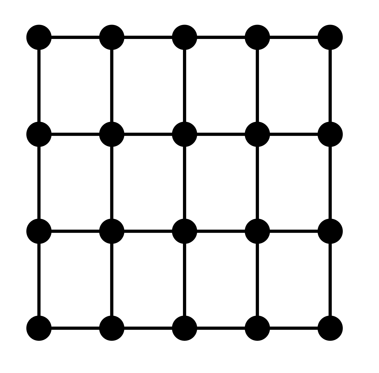
Yes, it grows exponentially so be mindful about where you add masters.
Wow… thanks for the diagram, @alexs It is soo much understandable !
So I go back to my font to add some layers 
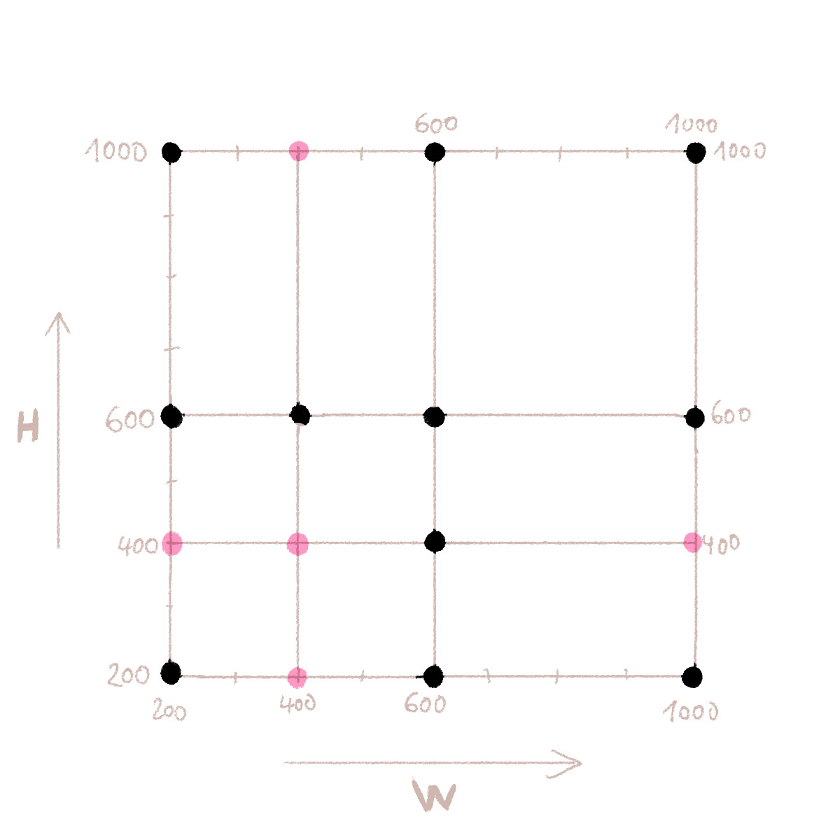
Hi @alexs here is the diagram of my “N” letter.
The black dots are the masters/intermediate layers.
If I’ve understood you well, I have to add 5 intermediates corresponding to the 5 pink dots ?
I’m working on a system that would reduce the number of masters you need in those cases.
Yes, it seems so!
Georg, that’s a great news! May I ask how will it work, generate the missing masters on export?
@GeorgSeifert wow it would help me a lot !