Hi guys.
I need your help
I work on a varaiable font with a width axis. The idea is to enlarge the width of the characters keeping a consistent stroke thickness.
I have 2 masters : one for the regular style and another one for the extra-large width.
As you can see in the video, the intermediate version between the 2 masters is ugly.
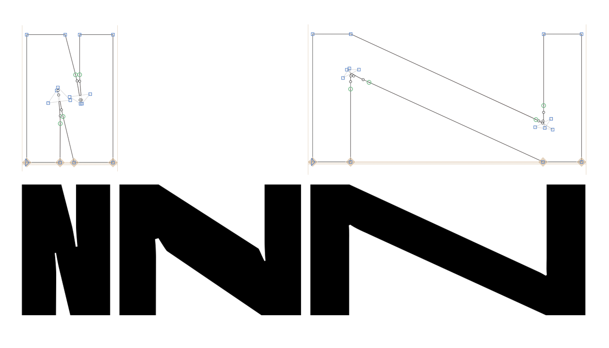
The inktraps are awful and the diagonal strokes are too large.
You’re right, @GeorgSeifert the diagonal stroke is better indeed, but the inktraps are not !
What do you think about the method with the seperate glyphs for an alternate glyph shape ?
I told you it is difficult What you are seeing are kinks. Normally those show up on round shapes but are caused when the angle and the proportions change.
Now play with the positions of the ofhcurve nodes. That might help with the diagonals.
Hey there. I spent a lot of time trying to handle those nodes/kinks but I couldn’t find a way to get rid of the ugly strokes…
I’m thinking about 2 other ideas, please tell me wht you guys think about them :
• Trying again with that solution : Alternating Glyph Shapes with Multiple Axes | Glyphs
• Create an intermediate master so I could design exactly the shape I want ?
I read the article, and there’s something I can’t find :
The text & example only talk about 2 possible values for the brace tick : weight and width.
But my 2 axis are width & height, so how can I tell the brace layer to affect those axis ?
The tutorial is still not updated for Glyphs 3 (@mekkablue )
You don’t change the name of the layer but right click it and choose “intermediate” from the context menu. Then you double click the layer title to edit it.
Hey everybody.
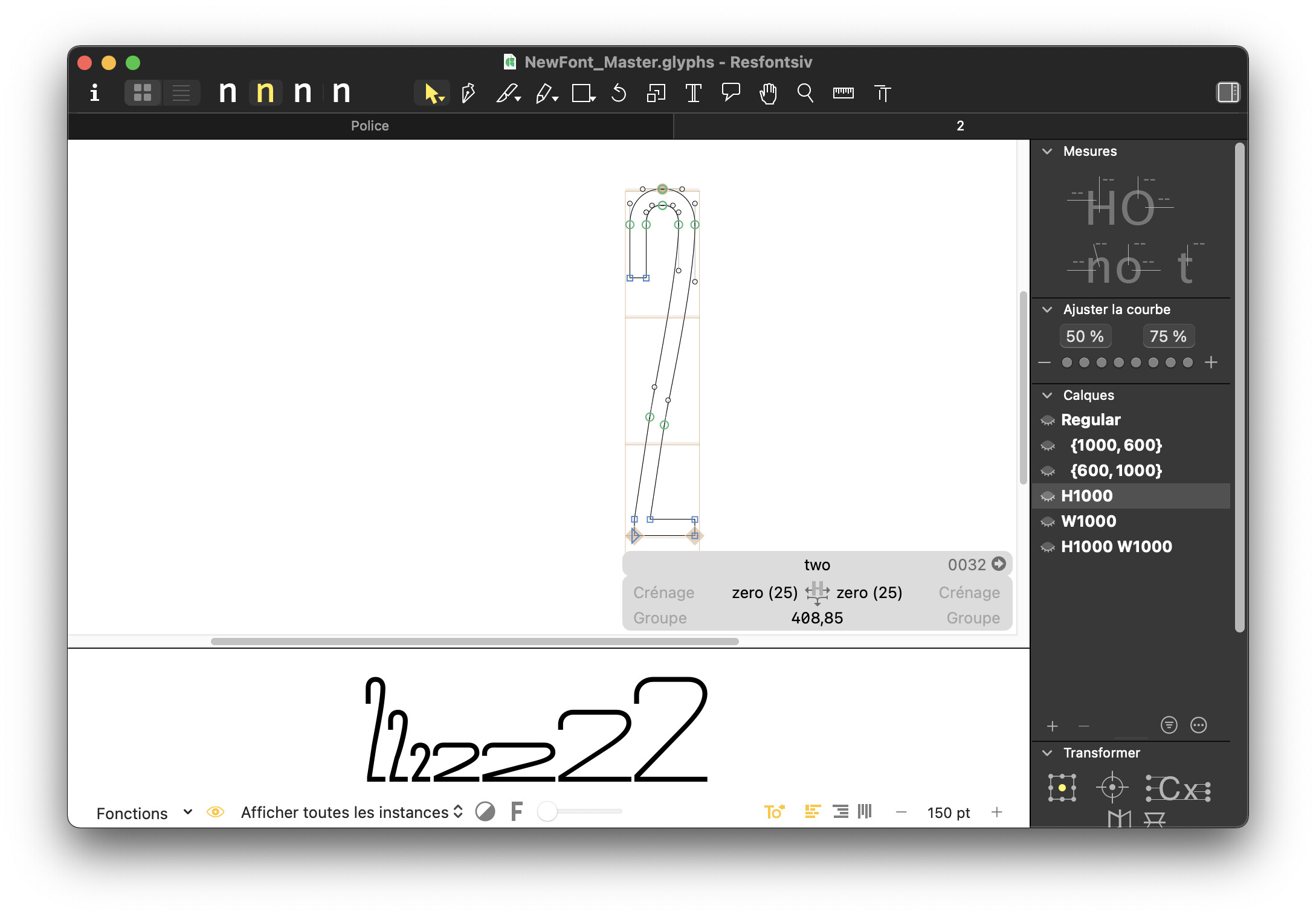
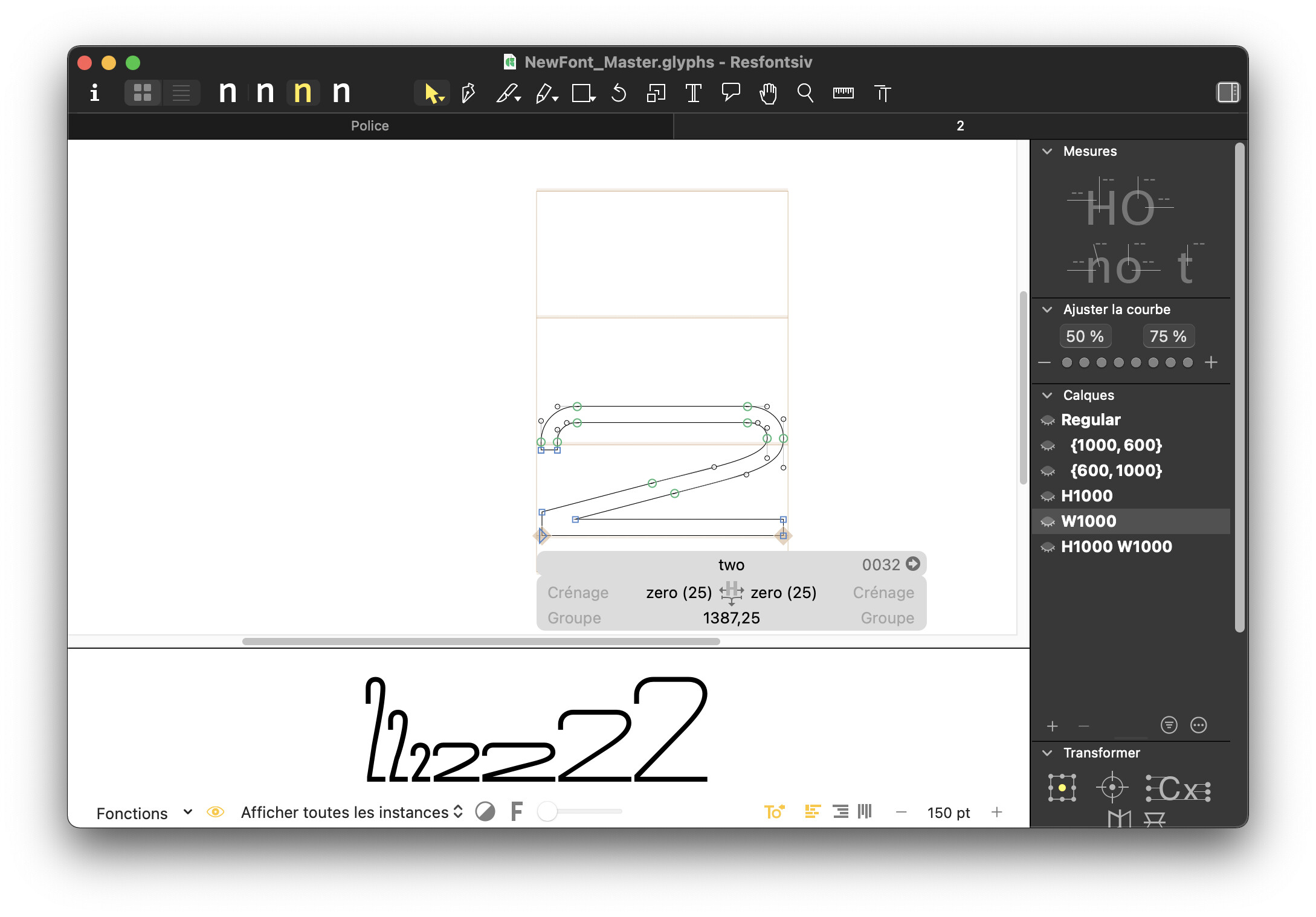
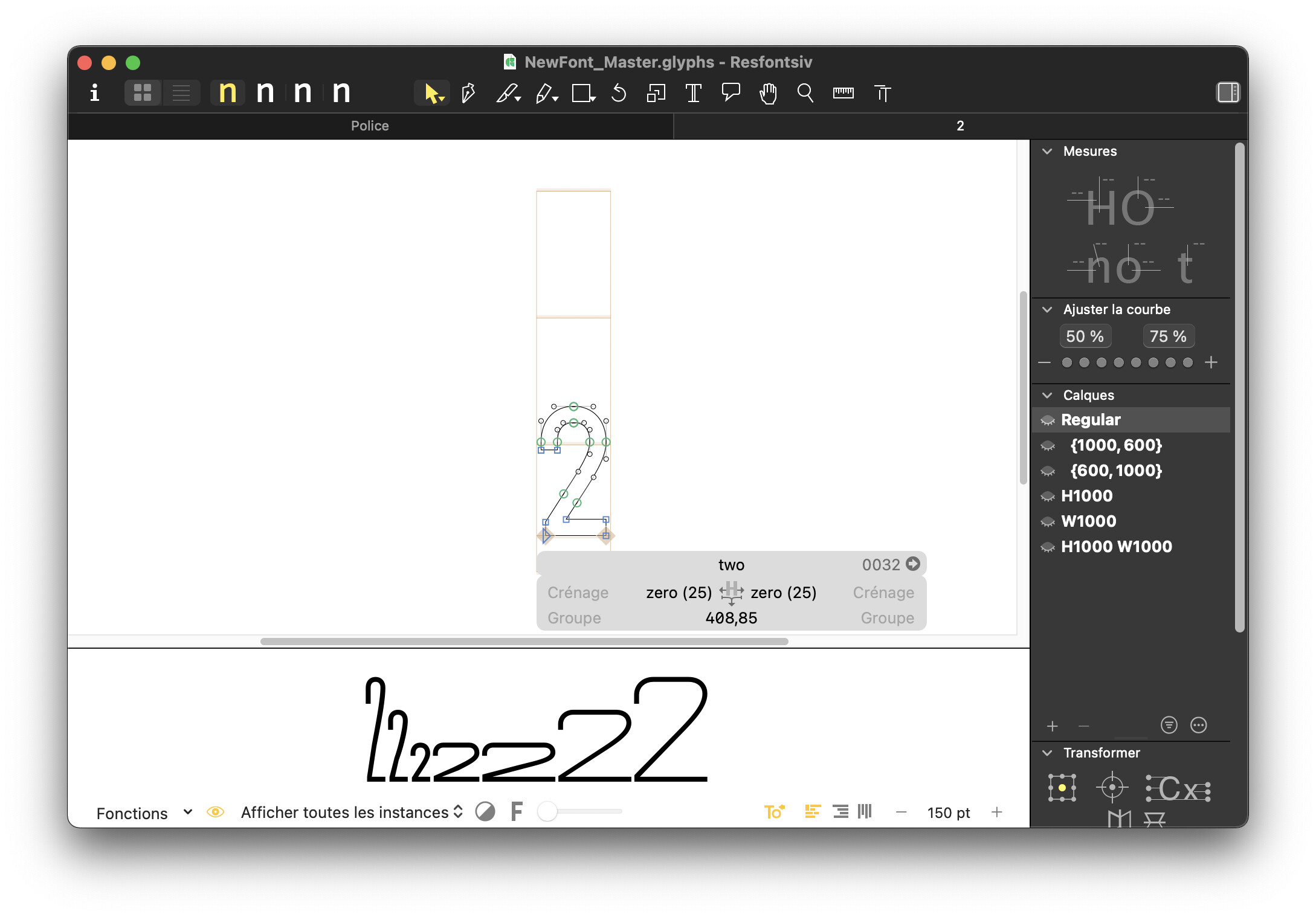
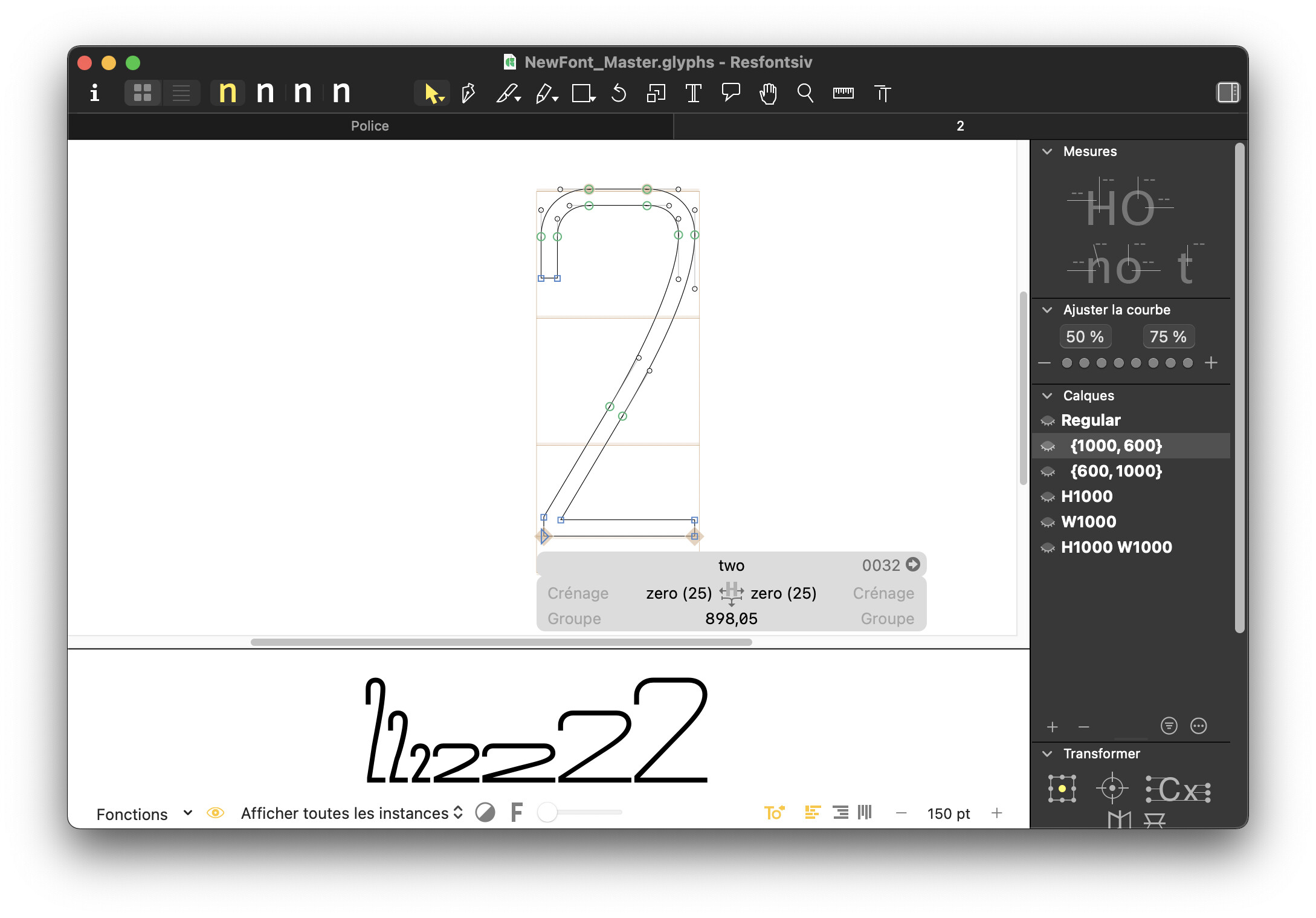
So @GeorgSeifert I tried this little “intermediate” layer trick, and it helped me a lot !
I use it with all my characters with diagonal strokes (A, K, M, …) and it works really fine, except for some of them who strangely behave when I use the axis slider. Here is an example in illustrator (the problem is the same in InDesign or Photoshop)
I stretch the font from 200 to 1000 on the width axis. Please look at the “2” number. As you can see, it doesn’t change until 600, and then it starts growing…
I don’t undesrtand why this is happening with this glyph : does someone knows what is going on here ?
I have to say I quite don’t understand what you mean, @GeorgSeifert…
You’re talking about the kinks, but this problem is been solved since I’ve created intermediate layers with modified paths.
Kinks are not my problem anymore. What I’m dealing with is related to variable width :
Some characters doesn’t strech until the axis value of 600. Please take a look at the video above.


 What you are seeing are kinks. Normally those show up on round shapes but are caused when the angle and the proportions change.