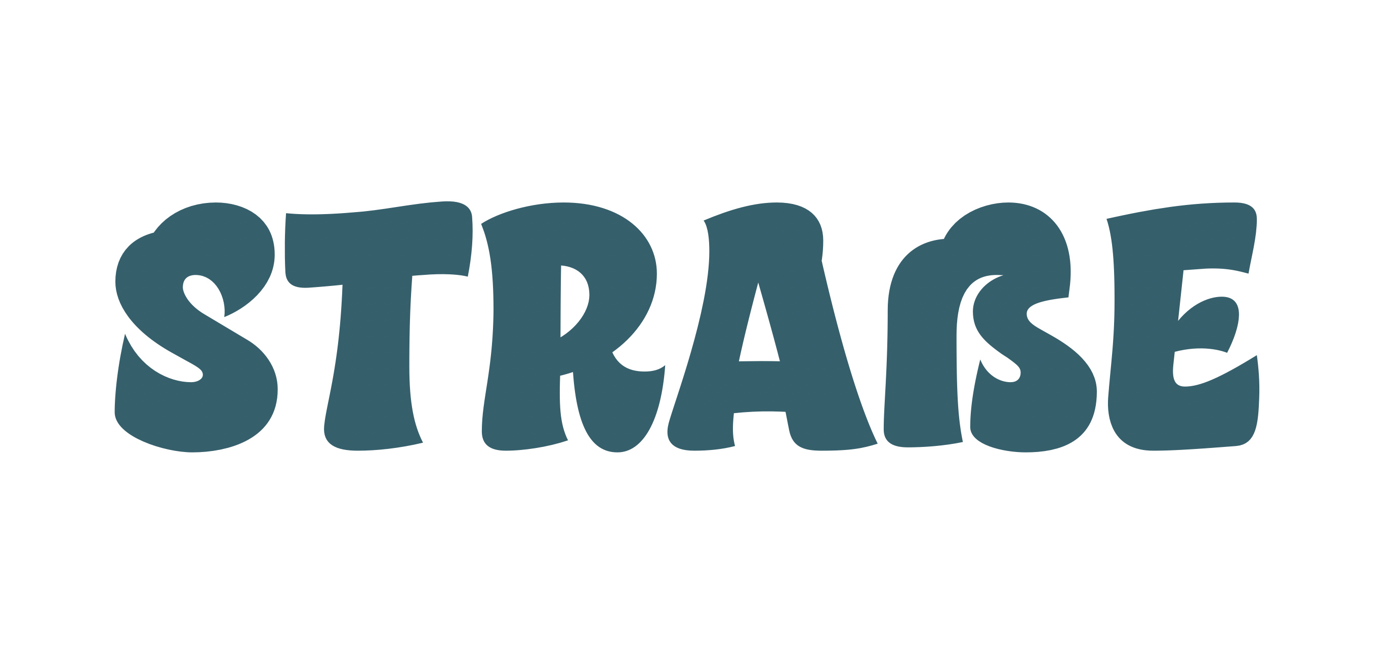
I’m looking for some advice on the design of an uppercase eszett in a brush-script typeface. Because of the logic of the design in similar strokes, I decided to design it this way but I want to check with native readers whether this feels comfortable/logic.
The lower right corner is quite heavy when compared to the stoke in the middle. The contras in the S is much smaller. And if you compare the lower right on the R.
There are different schools of thought on the shape. Personally I wouldn’t squeeze an S into the right half of it. Here’s why: https://youtu.be/-BnEzlsTz7Y