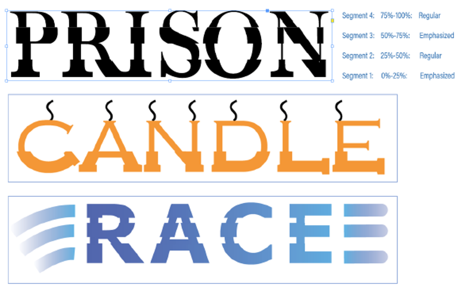
We wanted to know if there is any usefulness to generate custom fonts whose glyphs are a combination of bold and italic typeface. We call these glyphs “Hybrid Glyphs”. So, to say, each glyph is segmented into regions and each region may have a different typeface replicated .
In terms of workflow, the user selects the font, say regular, and defines the segment marks in terms of how low it is from the font ascender line. Let say he marks two points at 20% and 50% above from the fonts descender (total font height=ascender-descender). This will generate three segments. For each segment he then may choose a different typeface to be replicated. For example, he may choose Bold-Italic-Bold. This will even be possible if the designer does not have the bold and italic typefaces of the font. In such cases, it will replicate a false bold in the first segment, a false italic in the middle segment and a false bold in the third segment. In case the user has the required typefaces of the font family, then that portion of the glyph will be taken from the corresponding font. The user may choose any typeface like semi-bold, semi-italic, condensed etc
Some key aspects:
 1. Glyphs can be partitioned into any number of segments

 2. There is no convert to outline. Text remains live and editable

 3. User can control the thickness of the bold and slant angle of the italics.. something like variable fonts
We primarily want to know…
- Will this “feature” be useful to designers?
- How often will you use this capability?
- Under which scenarios and product will this most likely be useful? (maybe for Logos in AI? and titles in InDesign?)
- Do you see any missing aspects to this which can increase its usage?
- In light of the latest typography advancements (SVG fonts, variable fonts) how do you place this capability?
