Natanael
July 9, 2026, 4:35pm
1
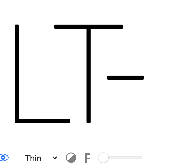
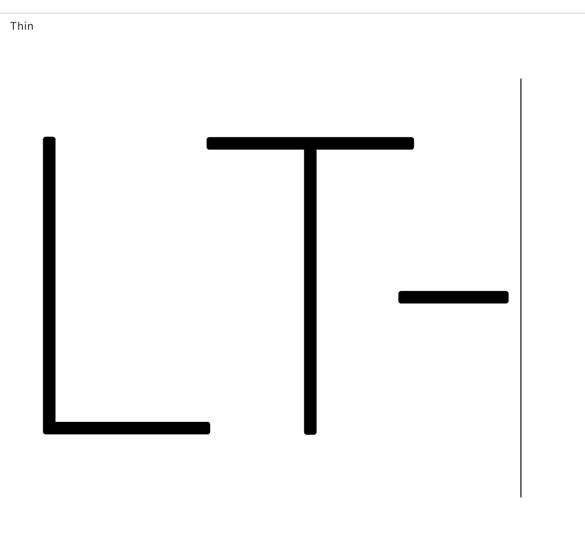
On glyphs preview I get one result but on illustrator or font gauntlet I get another result.
Glyphs:
Font Gauntlet:
The kerning values on the master extremes are the same, but as I interpolate the results get different.
I tried exporting static fonts and the same thing happens.
What is creating this, anyone knows?
Natanael
July 9, 2026, 4:37pm
2
I do have an extra kern feature but it is not for any of these characters. And I get the same result even if I inactive the feature.
Can you check if there are any exceptions with those glyphs. Search in the kerning panel.
Natanael
July 10, 2026, 9:53am
4
No exceptions. And all the masters have consistent kerning applied.
Can you send me the file?
Natanael
July 13, 2026, 10:44am
6
I sent to the general glyphs email as I lost your personal one.
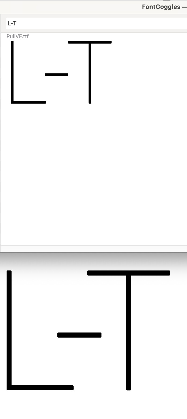
This is what I get in FontGoggles with the .ttf you send me:
SCarewe
July 14, 2026, 12:29pm
8
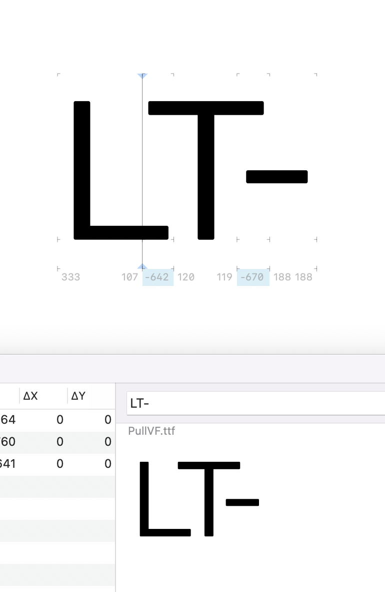
Why is the kerning (or spacing?) not the same in your Glyphs screenshot and the FontGoggles screenshot?
It is doing funny stuff because:
I need to check what exactly is going on, but a not aligned master is not recommended.
Other masters get exactly the same kerning in Glyphs and in FontGoggles.
1 Like
Natanael
July 14, 2026, 1:25pm
10
If I move the master to an aligned position you think it will fix it? I can try.
Natanael
July 14, 2026, 1:33pm
11
On thinner weights the discrepancy is more noticeable. (Glyphs and FontGoggles)
That is caused be the not aligned “Regular” master.
Natanael
July 15, 2026, 10:30am
14
Thanks, Georg. I was not able to fix it by aligning the middle master alone. I had to add additional masters on the extremes of the “regular” master weight axis as well. Then it worked.
Variable fonts use a quite different algorithm for interpolation. It is axis based. And Glyphs can handle much more complex setups.