Hello,
I’ve doubts about kerning. Can you help us?
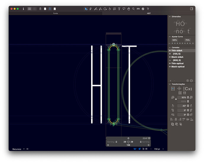
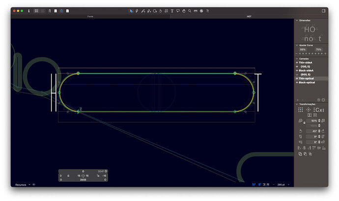
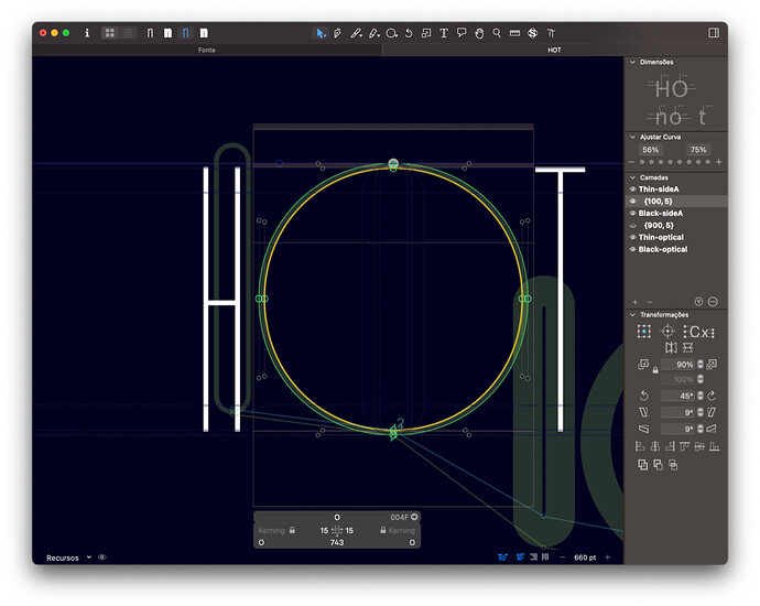
We’re currently adapting a variable typeface. This typeface has two masters (an ultra condensed and an ultra expended, both thin weights**).** I can adjust the kerning in these two masters, but when I try to adjust it on the interpolation between the two, it doesn’t seem to work (there’s always a locket sign).
Master ultra condensed
Master ultra expanded
The interpolation between the two masters where I want to adjust the kerning
Is there any option available on the Glyphs app so that I can make this revision/correction?
I’ll be waiting for your thoughts on this,
Thank you for any advice!
B.


