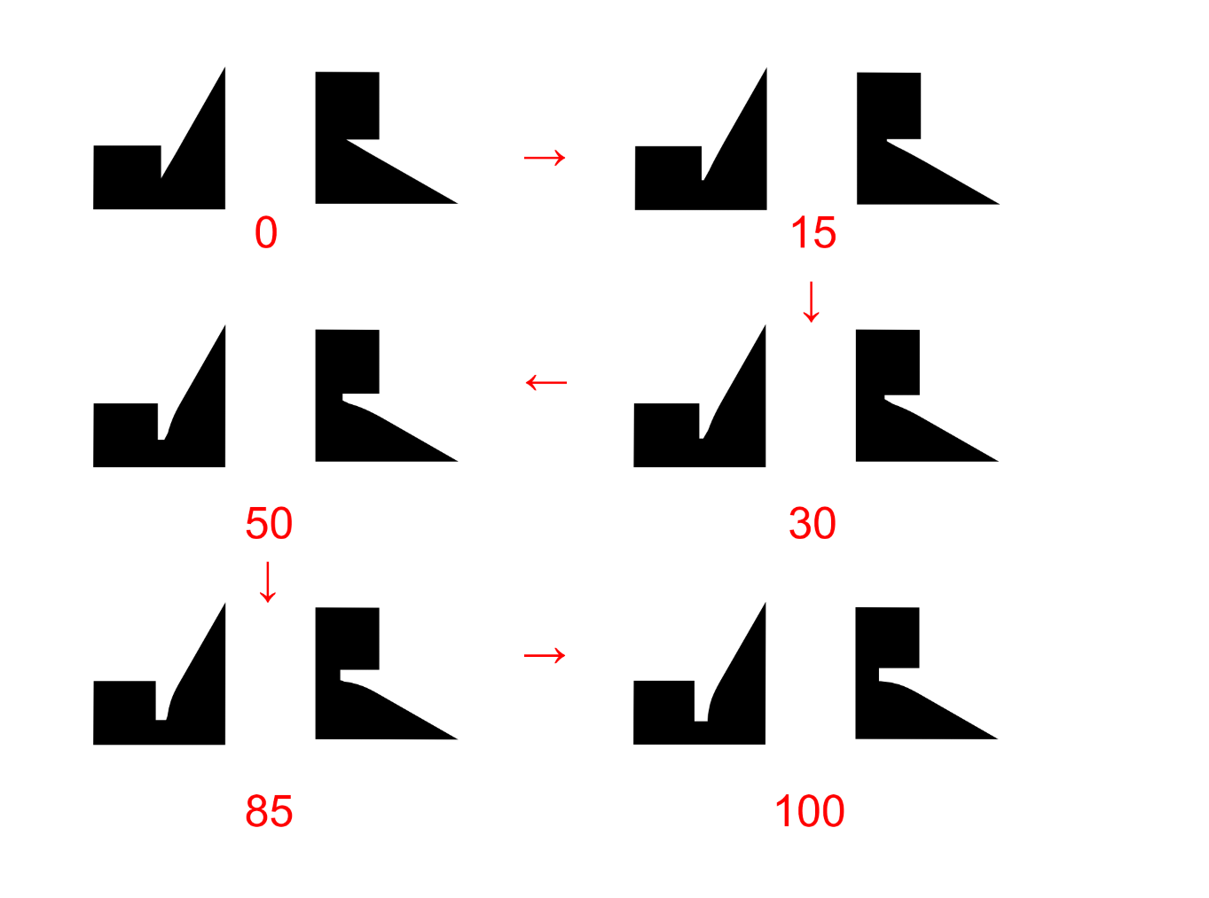
Here’s a video to see it animated. The video is shot from a variable font in Chrome 67.0.3396.99: Dropbox - File Deleted
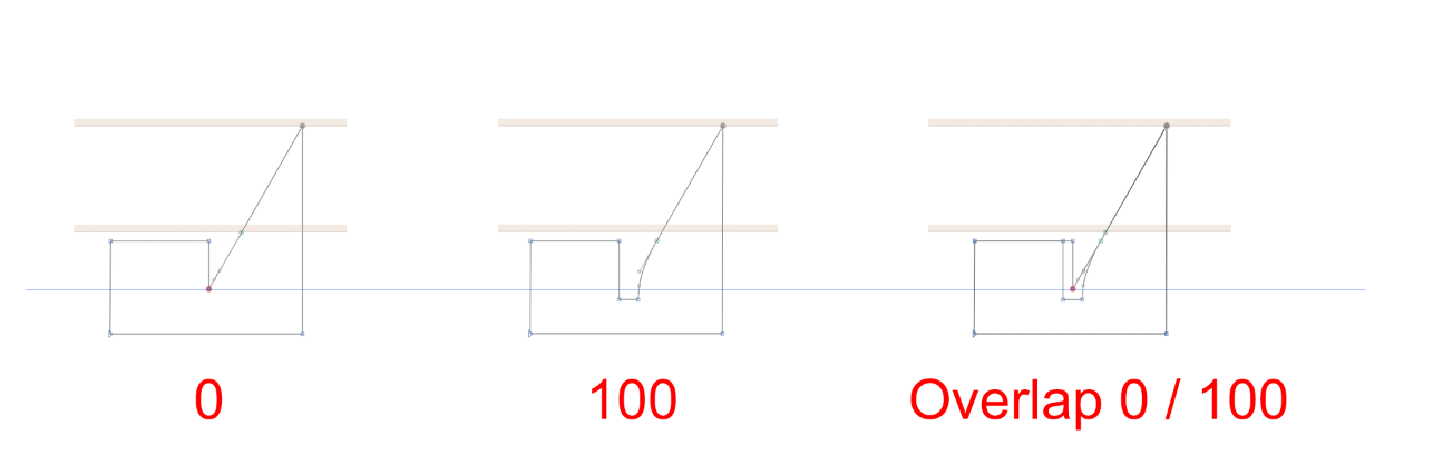
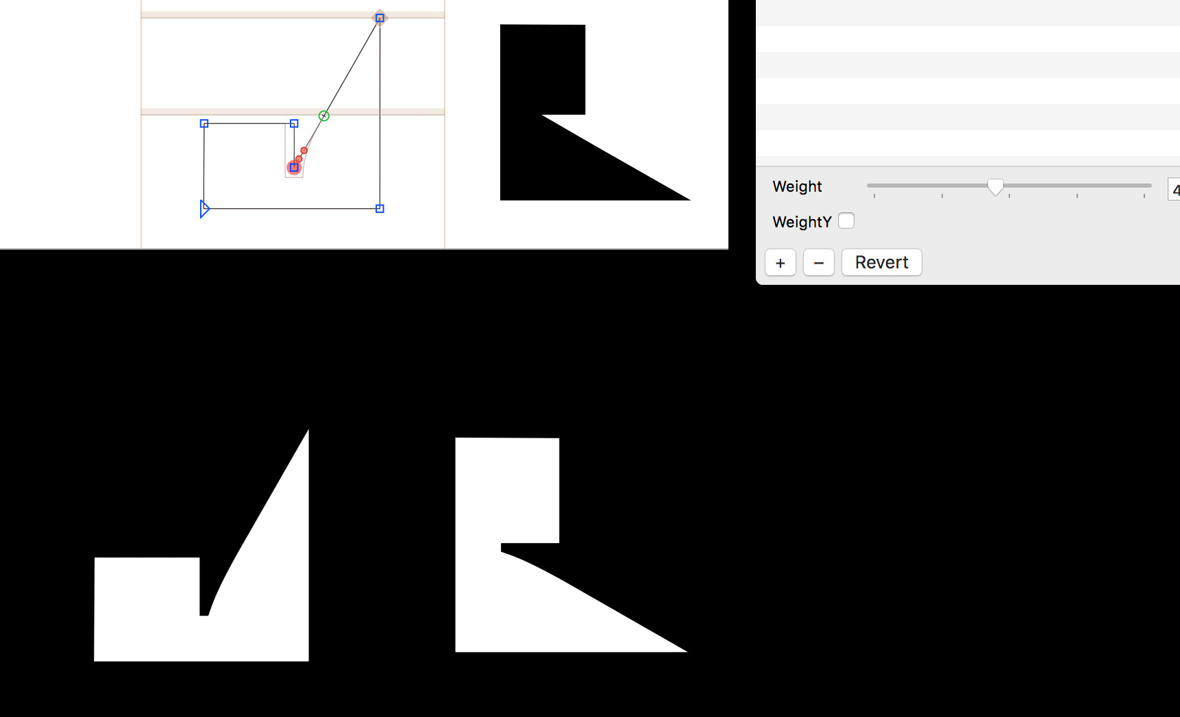
We tried to position the nodes and handles differently, yet never with a entirely dent-free transition. Diagonally drawn paths seems to be especially tricky.
Does anyone know how position and length of handles affect the display of steps in between and their animation? Are there tricks or way to improve this already? If not, will the rendering of those steps be improved in the near future?
These are kinks caused by two things: first a triplet constellation with both varying angle and varying proportions, and secondly, shallow curve segments which will become jagged when the points are fitted onto the unit grid.
Read this, please (scroll down to Avoiding Kinks):
And consider a bigger curve segment, perhaps with an overlap.
Update: Possibly also a problem that happens in TT conversion, in combination with the shallow curve. The limited coordinate range can be difficult.