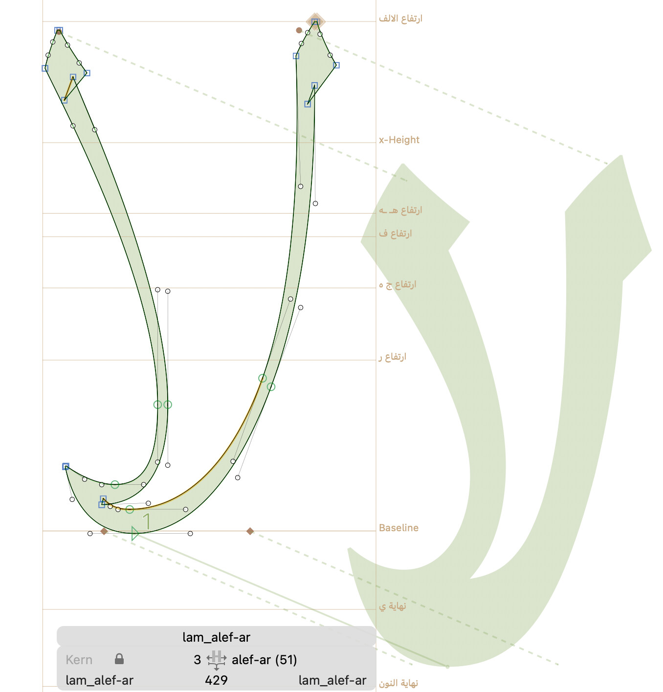
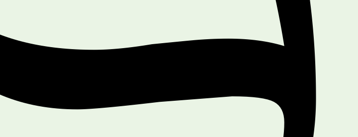
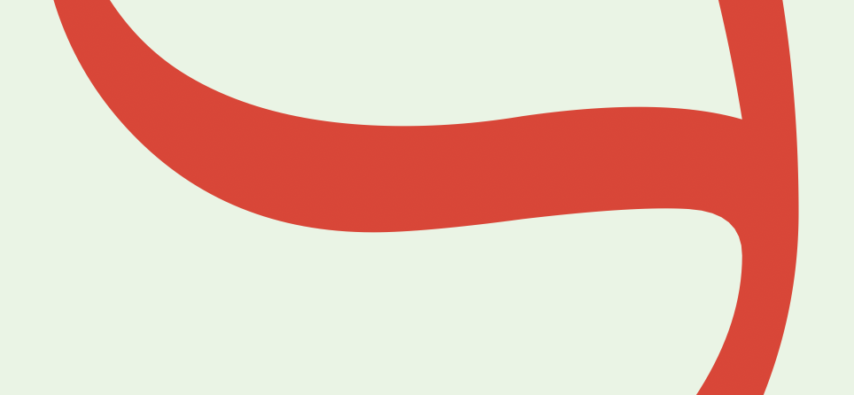
I have 2 masters, Extralight and Black. The interpolation is good, both weights work well but the weights between them is not. It happens in Adobe, FontGoggles and Glyphs
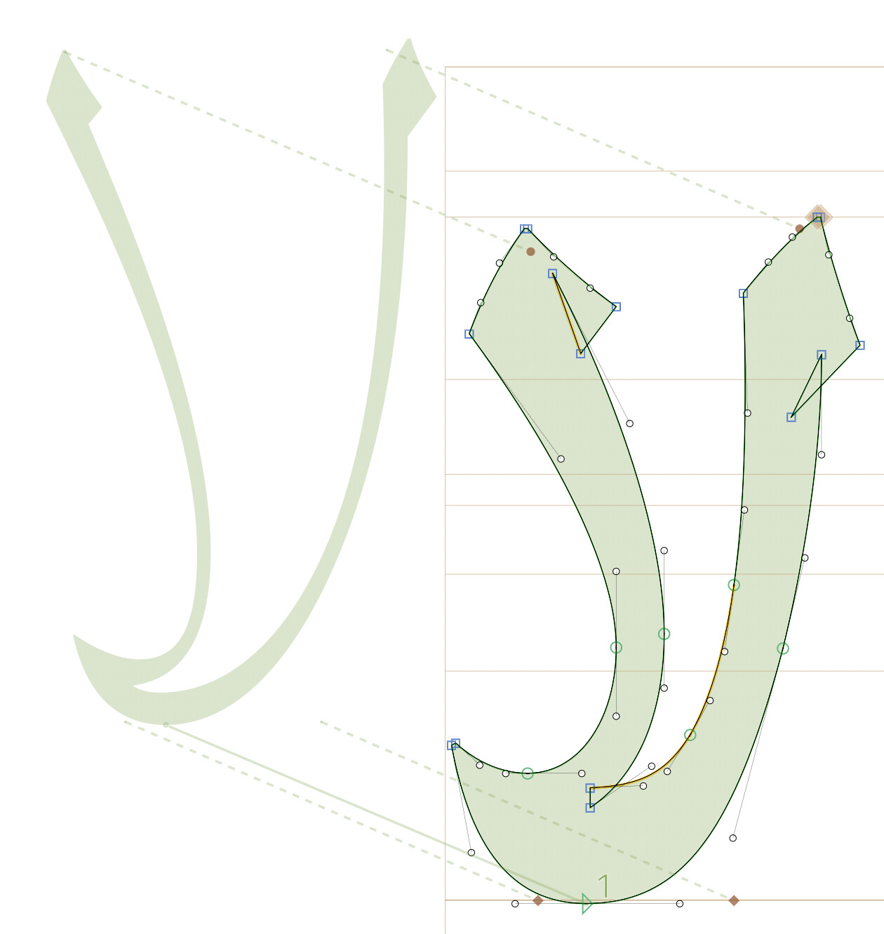
Here is lam_alef-ar as an example, there are other letters also have the same problem
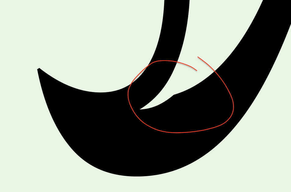
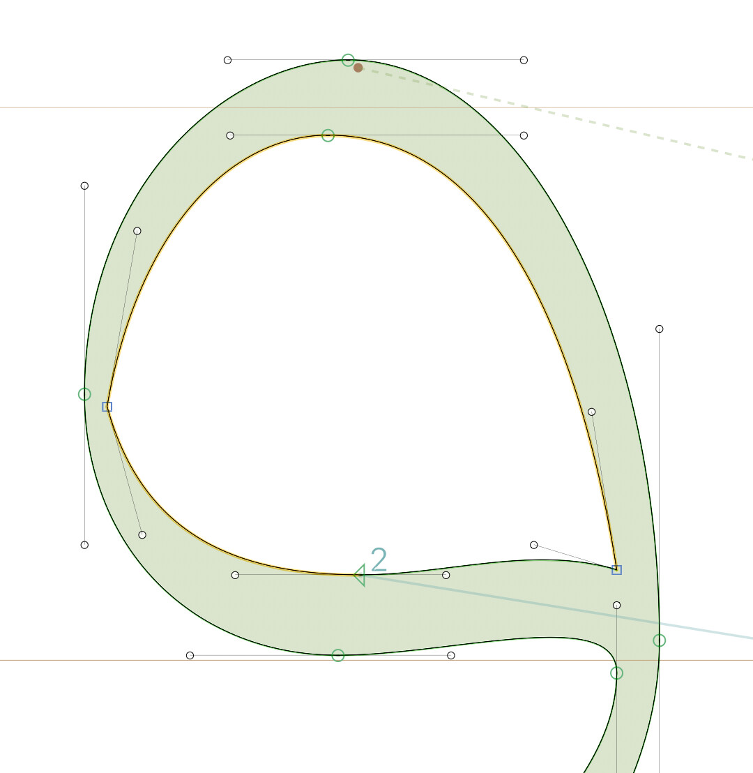
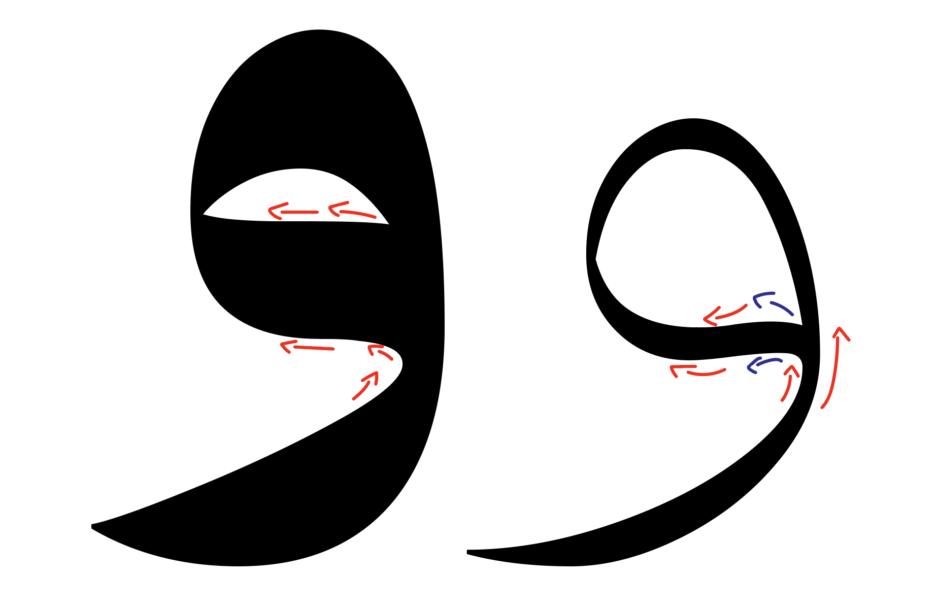
We can see that it is much better without extremes, but is it good to draw a curve like this without it? It is too hard to apply the solutions that are mentioned in the tutorial; because the path is changing when the letter becomes black, see the blow arrows:
when you need to interpolate and the extremes are not in all masters, omitting them in the others might be the only option. You might need to check the outline rendering in small sizes and the hinting (those extremes are mostly there for the hinting).
Extremes generally matter where the auto hinting engine would want to mark as a stem (i.e. important stroke of the letter), and at the bounds of letter (i.e. topmost, bottommost, leftmost, rightmost). But honestly, it’s only a good habit but not a hard rule; you are free to ignore it whenever extremes feel unnecessary.
Fewer nodes are better. Avoid short segments, even if it means deleting an extreme. If you are interpolating, try to make it so that node triplets do not change their angle or proportions during interpolation.
Avoid kinks, there are plug-ins for that (Show Kinks) and scripts (Kink Finder, Dekink) that will help you.