Hello!
I’m working on a project that requires the delivery of both a static and variable version of a font family.
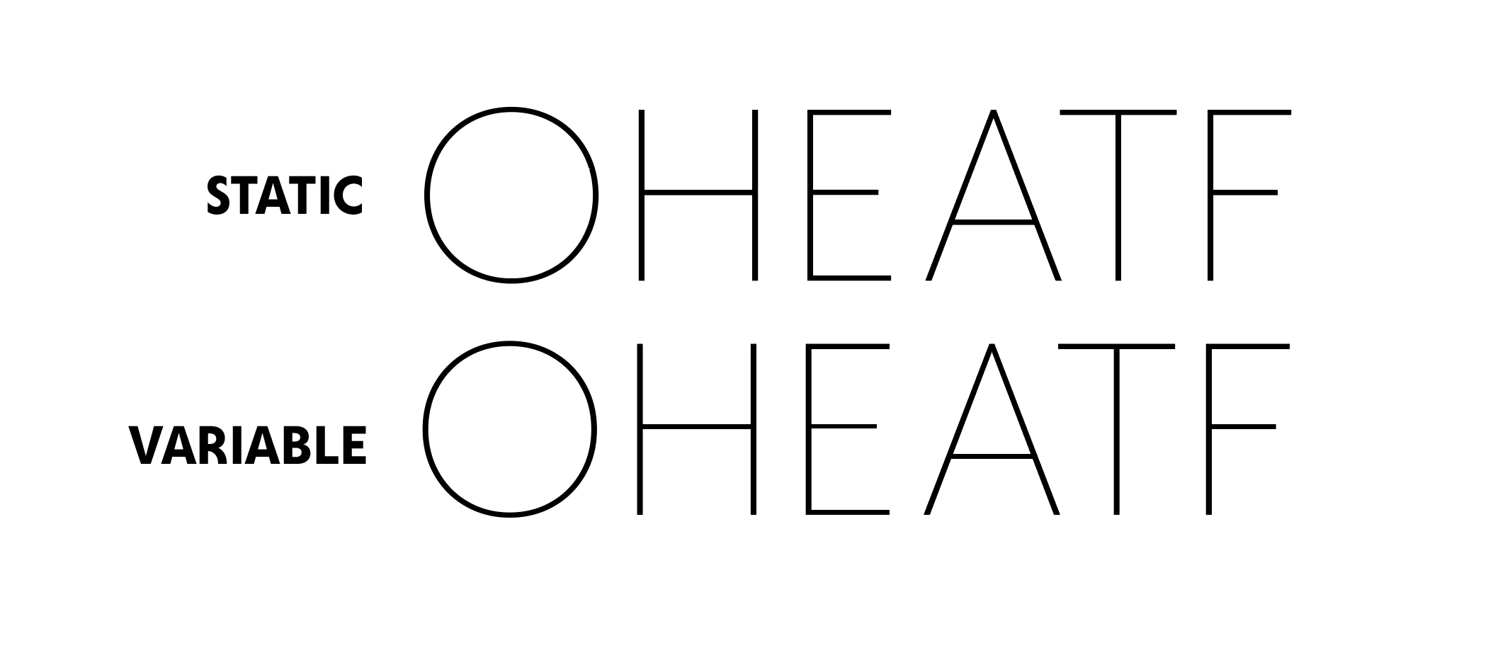
I was planning on NOT hinting the font, because it’s meant for large display use. But one thing I’m noticing is that the horizontal strokes of the VARIABLE version seems to distort when viewed at difference sizes. The static version doesn’t distort and looks good at any size. I’m previewing it in Illustrator.
Is there a reason why I’m seeing distortion of the horizontal strokes in the variable version but not the static version?
I’ve attached an image for comparison.

Are those static fonts .otf or .ttf?
Hello Georg,
The static fonts are .otf.
Then it might just be a fluke on how Illustrator is rendering the TrueType outlines. I would expect that the effect would be less noticeable in bigger sizes?
Yes, the effect mostly goes away at larger sizes. But even at fairly large sizes, you can still see it happening (the E specifically in this image):
I just wanted to make sure I wasn’t overlooking a setting that might minimize the distortion at smaller sizes.
I mostly found it curious that the static font version (.otf) never distorts at all, no matter the size. It seems to mostly effect horizontal strokes that fall between the cap height and baseline. The crossbar of the A & H, the middle bar of the E, etc.
Can you send me the .glyphs and the .ttf/.otf files?
Just sent the files @GeorgSeifert
Thanks for taking a look.
I can’t reproduce the issue. It always looks the same. There are tiny differences when comparing TrueType and Postscript outlines. But that is to be expected.
Ok thanks @GeorgSeifert .
Good to know, it was just something I had never noticed before when comparing static .otf VS variable .ttf.
I assumed because I wasn’t doing any manual hinting, that I wouldn’t see any distortions at different sizes on the .ttf Variable version.