Hello,
I have to do a variable logo for a client.
I can’t resolve the shape bug with the “T”.
As I read on the Variable’s tutoriel, I tried to change the started point, but it doesn’t work.
Would you have a solution?
Best
Hello,
I have to do a variable logo for a client.
I can’t resolve the shape bug with the “T”.
As I read on the Variable’s tutoriel, I tried to change the started point, but it doesn’t work.
Would you have a solution?
Best
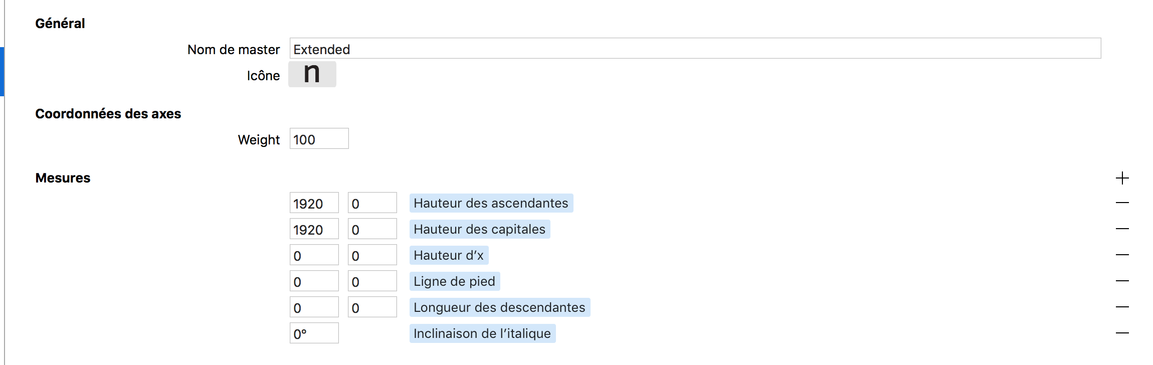
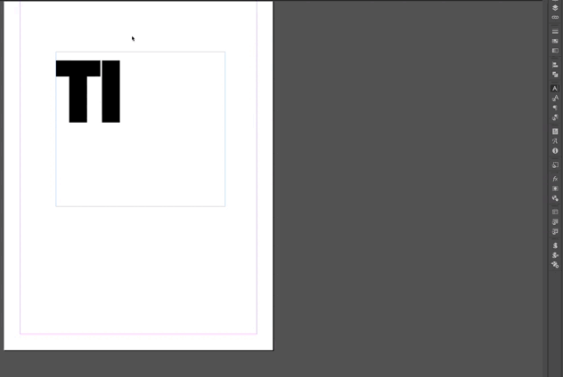
I think this is because the right stem of the N and the the left part of the T don’t have exactly the same angle. If you pay attention to the T/I, the same problem happen.
Ok, I will try, many thanks !
The angles look good. This seems to be a different issue, could you send me the file maybe? As a DM in the forum should work.
I send you the file. Thanks a lot
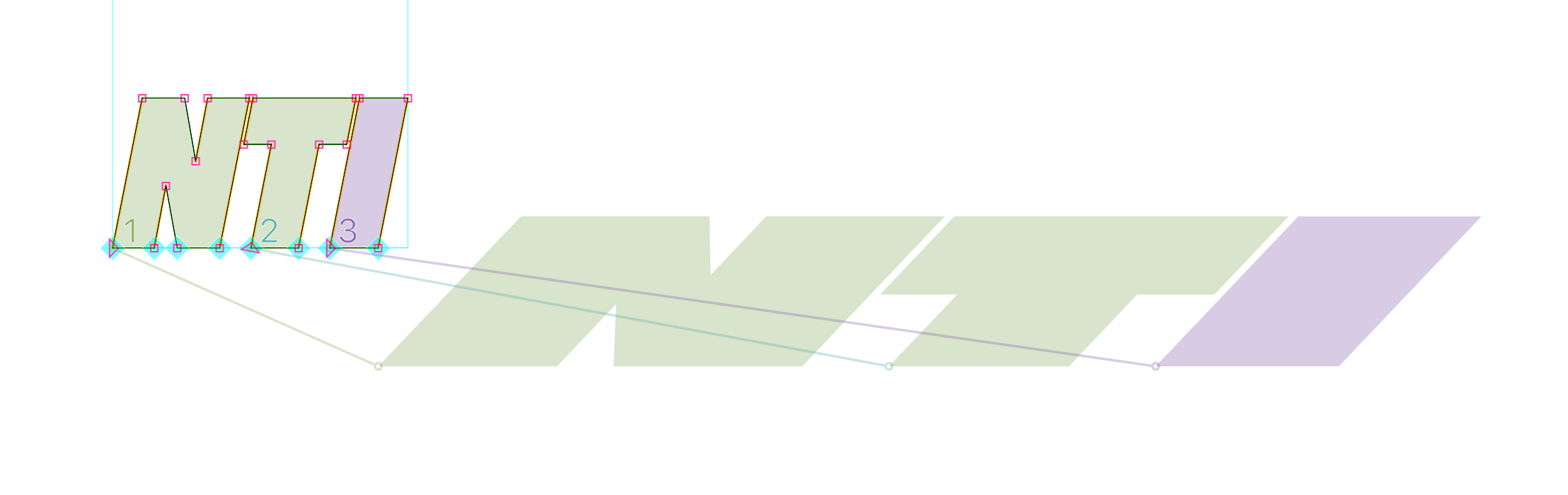
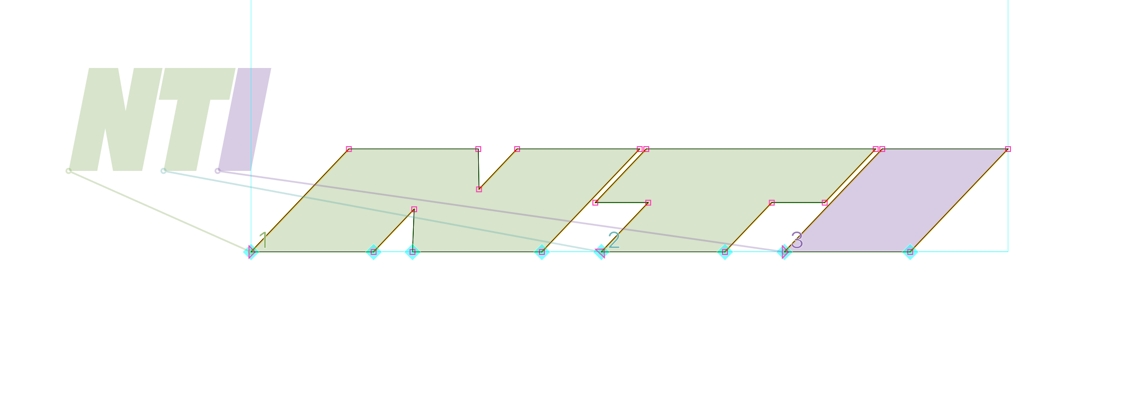
Hi again, I only just got around to checking out the file. For reference, the construction needs to use open corners when using different angles in each master:
Don’t ask me why, I don’t know. Maybe someone with more understanding of interpolation mathematics can shed some light on this.
![]()
![]()
![]()
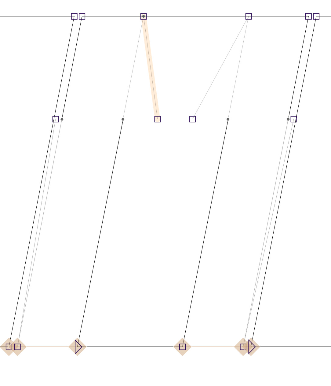
Sorry, it turns out the exported variable font interpolates differently than the preview in Glyphs.
Even with open corners, the variable font interpolates like on the screenshot initially posted here.
I cannot think of any reason why this happens, and thus can’t think of a solution. Please help.
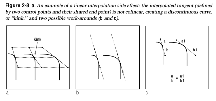
For the relative angle of two lines not to change in interpolation, either the angle must stay the same, or the ratio of both line lengths must stay the same.
It is better known when curves produce a kink in interpolation, as shown in “Designing Multiple Master Typefaces” (Adobe 1995, 1997), but is also true for lines.
The problem is that not only the slant of the letters changes, but also the top bar of the T gets fatter.
Thank you.
I assume there is no way of keeping outside overlaps in variable exports?
There is a trick that can be used to achieve the desired result.
The trick involves making four variants of the glyphs. Bold Upright, Black Upright, Bold Slanted, Black Slanted. Make them so that only the weight/width changes from Bold to Black Upright, and only the angle changes from Bold to Bold Slanted and from Black to Black Slanted.
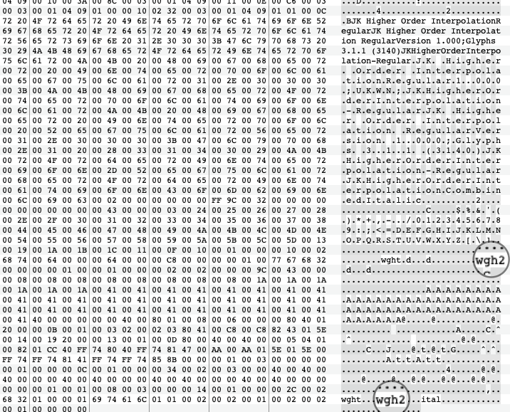
Then give both axes the same name (in my example file “Combined”, and give the first the axis tag “wght” and the other one “wgh2” (doesn’t really matter).
Now comes the tricky part, open the exported VF in a hex editor and change all occurrences of the letters “wgh2” in the binary file to “wght”.
Now you have two “wght” axes, which will be applied at the same time. You can test the result yourself with the attached file.
This method is called “Higher Order Interpolation” and was discovered by Underware.
HigherOrder.zip (5.3 KB)
Amazing, Jens, thanks a lot for this very handy explanation and practical use case! Sadly just setting two axes with the same axis tag in Glyphs doesn’t yield the same result… Maybe this can be something for the future of Glyphs, just leaving this possibility for those who know how to use it ![]()
You can add any suffix to the axis tag. It will be truncated to four letters on export. So instead of wgh2 use wght.2
Amazing! That works. So HOI is possible straight out of Glyphs, I had no idea. Thanks a lot.
Hello!
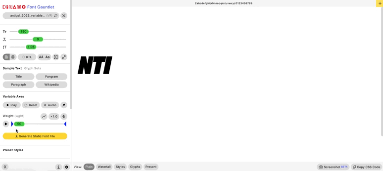
It’s seems it doesn’t work the same way from Dinamo Font Gauntlet than Indesign…I had already read about it on glyphs variable tutorial.
It worked perfectly from Dinamo, but not on Indesign…
Anyone would have a solution?
Best
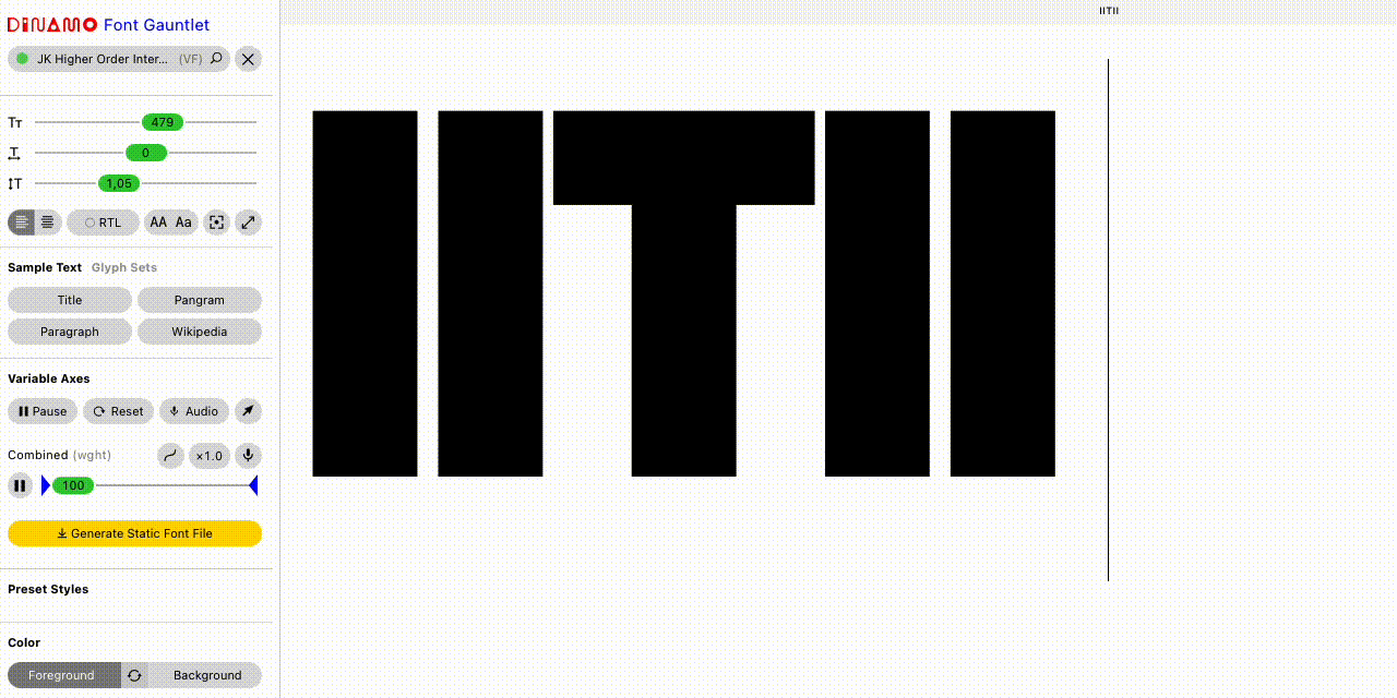
Hello, do you know if it is normal that I get two cursors in indesign?
(I get only one on Dinamo Gauntlet)
I think I did all the steps indicated by Jens, maybe I forget something but I don’t think so…