Hi All
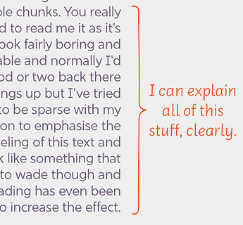
I’d like to include some very tall braces in my font, maximum about 8000units (see example image).
Of course, MS Word clips them, even within a Text Box.
My fall-back is to simple rotate them 90 degrees and Word users can rotate them in a text box, which works fine.
However, is there’s a simple way to adjust the vertical metrics to include them vertically without messing up the rest of the metrics?
They can’t be that wide either. Better spread it out to multiple glyphs that lock into each other.
Thank you @mekkablue What is the max width for reference?
The horizontal ones seemed to work ok in AI and Word.
I remember that @buerofliegenpilz once found out the max width in Word, whichever version it was at then. But I do not remember what it was.
OK, Is Word the limiting factor or are there other restraints you’re aware of?
I don’t think it is a good idea to have such a tall glyph. The text system is not build for this.
What you can try is to cut the glyph in some peaces and then type one piece per line and together they build the big parenthesis. This is how math fonts do it. It is also quite flexible as you can just add more lines to make it bigger.
Thanks @GeorgSeifert
I was worried it might be complex for some users to select the pieces and puzzle them together.
I made a version rotated to 90degrees, so it was horizontal. I then tested it in FontBook, Word (text box) and Illustrator. All appeared, and the glyph could be rotated into place in Word and AI.
Do you see any pitfalls to this solution?
Jamie
If it works in the apps that you need it to work …
But test it thoroughly. Print, convert to outlines, save a PDF …
