Weights order in Glyphs vs Illustrator

Hello, I have a small problem about weights order from Extralight to Black.
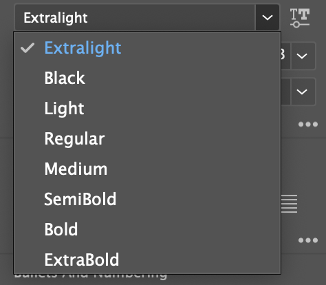
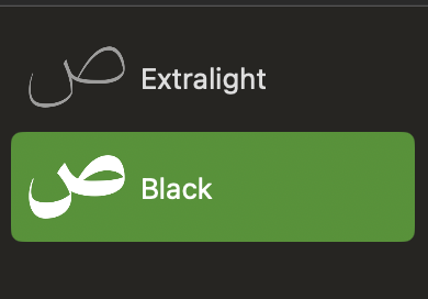
The logical order is starting from Extralight then the thicker to the thickest which is Black in my typeface, but in Illustrator it looks like this:

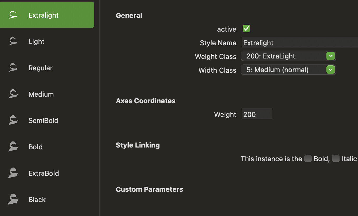
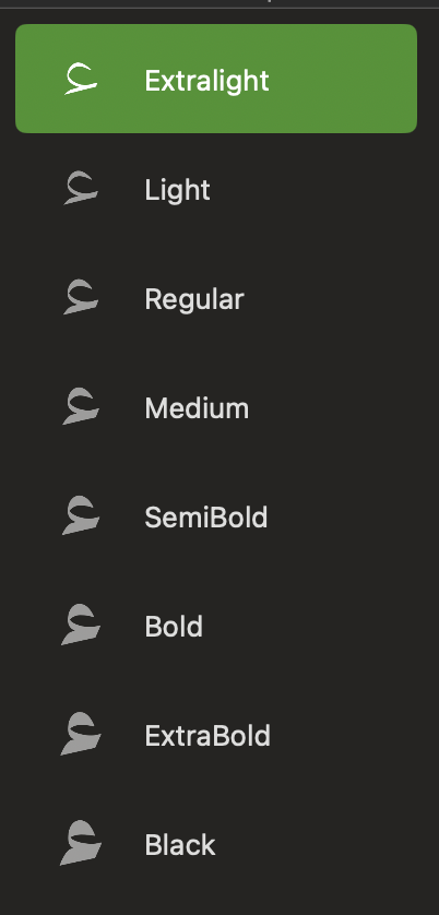
Weights order in glyphs:

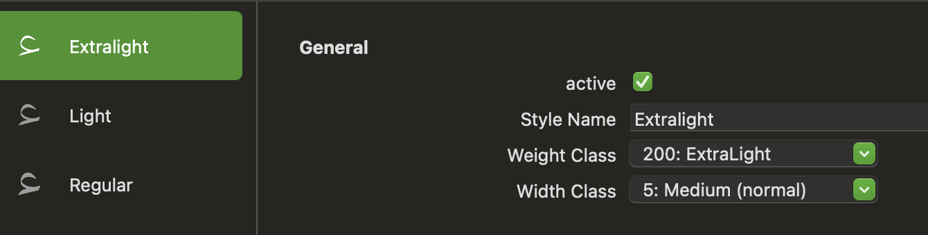
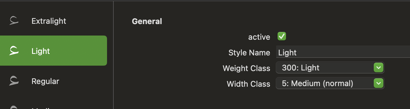
Masters order:

Note: InDesign follows Glyphs order, the issue in Illustrator.

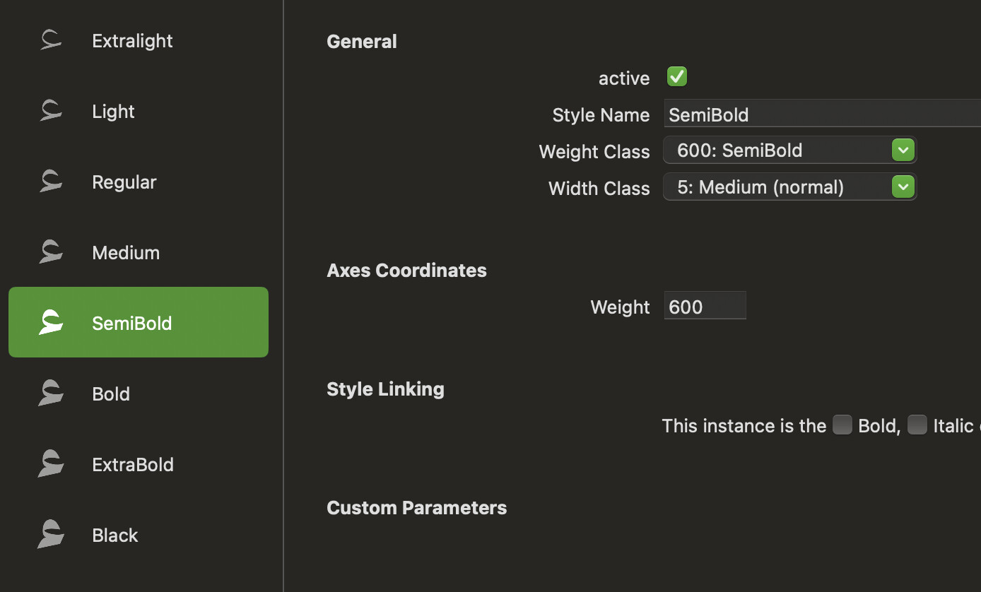
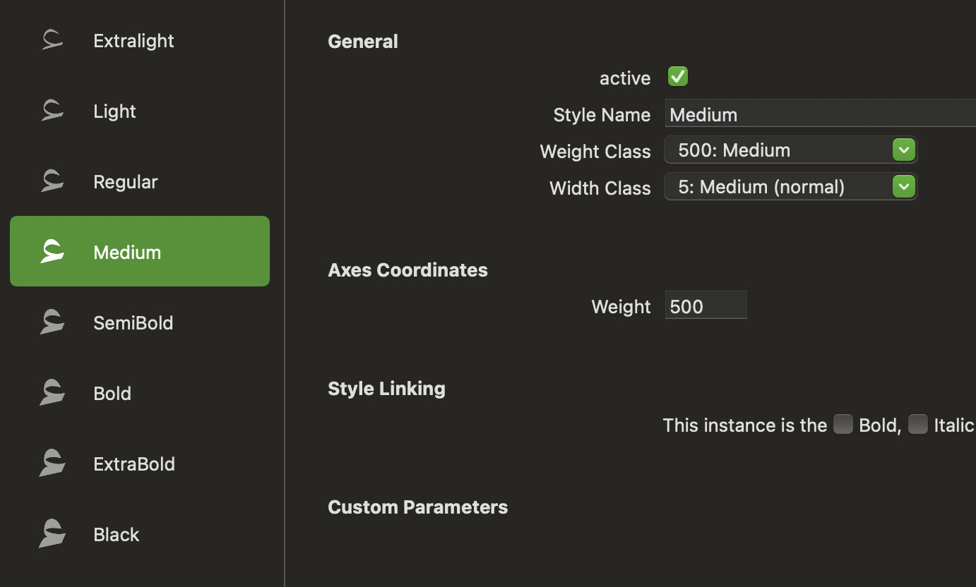
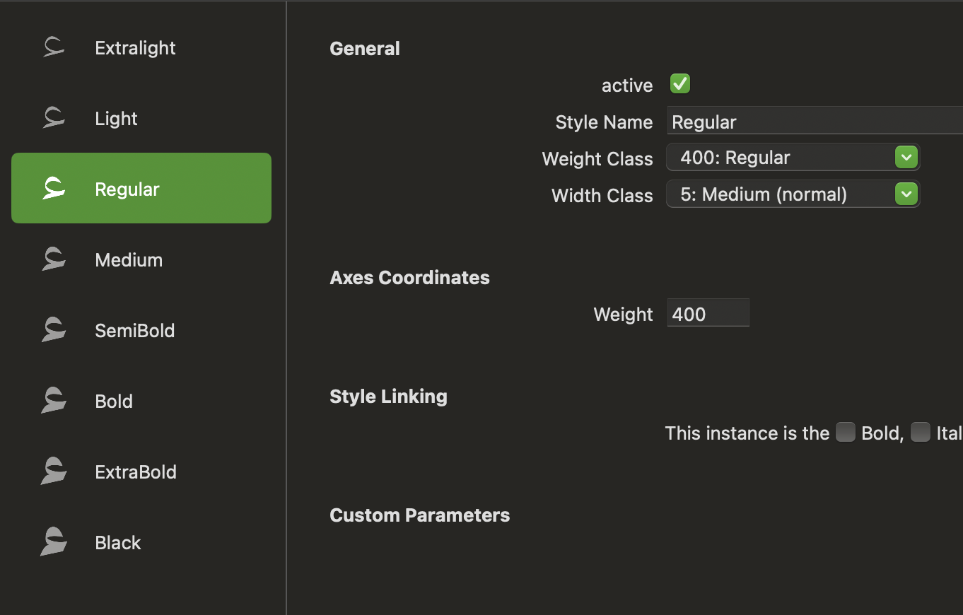
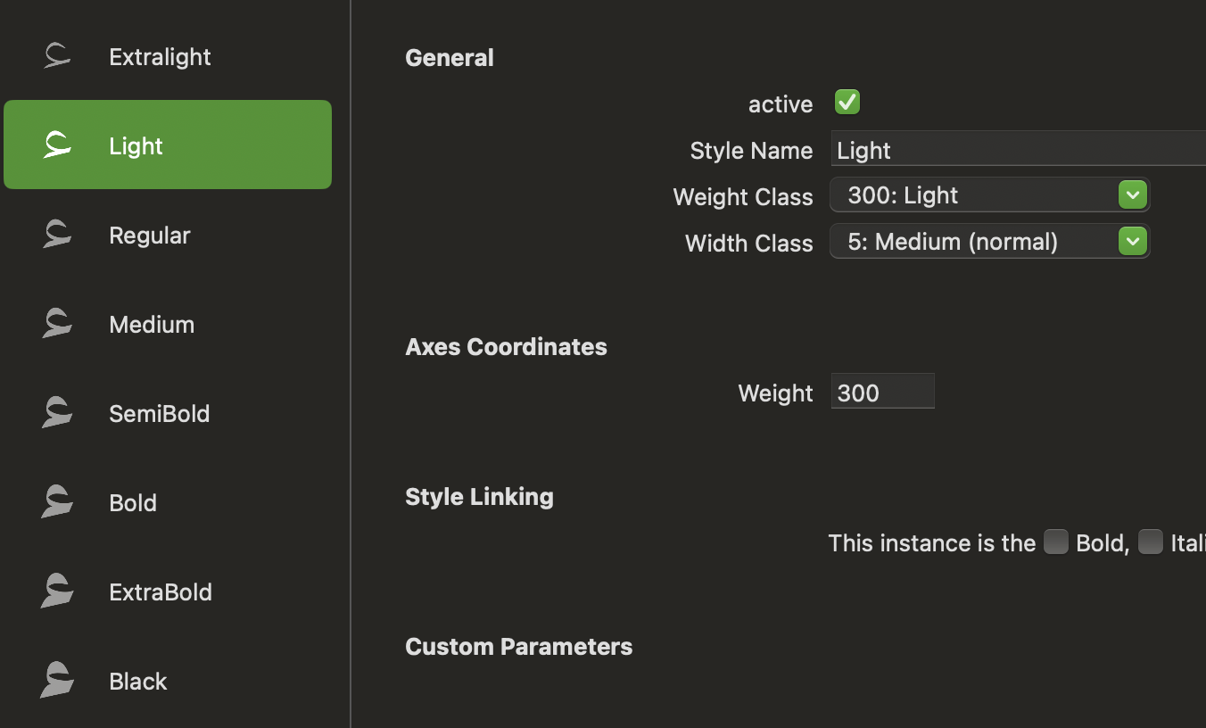
The order is determined by the weight class settings in the instances.

The weight class is in sync with the weights


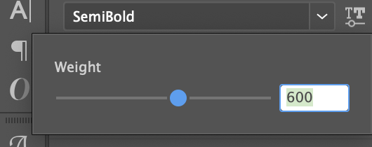
In a variable font, if your origin doesn’t have a corresponding instance, the style ordering can be messed up. What are the axis locations (weight values) of your masters, and of your instances?
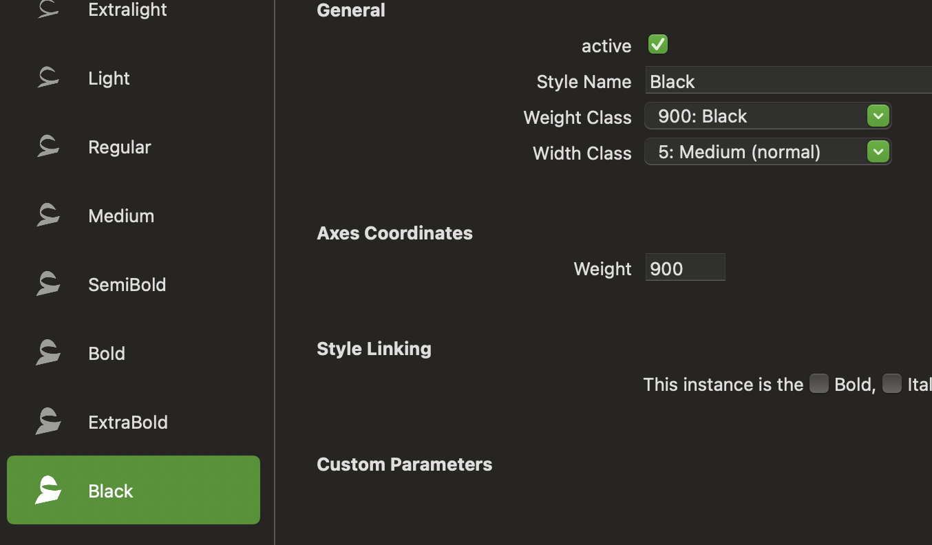
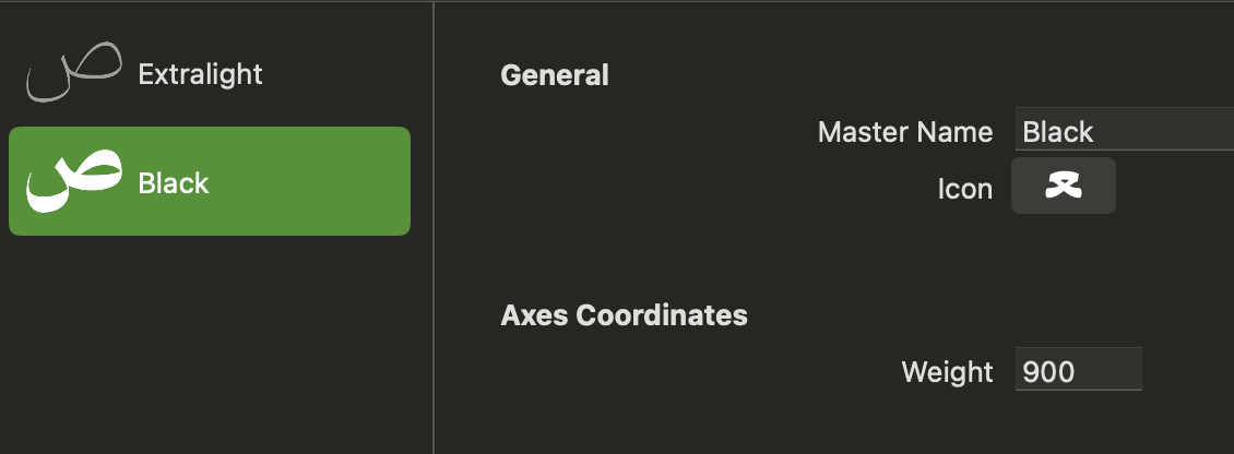
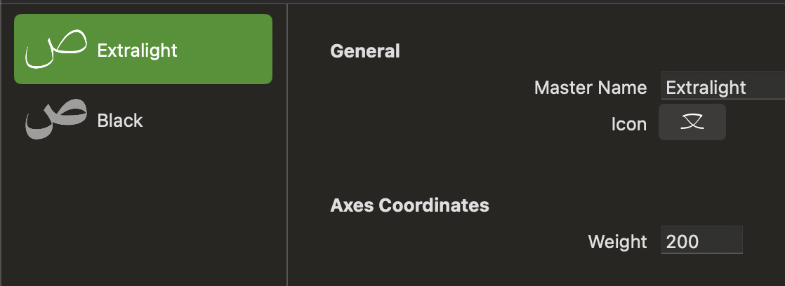
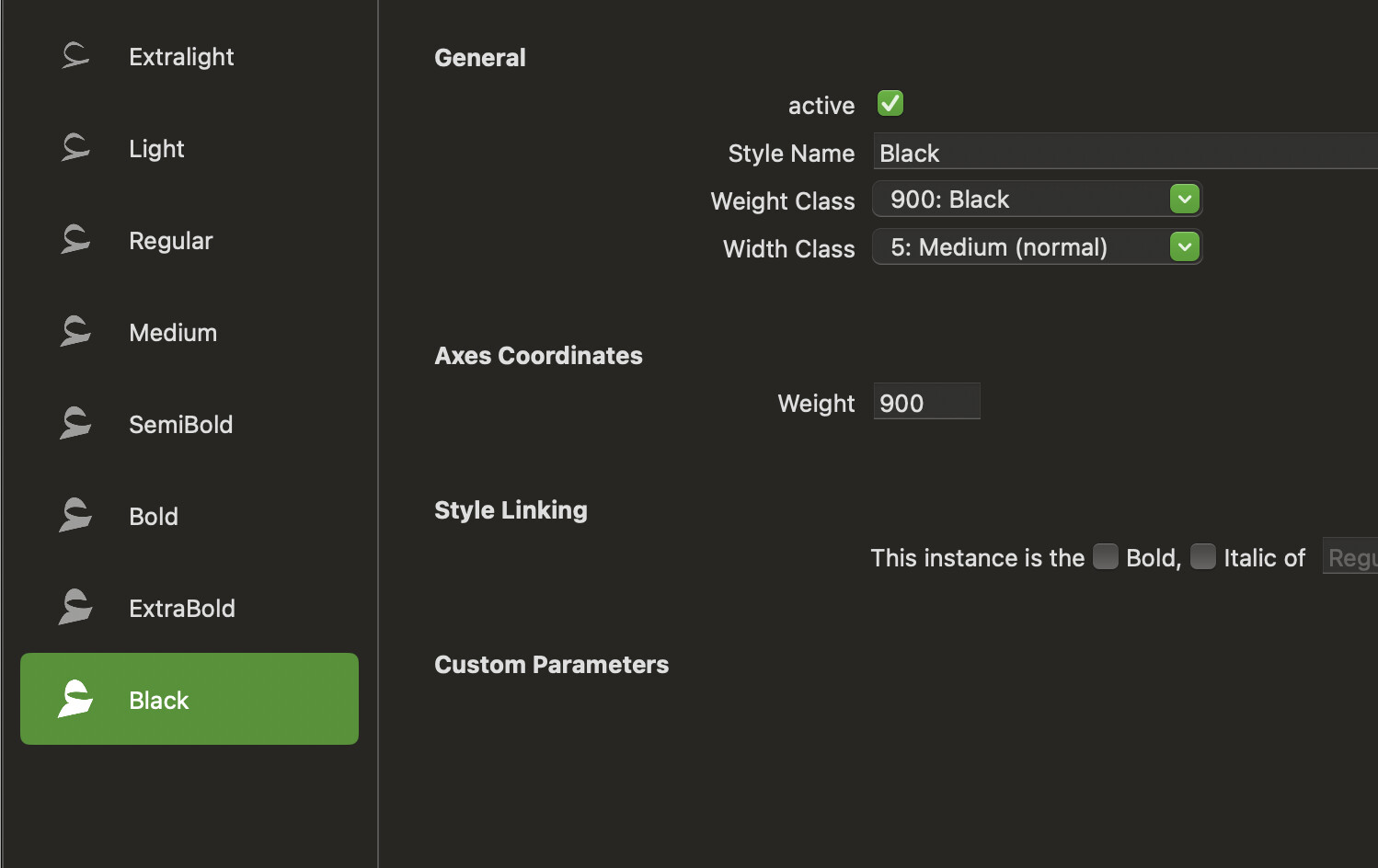
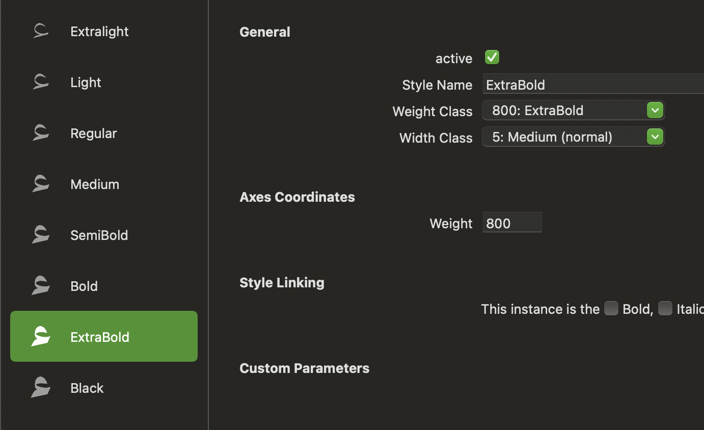
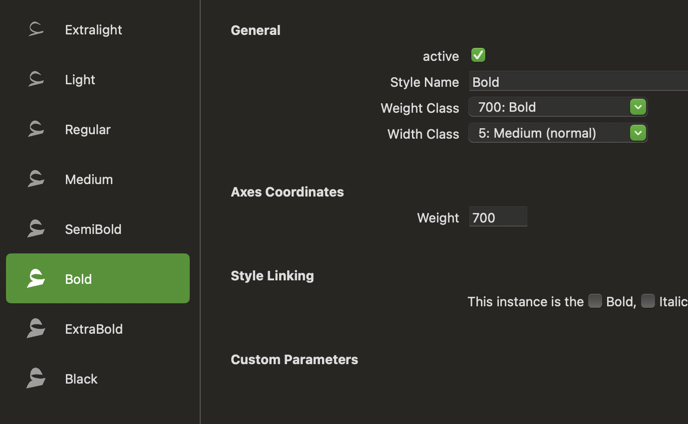
You can simply write a message with the weight values. Screenshots take up a lot of space.

The values look good. Don’t forget to set the style linking for your Bold instance (just check the “Bold” checkbox).

How are you testing your fonts? Are you using the Adobe Fonts folder?

1 Like

Yup, I noticed when export the font as a file for each weight, the order get correct. For variable still not correct


the variable slider is working very well and synced with the values

Drop your variable font into fontbakery.com or, better, Fontspector.