I’ve tried my hand at Hebrew for my latest typeface, and although I have no experience whatsoever with that script, the information on Wikipedia and in Glyphs seemed rather straightforward to me (as far as I can tell).
However, something seems to be going seriously wrong with the Nikkud the Italic. I’ve set up the anchor points so as to make sense in Glyphs:
…but this is what I end up seeing in Pablo’s font testing page:
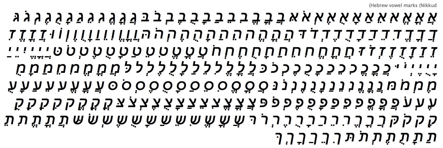
Very annoying! It seems to work reasonably well in the upright cuts.