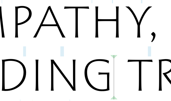
The same as the very pale blue mark in Glyphs 3: it’s the insertion point in the text.
No, not the cursor point mark, the other rectangles above the D, N and T?
Those are the visualization of the kerning values. They are blue (negative) or yellow (positive). But the position and size is not what I would expect.
Are they placed above or below the pairs? I agree, what I see makes no sense to me and is distracting. Can I turn them off?
They are places below the first line. There is a bug with the positioning. I fixed it yesterday.
Can I toggle them off?
Top Menu-View-Show Metrics?
Thanks, Elena!
Does it look better in the latest cutting-edge version (4001)?
That version does not show up yet. I do have “Cutting Edge” preference on. I don’t know how long it takes for it to be available to me?
The checkbox for the cutting edge version is broken. Run this in the macro window:
Glyphs.defaults["SUShowCuttingEdgeVersion"] = True
Either I did not do it correctly or it did not work. Define “macro window” for me?
I meant to put that into the Scripting window and run the script.
I think that is what I did. Is there an “Execute” command? I just pasted it in and hit the “enter” key but nothing happened.
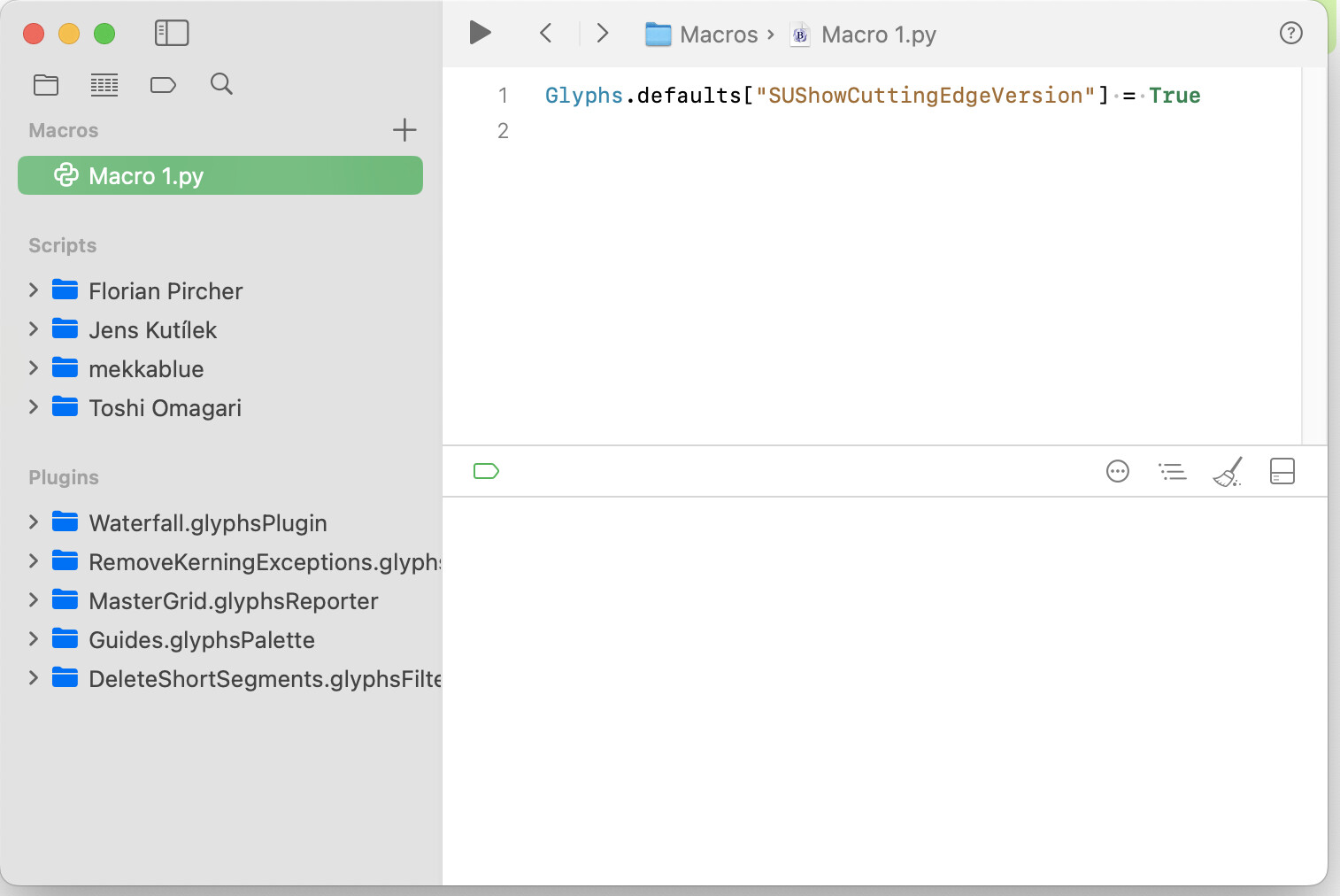
Press the Play (big triangle in the toolbar).
Use Cmd+Enter. Use Cmd+K to clear the log (if an error message pops up or a script/plugin prints anything to the log).
That WORKED! Thanks, guys! And yes, the implementation of the kerning bars is MUCH less obtrusive now.
Yeah, the kerning rects in G4 can look kinda weirdly positioned compared to the actual kerning values. Are you maybe zoomed in or out to a weird level? Sometimes the visual display gets off when the view scale doesn’t match right.
Joseph, I don’t know what might be a weird level. I often zoom in or out, depending on what I am looking for. Frankly, I never paid attention to those marks before in G3. I find them distracting. If I want to see the kerning value, I read the numerical value. It is much more precise and gives me the information I need to make adjustments.