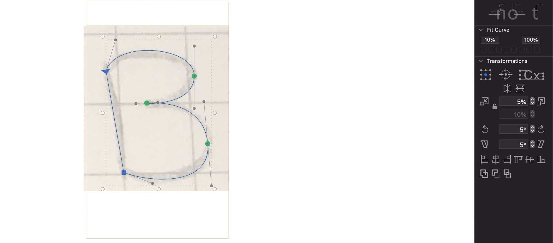
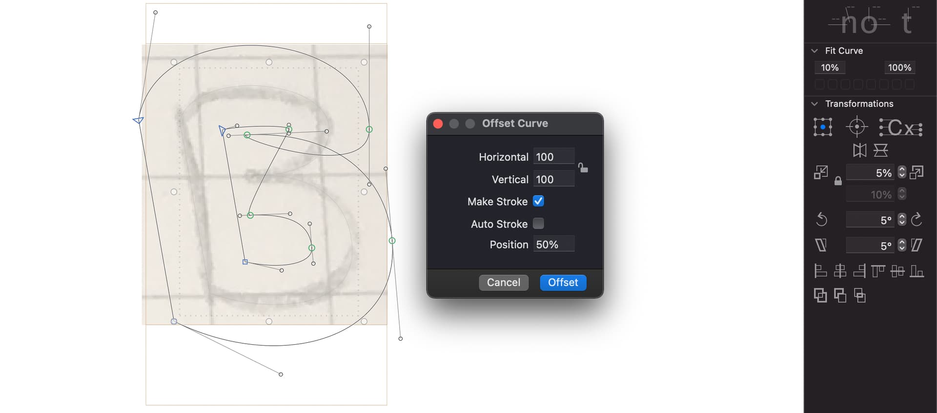
The offset curve algorithm in Glyphs mini is has some problems with very thick strokes as in your example. You can use the Fit Curve panel to adjust it. You will need one value for the inner and one for the outer strokes. You can change the min and max value to get better fits.
The mid point is a smooth point, which doesn’t result in a good offset. I suggest you separate them.
For more even thickness, I suggest you add extreme nodes, in other words perfectly vertical or horizontal handles. (shift+click with Pen tool around the top/bottom/left/right edges of the curve)
Don’t forget that the most powerful thing you have in smooth, even curves is drawing skill. Automated features get you started but honing your skills is more about putting in the work seeing and drawing than anything else. Anyone can draw a glyph but it takes work and skill to do it well.