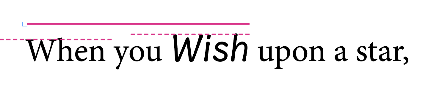
I’m trying to figure out how to adjust the space indicated below from the solid magenta line to the dashed magenta lines. When the word “Wish” is removed, the W in “When” is flush against the top solid magenta line (InDesign), but when the “Wish” font is used, both get “bumped” down.
You may do everything right, and still get complaints from users, particularly about the positioning of the first line of text in a text frame. In InDesign and Illustrator, the the first baseline offset depends on the settings in the respective document.
The weirdest thing though is that the default setting, ‘Ascent’, is the measurement of the Latin lowercase d. So, if you need to make sure that your font aligns well with others, and you do not want to spend a lot of your precious lifetime on explaining to Adobe users the two dialogs below, consider synchronising the heights of your lowercase d’s.
Well, the font is for me, but yeah, it looks like the way to do it for now is to set the baseline for the text frame, make an object style, and apply it to all text frames.
That said, it may be more practical to baseline shift it, which feels a little hacky but will also work.