I apologize to the Glyphs and Typography community for my rather ignorant question. I am still learning not only the interface of Glyphs itself but type design in general.
I often see characters drawn either in tutorials or in screenshots of the Glyphs UI when fellow users share their work in progress. I can’t help but feel like I am missing some sort of fundamental lesson as to why I see characters being drawn this way. With their paths sort of perfectly criss-crossing one another and remaining a single path rather than multiple pieces or paths.
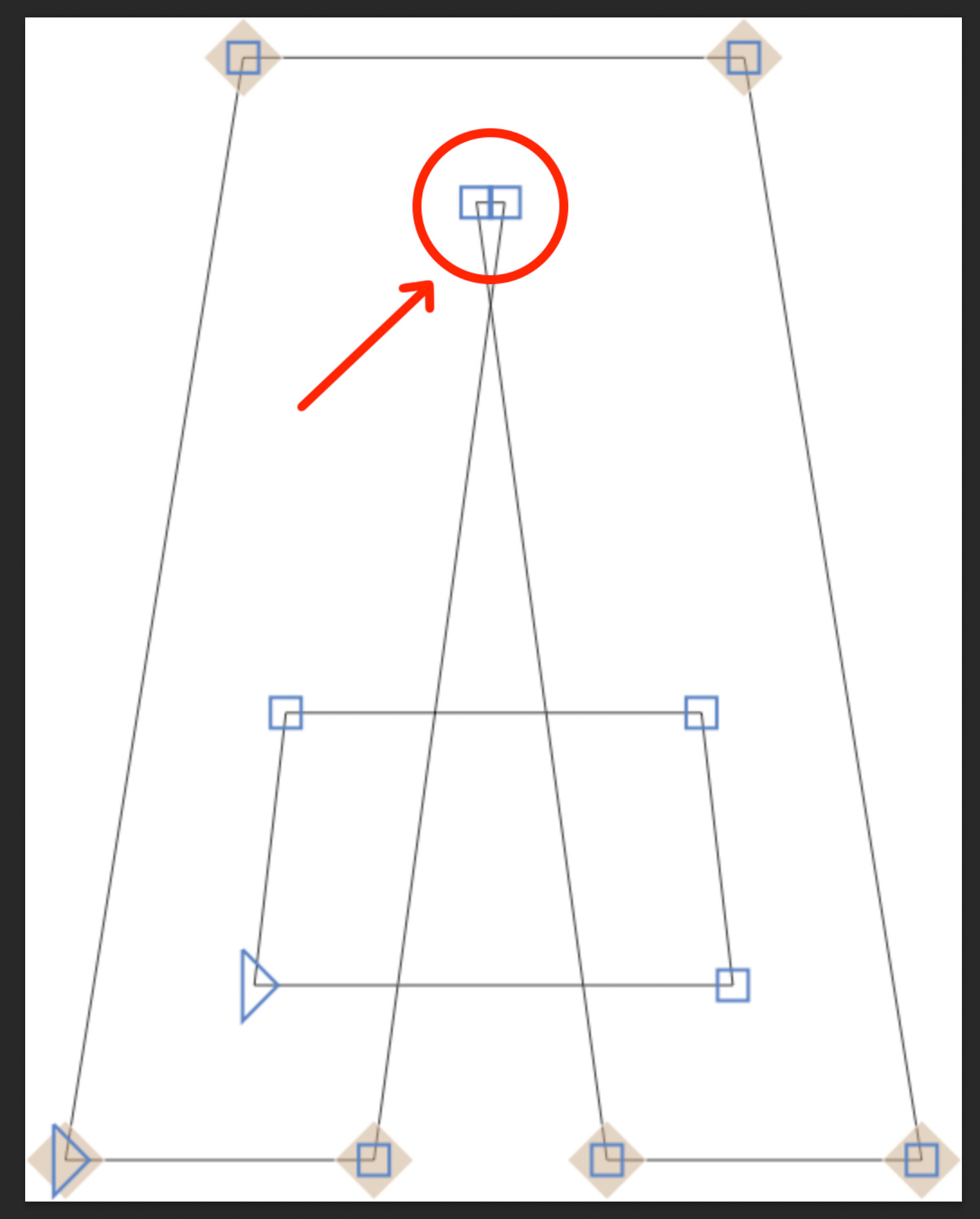
Would anyone be able to explain why this is?
Thank you again. I love Glyphs and am excited to keep learning more.