Looking into that file raises a question I had several times, and maybe you know as you seem to contribute to MonaSans(?)
What is the deal with negative italic angles? The font has its full slant at -12 and no slant at 0. I have seen this several times, but also the opposite. Do you have any information on best practices?
(I even saw fonts slanting their shapes in the opposite direction of the slant angle that is stored in the file – giving some odd looking previews in a test app, that I built).
What do you mean? Are you referring to the latest file I pushed in the v1.1 branch? I currently have it set up with a 0–1 italic axis. However, we are in the process of onboarding the font with Google Fonts and they are pointing out the same question. They instead want a slnt axis with 0 to -12 as values, which I have always found odd. I don’t see a problem with a 0–1 italic axis.
A slant to the right is expressed in OpenType with negative numbers. The italic angle field in Glyphs is inverted on export. So if you enter an italic angle of 11, it’s exported as −11. The slnt axis follows the same logic within the OpenType standard.
I see. My work is in the v1.1 branch. I will let you know what Google says about the axis choice, they are complaining, as I mentioned
Maybe, in the meantime, somebody else has a better reasoning.
Thank you! So this is specific to the slnt axis? I cannot recall having seen my ital axes reversed on export (not used the slnt in a proper project yet)
That makes sense, on a technical level, thanks. However, from a user perspective, it’s mighty confusing. 99% of people call a slanted font “italic”, especially if it’s optically corrected and everything. Using an italic axis thus makes sense, especially if it’s interpolatable.
Glyphs matches most user’s expectations by inverting the italic angle in the master settings. For axis values, however, Glyphs does not interfere. The slnt spec reads:
Note that the scale for the Slant axis is interpreted as the angle of slant in counter-clockwisedegrees from upright. This means that a typical, right-leaning oblique design will have a negative slant value. This matches the scale used for the italicAngle field in the ‘post’ table.
(That spec part with the ccw reads like “because that day we thought its funny” ¯\_(ツ)_/¯
I think a UX perspective would have made way more sense than forcing it to match the way a value is stored in another table field.)
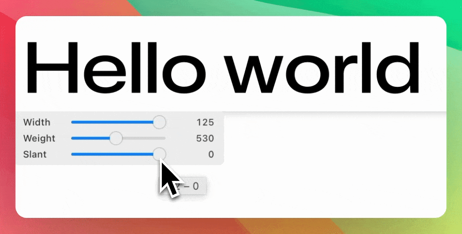
So to sum up my question (sorry for highjacking the thread) For a slant axis it is advised to use negative values for the slanted shapes, and 0 for the upright
Are there any known issues with ital and slnt not following the specs? Seems like about a half of fonts don’t follow it, especially with the ital axis being all over the place.
I strongly believe anything other than the actual positive angle makes no sense, and feel inclined to support anarchy and chaos, so that software developers don’t rely on the silly specs either.
Why do you think the spec is silly? In mathematics, all angles are measured positive in counterclockwise direction.
(Engineers apparently measure differently, e.g. what we would call a 15° slant to the right is called a 75° slant measured from the baseline in the case of Normschrift standard lettering)
I would argue that very few fonts need a Slant axis to begin with. For most Latin designs, an Italic axis suffices.
It is a good idea to follow the spec recommendations because an app may rely on you following the specs, in this case e.g. for drawing a slanted cursor or a slanted highlight rectangle that fits the slant of your font.
Please convince Google of this. Currently, if you have an italic axis, Google Fonts require you to split the variable font into two versions: Roman and Italic. That somewhat defeats the purpose of the axis.
and it seems lightly discussed at the time. Perhaps creating a meta-issue pointing to these two issues is the way to go? My inclination would be to try and get #4199 solved first and then slowly drift into a new issue regarding the GF check specifically