I’m creating a font that has each character with negative kerning so that they overlap each other. Basically the previous character overlaps the next character by 30% and so on.
After exporting, I’m noticing that I’m getting a lot of subpixels or larger areas in overlap areas. Is there anyway to stop this so that it’s smooth?
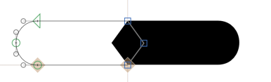
Here’s a bunch of overlapping simple shapes, notice the little bumps (especially evident on 1x screens):
Keep the overlaps as short as possible, consider disabling hinting. Please note that this is what the renderer makes of the information passed on to it, and it will look different in different rendering environments. There may not be much you could do about it from within the font.
30% of what? Keep it short, like 10 units, 20 units.
Honestly, I’m figuring all this out as I go. I made a font a long time ago, but that was in FontLab.
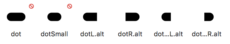
Unfortunately I can’t keep the overlaps very short. That being said, I’m thinking I could probably accomplish what I’m looking for by making contextual alternatives. Now I just need to figure out how to do this.
I want the end result when characters are together to look like a long version of ‘dot’ without overlaps and with spaces in between (think a wireframing font). So I’m guessing I’m going to need to substitute any letters when they’re typed next to each other with the alternative left and right ends I’ve created. And I’ll probably need to create a separate middle section that is used when there are letters in the middle of the word.