When I select 2 points at the top of a letter, create a hint, Glyphs often applies a negative value for the hint, as shown in the screenshot.
That is of course wrong, as all hints - except ghost hints - must have positive values.
Is this corrected on export? If so, why display it wrong?
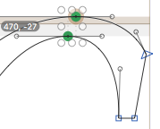
This is corrected at export.
I figured out the rationale, when it touches a zone, it becomes a negative value, when there is no proper zone yet, the number becomes positive. In my opinion this is confusing, and someone who read the specs knows negative is wrong, but it is impossible to change.
I use it as a “live” measurement, I just want to see the thickness of the stroke. Please get rid of those minuses 
The visual representation of postscript hints work a bit like TT stem instruction. They start at a zone/CVT and go up or down from there.
Do not mistake the GUI implementation (linking to points, interpolating with the nodes it is linked to) with the PS hints that are inserted at export time.
The distance is calculated from the point it links to, from which the point that is set as origin is subtracted. Setups are thinkable where one of the points bypasses the other during interpolation, so we need to differentiate in the UI. You can still reverse the hints if you do not want to see negative values.
1 Like
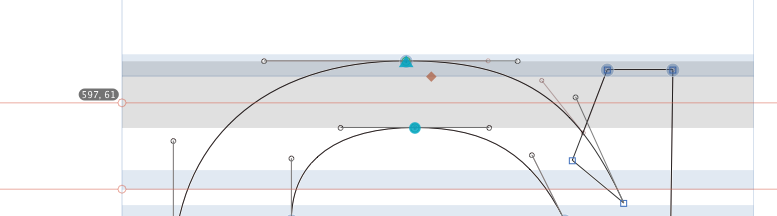
It doesn’t seem to be like that, a hint at the top of an O gets a positive value, a hint at the top of an E gets a negative value, both stems hanging from the cap-height zone. That does not make sense does it?
I asked around but nobody knows how to reverse hints.
I wrote:
That was because the horizontal stem also overlapped with the next zone below cap-height. Makes even less sense though.
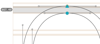
So in order to see positive hint values (according to font specifications) I should just add a bunch of extra zones before hinting ![]()
Click on the hint (the grey tablet shape) and exchange the two aquamarine indicators (disc and triangle), et voilá!
It probably could be scripted.
My guess though is that virtually everyone just calls the autohinter on export and never bothers to look at the hints ![]()
The representation of hints in the user interface does not correspond exactly to the way they are written into the font file. In the UI, you just need to make sure they are hooked to the right nodes. All the technicalities are sorted out during the export.
Now what actually is the problem? Are the hints written wrongly into the CFF file?
The UI problem was already described in the post from 2017, and I did not see an answer yet to make me understand, I can repeat it: Why is the display of hint values wrong?
They do end up correctly in the fonts, that is not the problem.
I just happen to know that all stem hints must have positive values so to me negative values are wrong. (in FontLab, negative stem hints in the UI might end up in the font as ghost hints, so I am trained to avoid them at all cost)
Even more confusing is that top stems sometimes get a positive and sometimes a negative value, depending on what other (non-related) zones might be in the neighborhood. Stems in TrueType also have positive values, no matter if they go up or down.
So why is there something inconsistent and non-logical in the interface, that does not help the user in any way? Why not just show the absolute value? I only want to know how thick the stem is (in all masters), and that happens to be according to the technical specifications for stem hints.
I agree, we can take out the minus. I’ll put it on the list and we’ll discuss it, but not with very high priority. So I need to ask you for a little more endurance.
Please do not mistake the visual representation in the UI for the PS hint that ends up in the CFF. The PS hint is derived from it. The blue hints are hooked to nodes (PS hints are not), and they interpolate with those nodes (PS hints do not do that). You might say, the display of the hints is wrong because of these differences. But it does make sense from within the UI. Even the direction may have significance for other workflows than yours, e.g., if you want to translate the hints into TT instructions with a script. And there, the direction does make a difference.
In Glyphs, you would only hint the first master, so why would you measure a stem in all masters with a hint?
For measuring stem widths, I would rather recommend a simple node selection and then switching through masters (consider the Sync Layer Selection plug-in). That allows measuring of unhinted stems as well. There are even some plug-ins that display the distance once two nodes are selected.
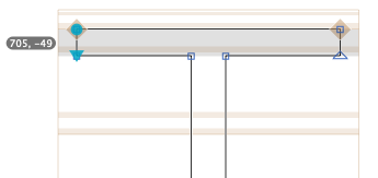
On a related note, I don’t know for what the position value in the hint label might be useful. It might be a cleaner UI if it was omitted?
Thanks for agreeing after three years ![]()
Of course I saw what ends up in the fonts and I know the difference between hints and links (hooked hints), I am just trying to point out possible interface and workflow flaws.
A translation of PS Hints to TT instructions is obviously never going to work properly, it is a bit like writing a car manual by looking at a bicycle, but yes it is probably fast. When such a workflow depends on the negative value/direction of PS hints, you might have to repair the bug that I tried to describe. Maybe it is an unknown feature, but I have trouble understanding why the top of a T gets a negative hint direction, but the top of the O gets a positive value:
A minus value is not as good as a UI element to reveal the direction of hints as an arrow is, and the arrow is already there, another reason to ditch the minus.
Of course I totally agree with Jens that the hint position should be ditched in the label, it is not relevant for the hinting process.
Hinting only the first master is definitely NOT my preferred workflow. That master might be very thin or very narrow causing extra navigation, and hints might snap to wrong points that align with a stem in the first master but are very far apart in the black, which is actually very common. And then there are some rare floating hints, unhooked by lack of points, that I need to see and check in all masters.
You ask why I would like to measure stems in all masters with a hint, well obviously because hints need to be there anyway. That is just the most practical thing imaginable. I use them in the design process. Sometimes I fly through all glyphs looking at hint values just to check stem widths, obviously in any or all masters. And I use them for other purposes.
Your recommendation to first make a selection to measure stems is utterly unpractical, it would stretch the checking process to infinite lengths!
P.S. developers here made a Show Nicer PS Hints plugin for Glyphs that works in all masters, we think Glyphs can do better ![]()
1 Like