Assigning a code point to a ligature

I want to assign a ligature to a unicode character. For example, 00B1 is ± and imagine that I also want to make so that if you type +- you get ±. (I’m doing more than that but that’s a simple example.) But if I create a glyph named plus_minus, when I assign it a unicode value, the ligature rule doesn’t get generated anymore. That’s even the case if I name it plus_minus.rlig.

I found this old post Standard ligatures & Unicode that says I can do this by turning on custom naming but that doesn’t fix the problem: it still doesn’t create the ligature rule.

The only workaround I can see is to either (1) create all my ligature rules manually (since you can’t mix and match auto-generated and manual rules) or (2) create a second character that includes the first character as a component. Either seems clumsy.

It seems to me that if I explicitly add .liga, .rlig, etc. suffix to a glyph name than it should include it in the appropriate ligature feature even if it’s assigned a code point. What else could it mean?
In the case of existing glyphs, say plusminus, the name is already registered and nothing is done to the glyph by default. You do need to write a ligature code by hand in that case. It’s super simple.

sub plus minus by plusminus;
# Automatic Code

And in Glyphs 3, you can indeed mix automatic and manual code. The second line is where the automatic code will be inserted afterwards.

Having said that, I think the real solution in cases like plusminus is to register an entry to the system user dictionary.

Thanks for the quick response. I didn’t know about # Automatic Code. Nice.

A user dictionary isn’t helpful as plusminus was just an illustration. The fonts I’m working on are specialty fonts. One is a chess font which, for example, assigns the white pawn to the letter p. Ligatures are used so that you can easily access variations of the symbols. Since only a small subset of chess symbols have unicode points assigned, I can’t just use those and besides they’re hard to type. On the other hand for those that do have unicode points, I would like those to work. So now that I know how to mix automatic and manual, I can do this with:

GSUB
sub uni2659 by p;
# etc.
# Automatic Code

If it is just that one to one substitution, you can just assign both Unicodes to the ‘p’.

If it’s a chess piece, wouldn’t you also need a color info? U+2659 ♙ isn’t just p, but white p. I am still lacking the full context, but there may be other better ways than ligatures depending on that.

To get into more detail, in traditional chess fonts, the letters p and P are assigned to the white pawn and black pawn, respectively. But chess diagrams want to show pieces on black and white squares and since it’s convenient to represent a board as a string of ascii characters, a white pawn on a black square is o and a black pawn on a black square is O. (o is the letter next to p on the keyboard. There are some different encodings but this is the one I’m using.)

The “black squares” have cutouts so the shading doesn’t obscure they piece, so there’s not just one black square glyph. Throwing in a few variant pieces (amazon, duke, cardinal, zebra), there are 20 uppercase and 20 lowercase letters assigned to the pieces. Only some of those have unicode points assigned. But wait there’s more.

For chess puzzles, there are also “neutral” pieces which are half black and half white and these can be on black or white squares. That’s 20 more glyphs. For these, I’m using ligatures so i_p is a neutral pawn (n is already assigned to the knight, so I chose i for “impartial”). This breaks the convenience of one letter per piece but this seems more convenient than using Greek letters. (Aside from being hard to type, Ν looks a lot like like N.)

Additionally, each piece can be rotated in one of the eight compass directions so there are 60 x 8 combinations. Ligatures seem like the best choice for those as well.

I’m also working on another font for crossword puzzles, where 12 or 123 can be used to put 12 or 123 in the upper left corner of a crossword square. I can do this with rlig required ligatures or I can do it with rclt required contextual alternates. It’s not clear the support for “required” ligatures and alternates in browsers and word processors. CSS, for example, has a setting to enable common ligatures or disable all ligatures but not an option to enable required ligatures. (CSS font-variant docs) Microsoft Word has the same issue, although at least the default is on rather than off as it is in CSS. In this case, rclt would reduce the number of glyphs substantially (replacing glyphs with rules) which might make the font smaller. But I haven’t decided for sure.

1 Like

Very interesting. It could be a technically robust chess font if executed well.
From the sounds of it, I’m still not convinced ligature is the best solution, and also think you don’t necessarily have to use the chess piece code points; you could simply draw a shape of white pawn in p for instance.
I want to think about the best solution. Can you provide a sample notation text of a state of the board?

I appreciate your interest and feedback. Here’s the initial configuration of a chess board:

RMBWKVNT
OPOPOPOP
,#,#,#,#
#,#,#,#,
,#,#,#,#
#,#,#,#,
popopopo
tnvqlbmr

If you don’t care whether or not the squares are black or white, then you can just write RNBQKBNR ... rnbqkbnr. And it’s easy for a script to convert that into the above format if desired.

You’re right that I don’t need to assign unicode points to these characters. I wasn’t planning to initially but then it occurred to that since some of them do have code points assigned, it might be useful if I also assigned the glyphs to them.

Since the crossword font is more complicated, I’ll also give an example of that too:

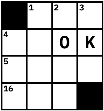
#,1,2,3,
4,,O,K,
5,,,,
16,,#, 

is a crossword grid that looks like this:
image

If you’re paying careful attention, you’ll notice that the # and , characters operate slightly differently in the two fonts. In the chess font, every character (or ligature) including # and , represents a single square of the chessboard. In the crossword font, , is a blank square and the other characters (the black square, the numbers, and the letters) go on top of the square. In this example, only the numbers are ligatures or contextual alternates. (There’s more to this font than I’ve described, but this is a lot of detail already.)

Thanks! I was thinking the checkerboard could be automatically deduced by the OpenType font alone, but realised OpenType can’t check context across the lines; each line doesn’t know if it’s odd or even (unless notated in a single line, or I add a marker to the start of each line).

If you want to notate the neutral and rotated ones (I assume they are chess-derived rules), yeah ligatures may be the best option indeed if you’re marking each piece with neutrality or direction. They exist on Unicode too, so chess representation may actually be complete?

On the other hand, the crossword font looks more straightforward; the multi-digit numbers could be done with single substitutions and positioning, but it’s probably few enough to make all the necessary numbers into ligatures anyway.

I have made my own solution using an open source chess font. My changes are:

  • Organised the glyph names. Mirrored pieces like R and T are double-coded to a single glyph. Note the glyphs marked in green have two Unicode values. (kinda redundant when tiles are automatic though)
  • Pieces on the black tile are treated as “.fill” alternates.
  • Added numbers 1 to 8 to be added to the beginning of each line; it automatically marks the background tiles correctly. (in fact, marking the first tile is all it does, so it can be 1, 2, 1, 2…)
  • Added contextual alternate feature (it’s on by default in most environments). It has two groups: black and white tiles, and substitutes the next tile with that of opposite colour.

Try testing this text with the attached Glyphs file:

8RMBQKVNT
7OPOPOPOP
6,,,,,,,,
5,,,,,,,,
4,,,,,,,,
3,,,,,,,,
2popopopo
1tnvqkbmr

OpenChessFontSmart.glyphs (231.3 KB)

3 Likes

That’s very clever. Yes, the alternate letters (o for p) are redundant. They only exist to render the background. Those conventions were created before opentype and before Unicode. This is better. The 1-8 actually us useful in another way. Sometimes, people want grid with numbers on the left so I’ll make that work and then I’ll have alternate characters for when you don’t want that. I’m going to think about if there’s any way to apply that to some of the features of the crossword font. Thanks a lot!