It’s been a while… and I’m still working on my variable font
I fully expect to publish it soon, and I have a question for you guys :
I saw that most of the variable fonts are sold with “static” styles (probably for those using incompatible softwares)
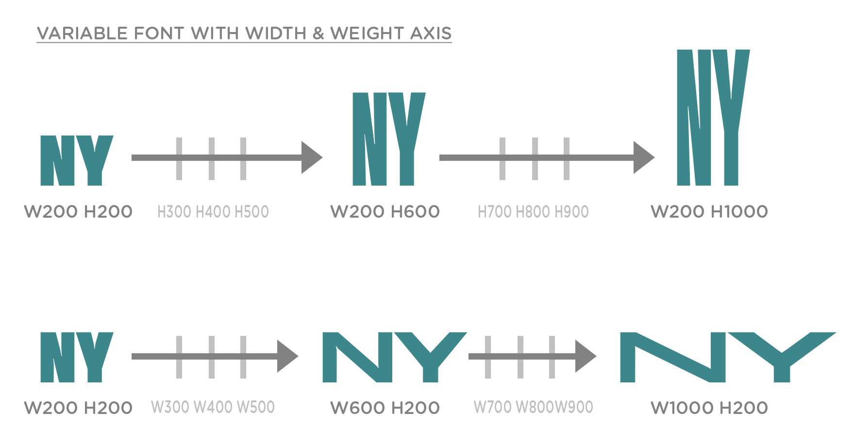
So I would like to create static styles for my font too. It’s a 2-axis font (width & weight)
Each axis value goes from 200 to 1000.
Right now, I created some extreme positions and some intermediate ones when needed.
QUESTION
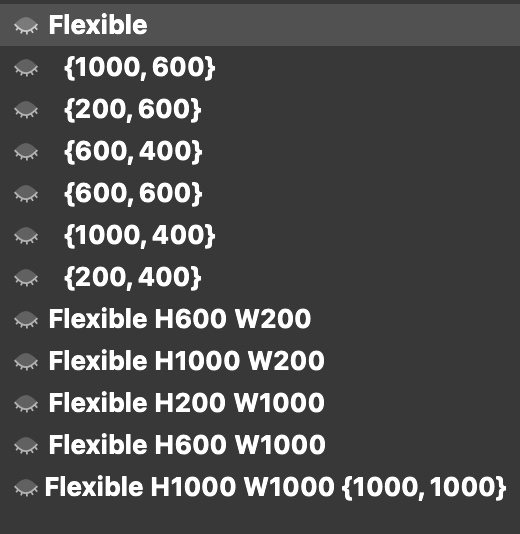
I have 20 instances. I would like those instances to show in a specific order in the drop-down menus of Adobe applications. I know the width and weight classes are made for that, but whatever I do, I don’t find the way to put them in the right order !
N interpolation: hard to say. Does the N have brace layers? Maybe there is something wrong in their setup.
baseline: are the words set in the same text box, or in 4 different text boxes? Can you select the text box(es) for the screenshot? Adobe apps (especiially InDesign and Illustrator) have can calculate the offset of the first baseline in multiple ways. It depends on the setting for the box (‘area text’ in Illustrator)
Menu order: in your case, you can have them sort alphabetically. Make all instances the same weight and width class, and instead of 1000, write 999.
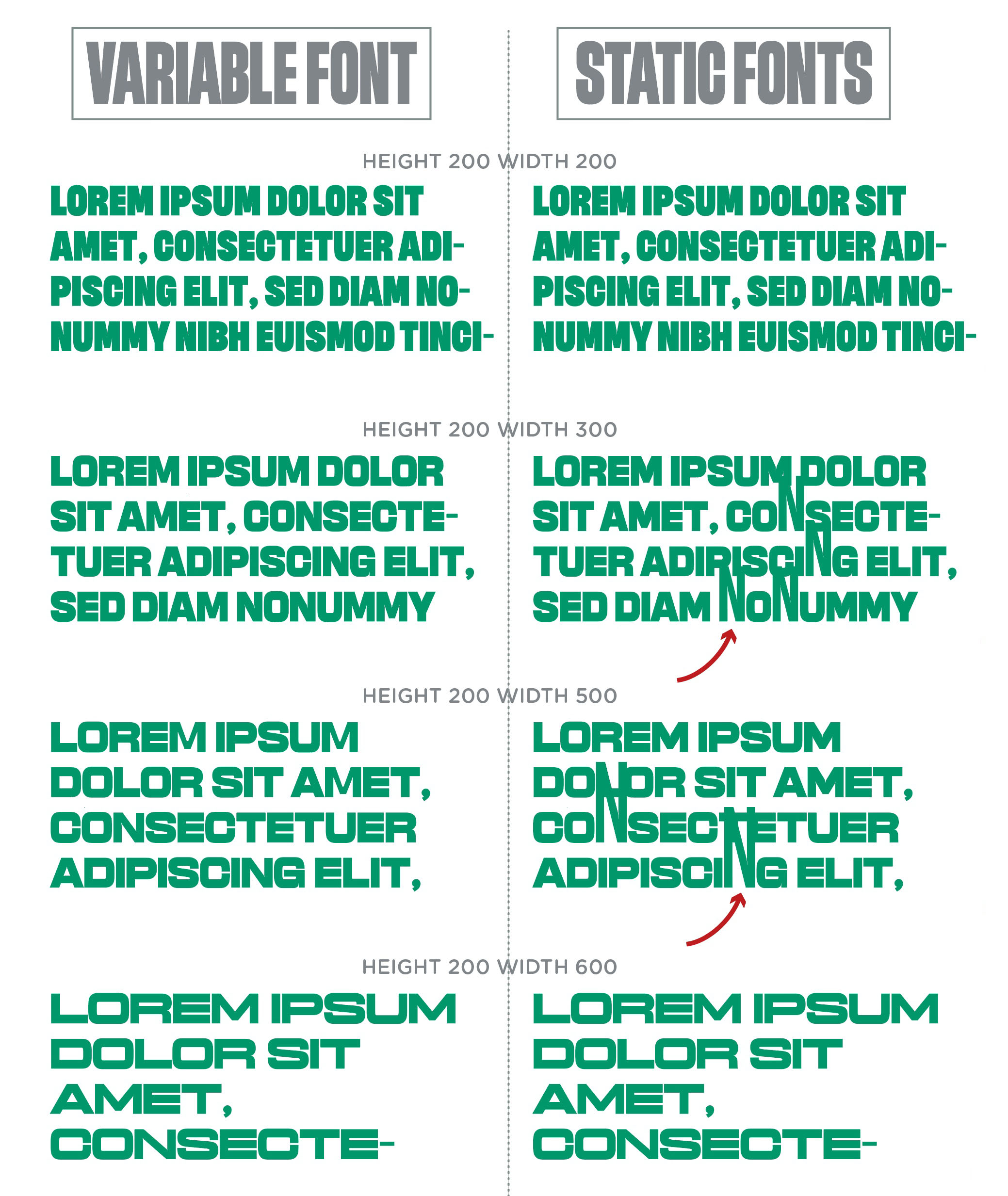
PROBLEM 1/N interpolation
The N letter has intermediate layers : I use that layers because the interpolation of some of my letters was bad (see my post about it here)
But as I finally found how to make it work in the Variable Font (the rectangular designspace!), I thought the exported statif fonts would be OK too
Here is my layers for the “N” letter :
What do I have to do ?
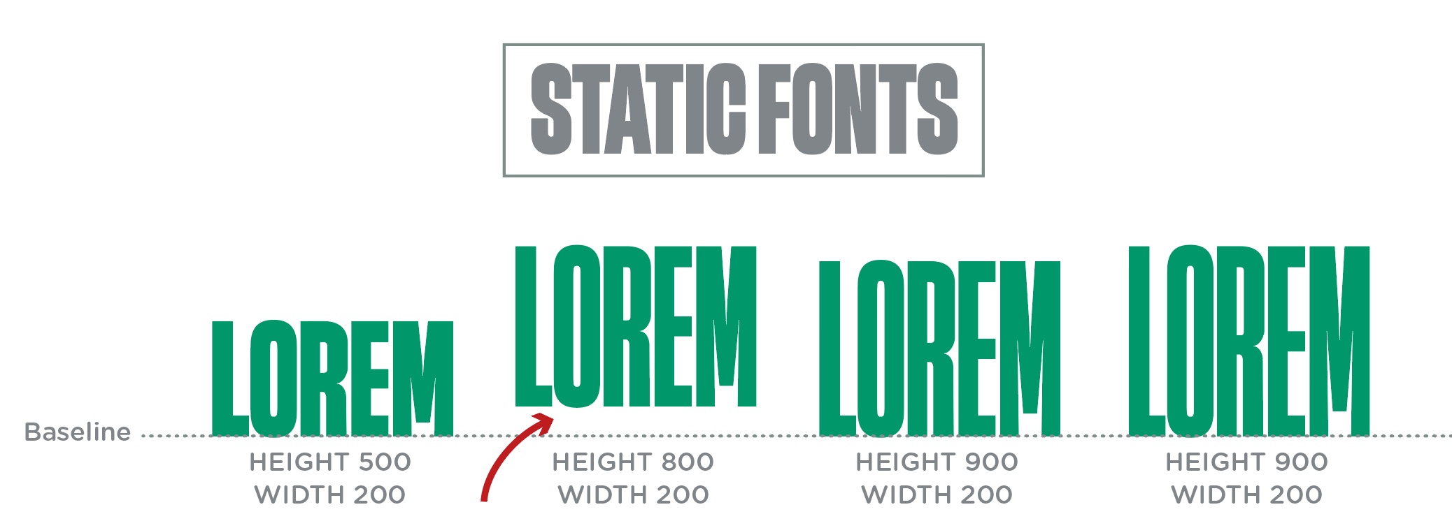
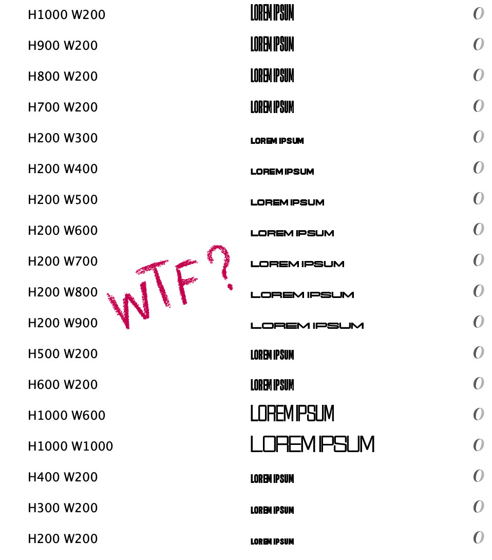
PROBLEM 2/Baseline
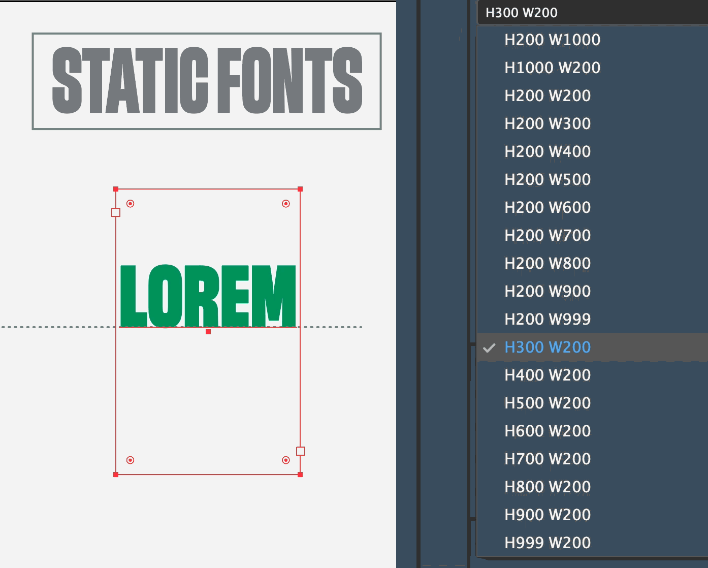
The words are in separate textboxes. I’ve just tried with words in only one textbox and it works fine. But it is still weird to parse the fonts and to see this offset on the H800 W200 :
QUESTION/Menu Order
Thanks ! I did what you said, and it’s OK even without the “999” trick
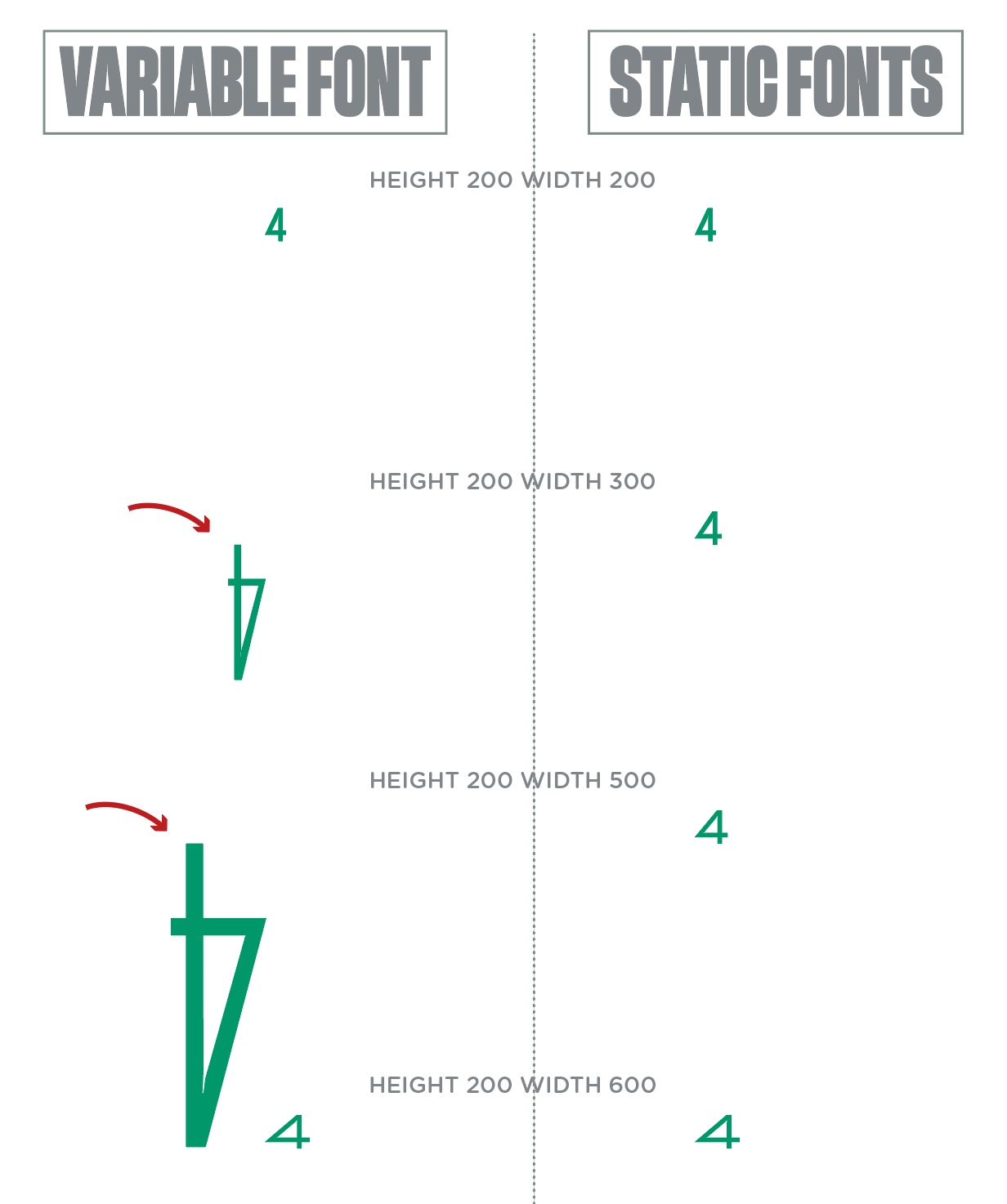
I’ve just discovered another weird interpolation.
This time it is the opposite problem : the “4” letter goes crazy in the variable font but is perfectly OK in the exported static fonts !
PROBLEM 1/N interpolation
I tried to export a static font using the Dinamo Font Gauntlet Generate button. I choose the same width & height where my N is too big, and guess what ? The N is OK !
So Dinamo Gautlet exports it fine, but not Glyphs… What’s happening ?
The static font export uses a different algorithm than the OTVAR export. So some differences are to be expected. Font Gauntlet derives a static font from the OTVAR.
About the 800/200 style baseline offset: what does the lowercase d look like and what are your box settings?
For the lowercade “d”, I use lowercase d-hack to fix the baseline as I said here.
The baseline problem with the 800/200 static font is exactly the same with that lowercase d, as it is for the whole exported font.
My box settings : Align “Top”. Same problem occurs with “Center” or “Justify”
The only good option is Align “Bottom”, so the problem is solved (same baseline for all instances)
Would need to find out which masters are involved for the interpolation of the 800/200 style. Maybe a master is set up wrongly. I would research and see what happens if you create a 799/200 or 800/201, etc.