Hello,
Is there a way I can simple make the line height taller for the entire font. I basically need some some space above or below every character.
Thanks for your help. I just don’t understand what all of the different terms mean.
Hello,
Is there a way I can simple make the line height taller for the entire font. I basically need some some space above or below every character.
Thanks for your help. I just don’t understand what all of the different terms mean.
Go into your Font Info (Cmd-I) and switch to the Masters tab. In the Metrics section, experiment with your values for Ascender and Descender.
What about in Glyphs Mini? Is there a good way to increase the lineheight? I have experimented with UPM, Ascender, x-height, Descender and Cap height values but they don’t seem to change anything regarding the line height.
When I change the UPM, I see a relative change in the size of glyphs compared to the line height, but the line height stays the same.
To make things clear: I test this in a web browser, not in InDesign. When I change a webpage’s font from say Helvetica into my font (made in Glyphs Mini), the line height always decreases dramatically. It seems like I can only change the line height by altering it afterwards in css.
What is the algorithm Glyphs Mini uses to come up with the line height a font gets?
The line hight is calculated from ascender, descender and UPM.
That’s strange, I have altered them all and the line height doesn’t change at all. Could you maybe explain me a bit more how Glyphs Mini does the calculation, so I can figure out what I’m doing wrong?
I’ve created an example of what I mean by setting the same text with the exact same settings in my font and in Courier in Photoshop. Here’s that image: http://flickr.com/gp/worldreceiver/406573
The lineheight on the right of the image never seems to change, whatever i set as ascender, descender and UPM values…
I would effectively need to make a smaller font and set a higher font size in Photoshop to get the same line height as the Courier example next to it.
Adobe app does its own calculation of the line height and only look at some of the height setting (cap height or ascender height?). Apple apps like TextEdit or Pages, and MS Office give different results.
You are right Tosche, the “auto” line heights are different in different apps.
But here is the same test in Safari: I changed the fonts in the page you are looking at to Courier and to my font, made sure line heights got calculated automatically and the result is the same:
http://flickr.com/gp/worldreceiver/0F80gk
I’m just trying to find out how I can change this. As a test I copied into my font the ascender, descender, cap height, x-height and UPM of an existing font that spaces nicely. The result is the same: it has no effect on the line height when tested in Photoshop or Safari.
Webfonts are yet another beast in terms of line-height calculation. The common recommendations for desktop fonts do not produce consistent behaviour in browsers.
Hi Tim, I’m not sure that’s what you meant, but I wasn’t testing with webfonts.
I just changed the stylesheets from within the Safari debugger. In my tests so far, I have only used the fonts installed on my machine.
But in the end I am planning to use the font I’m building as a webfont.
For html/css pages, I don’t think it matters whether you specify a locally installed font or as webfont loaded via @font-face. Haven’t tested yet but I’d be very surprised if these options lead to a different line height. I’d assume the browser always grabs the vertical metrics from the font and then does its calculation.
How did you test the font? Did you install them in FontBook?
yes
I basically copied all the metrics from an existing font that has great vertical spacing into my test font. I then export this font from Glyphs mini and install it in fontbook (just like the existing font)
As a super objective test, I created two pieces of javascript that I run on different websites, they look like this:
javascript:var children = document.getElementsByTagName(’*’);
for(c in children){
children[c].style.fontFamily=“myTestFont”;
children[c].style.fontWeight=“normal”;
children[c].style.lineHeight= “normal”;
children[c].style.letterSpacing=“normal”;
}
The other one looks exactly the same, but “myTestFont” is of course replaced by the font I copied the vertical metrics from.
The result is that everything should be exactly the same except for the font being used. The lineheight is then automatically calculated for the two fonts who should exactly the same vertical metrics according to Glyphs Mini but I still get different lineheights…
And still, you only have limited control over how the app will calculate the default leading. One example: Illustrator, by default, measures the height of the lowercase d.
When it comes to web browsers, there simply is no reliable way to sync leading between fonts, unless you put all the glyphs you need in the same font file.
aha! that’s very interesting, I deleted the font every time from fontbook, emptied the trash and the installed the new version with exactly the same name. So this could be a solution to the mystery…
I’ll run some tests right away!
hm I did some tests with exporting the font with a new name after every change, but the line height never changes. The glyphs become smaller RELATIVE to the line height when I make the UPM higher, but no changes in the resulting lineheight. So the caching wasn’t to blame…
What you are investigating now is how one particular version of one particular app (Safari, I presume?) on one particular version of an operating system (OS X Lion?) does its type setting. There is no guarantee it will stay the same in a different setting.
I wouldn’t say that, at the most ‘not only the caching’. Caching is a pretty complex issue, where you can end up with the glyphs from one version of the font, but the metrics from another, and the glyph IDs from yet another version. So, do make sure you keep changing the family name every time.Yes, after testing in inDesign, Text Edit and illustrator, I have now limited my experiments to Safari (OSX 10.8). I understand that different apps have different ways of calculating. I see for example that in inDesign I can perfectly change the default line height by playing with UPM and ascender heights.
And yes, of course, I’m not saying the caching will never be an issue, just in my case, it wasn’t affecting my results. In the future I’ll definitely make sure to keep changing the family name every time.
I was just hoping someone could help me understand how the line height is being calculated so I can set it up in my font with a default nice vertical spacing instead of needing to take care of it afterwards. I’m starting to think it might not be possible for Safari.
I also have a problem with leading. The fonts I make in Glyphs often end up with too much space between lines.
Here’s an example from my newest font, Traction. The ff ligature in the upright italic is supposed to span the entire space between descender depth and ascender height. Yet there is a considerable amount of space between the lines. Where does that come from? And do I have any control over it?
In Pages:
http://www.cinga.ch/type/off_Pages.png
And in Glyphs:
http://www.cinga.ch/type/off_Glyphs.png
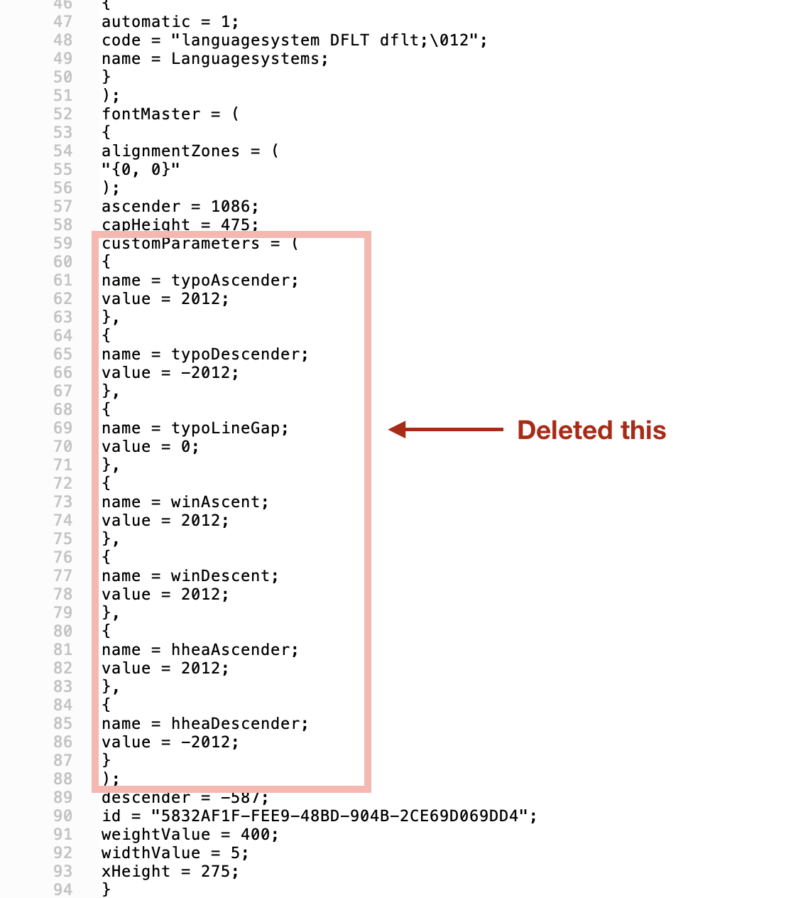
In case this helps anybody:
I was having a stubborn problem very much like the one others described above. I opened my .glyphs file in a text editor to look at the raw config, and lo and behold, there was a customParameters section (apparently not visible anywhere in the app) that was overriding a bunch of vertical spacing settings such as typoLineGap and hheaAscender.
I deleted that entire customerParameters section (making a back first, of course), and all my vertical spacing problems magically went away.