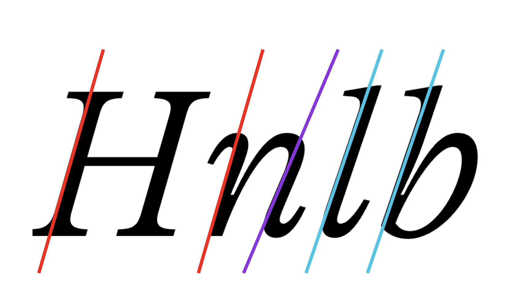
This plugin highlights the path segments which angle is not precise (or not closest) to Italic Angle of the selected master and is within observed angle range (±10 degrees around Italic Angle). Also it adds placeholder dots around the nodes to indicate the horizontal direction and position for better node placement where segment’s angle will be precise (or closest) to Italic Angle. Besides checking the standard Italic Angle, you can set an additional Italic Angles to check, which will be highlighted in different (of red) colors.
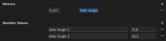
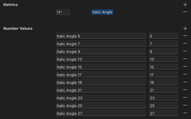
Standard Italic Angle is set in Font Info → Masters → Metrics → Italic Angle.
Additional Italic Angles are set in Font Info → Masters → Number Values.
The name of additional angles should contain “Italic Angle”, such as “Italic Angle for ascenders”.
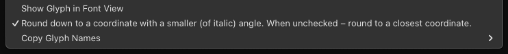
If the precise italic angle lies between two integer coordinates, here are two options of rounding (to .x coordinate with a greater or smaller angle) that could be toggled by right click context menu item called “Round down to a coordinate with a smaller (of italic) angle. When unchecked – round to a closest coordinate.”.
When checked (by default), it will round down to a coordinate with a smaller angle.
When unchecked, it will round the angle to the closest coordinate. If you are working with an angle like just 11° or 12° which is not based on integer ratios, there will be a lot of “almost precise” angle coordinates where you may prefer to round up to +0.02° instead of round down to -0.98°.
Distance
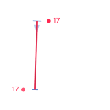
The distance from a node to the placeholder dot is displayed in number next to the placeholder dot, so it is easier to know how much the node should be moved to fit the correct position. For example, if you see the number 4, you need to press the left or right arrow key 4 times. It makes the correction faster.
Background
The issue of path correction after interpolation is always relevant, especially for italic styles. Usually the glyph shape has its own differences in different masters, so after interpolation (and more often after extrapolation) there are possible kinks, broken rounded nodes, and deviations from the Italic Angle. Read more about the issue in topic Is there a quick way to fix paths after interpolation?. Usually, RMX Tools is used to correct such a kinks and deviations. On the other hand, Highlight Imprecise Italic Angle is more intended for manual review of each glyph, because sometimes it should be estimated by eye and the correction is not always needed.
The reporter now also displays the distance from a node to the placeholder dot, in number, so it is easier to know how much the node should be moved to fit the correct position. I made some tests and realised that knowing the distance in advance make the correction faster.
I found this tool very useful when I worked on some italics last week. Thanks for publishing it!
Here is a thought (or a feature request):
When designing an italic, it’s often not possible to get the exact angle, because of integer coordinates. Think about the angle of the bars of a sans-serif E, or a hyphen. In that case, my personal rule is: (1) make the angle as close as possible to the precise angle, and (2) the angle must not be greater than the precise italic angle.
For example, if the angle is 11.3099 degrees (1:5 ratio), and the hyphen has a thickness of 14, I’ll give the terminal 2:14 even though 3:14 would be is closer, but it would be greater than the precise angle. Hope this makes sense.
Would it be possible to implement that reasoning, so that the tool does not complain when I have 2:14?
Hi Tim. While I was faced with the choice of making the angle greater or smaller (from precise angle), I also always chose the smaller one to make some shapes less sharp and peaky. It was instinctive. So it is important for me to hear another opinion that confirms this. However, I should clarify about priority of rules 1 and 2.
Should the rule 2 only be applied in a controversial situation where both coordinates are equally distant from the precise angle? Like choosing 11.7° in the following case when 12° isn’t available: 11.7° < 12° > 12.3°
Or should it be the permanent rule for any controversial situation, even if the greater angle will be much closer to precise angle? Like anyway choosing 11.3° in the following case when 12° isn’t available? 11.3° < 12° > 12.1°
@TimAhrens hi! I published an update for your request. For the situations where italic angle lies between two integer coordinates, the rounding down will happen – to coordinate with a smaller angle. This option is by default now. However, I also added the possibility to toggle between two rounding options using right click context menu. So you can decide which mode is best for your italic angle or for your personal preference.
When toggled on (by default), it will round down to a coordinate with a smaller angle.
When toggled off, it will round the angle to the closest coordinate. Why this option is preserved? If you are working with an angle like just 11° or 12° which is not based on integer ratios, there will be a lot of “almost precise” angle coordinates where you may prefer to round up to +0.02° instead of round down to -0.98°.
Maybe, instead of insisting on a certain principle, the tool could implement a (very small) tolerance?
Another thing I noticed: at smooth connections between a straight and a curve (so-called tangent points), I have cases in which the tool complains about the handle but not the straight line. It’s easy to understand how this can happen with integer co-ordinates but it seems strange to see the tool give a warning about the part which is enforced by Glyphs, i.e. the angle of the handle.
I have released an update with 3 exceptions that prevents highlighting some segments that shouldn’t be highlighted.
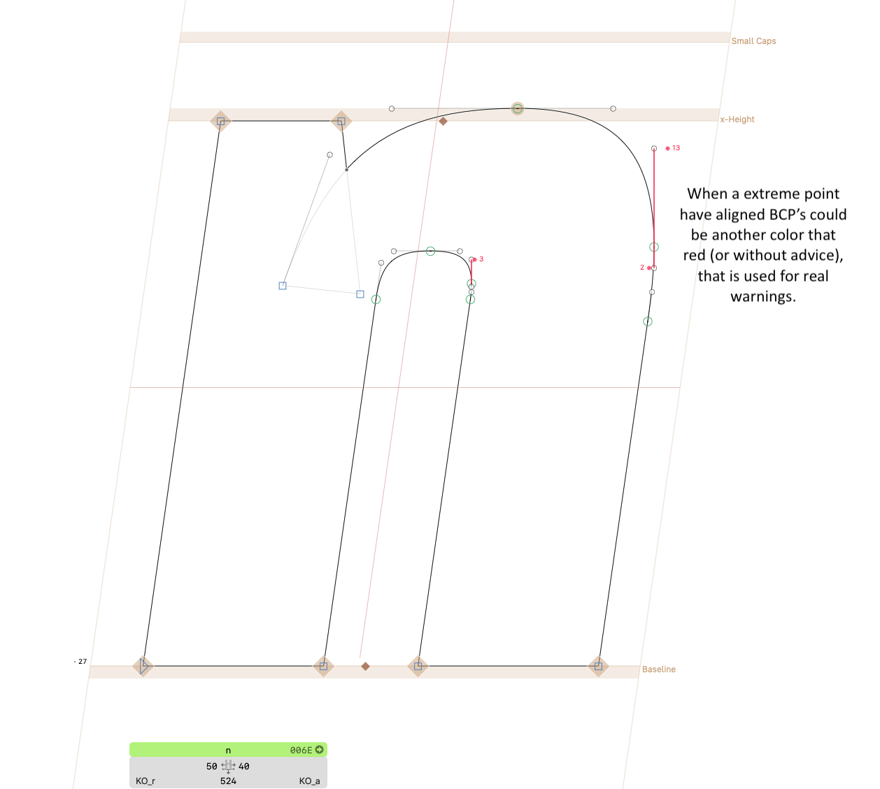
1. Vertical segments with 0 degrees.
Prevents to highlight vertical segments with an exact angle of 0 degrees, like a handles above/below the left/right extreme points.
2. Line + tangent node + handle.
Prevents to highlight the handle if the line has correct angle, and if handle is not broken. The broken handle is always highlighted (when the difference between line’s angle and handle’s angle is greater of 0.5 degrees). Sometimes, if the handle segment is very short, the handle can still be wrongly highlighted (like a broken handle, it happens due to a rounding to integer coordinate when the angle may vary too much), but it is a rare case.
3. Handle + smooth node + handle.
Prevents to always highlight one of the handles around a smooth node if there is no way to set both of them simultaneously to a better position. In this scenario, the better option (without highlighting either of two handles) would be one where both handles would have an average angle closer to Italic Angle (the tool pre-calculates the angles after possible correction and compares it with the current angles before the correction). If the Rounding Down mode is active (by default), the better option (without highlighting either of two handles) would be one where both handles would have an angle smaller or equal (but not greater) of Italic Angle.
I wonder if it would make sense to allow giving it multiple angles to check. It of course gets in the territory of eye-balling, but some of it may make sense to track:
Tip: Add a note with the highlight color to the name, to make it easier to keep track of which angle is highlighted in which color, like “Italic Angle for the right stem of n (cyan highlight)”.
Read more about the colors
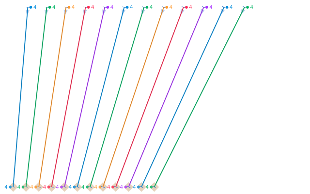
The tool has 5 predefined colors (green, yellow, red, purple, cyan) for 5 different Italic Angles to check (like standard one + 4 custom ones). Standard Italic Angle is always highlighted in red. The two greater (than Italic) angles are highlighted in purple and cyan. The two smaller (than Italic) angles are highlighted in yellow and green.
If you specify more than 4 additional angles, the extra colors will repeat cyclically as shown below.
Tim, it’s a tough decision to choose just one rounding mode because many people might expect to have classic rounding (to a closest coordinate). I still thinking about which mode should be by default so perhaps I’ll do some research.
Interesting. May I ask for the reason for your personal rule? What is the downside of having an greater angle than the precise angle, even if it is closer to the precise angle?
How about a slider called something like “rounding preference”, which would be a simple rounding in the center and move that threshold either way from there?
The slider makes sense, and it could be a more flexible approach. However, there are two questions to consider.
Module installation question [EDITED] – answered by Georg in the following comment
What I don’t like about dialogs that both of implementations requires the users to install additional modules (xCode, Vanilla) to make it work. Vanilla option looks more acceptable because at least there are the prompt to install the module. Regarding xCode, I don’t even look at this option, because most users will give up instead of going through all those steps with downloading, modifying, compiling, etc.
Logic question
There are two opposite implementations of what the slider should doing:
Moving the threshold. The slider could be named like “Rounding threshold”.
If the slider (with range of 0-1) is set to 0.2 → the threshold will be 0.2, that means more rounding up cases.
Moving the direction of gravity. The slider could be named like “Rounding gravity”.
If the slider (with range of 0-1) is set to 0.2 → the threshold will be 0.8, that means more rounding down cases.
At first glance, I think that the second option may feels more natural. Like if I want more rounding down cases, I move the slider from center to the left direction. I need to think about it.
The user doesn’t need Xcode. Only you need it to edit the .xib file and to compile it into a .nib. From there on, macOS can handle the rest. And it is exactly the same way as Glyphs is providing its dialogs.
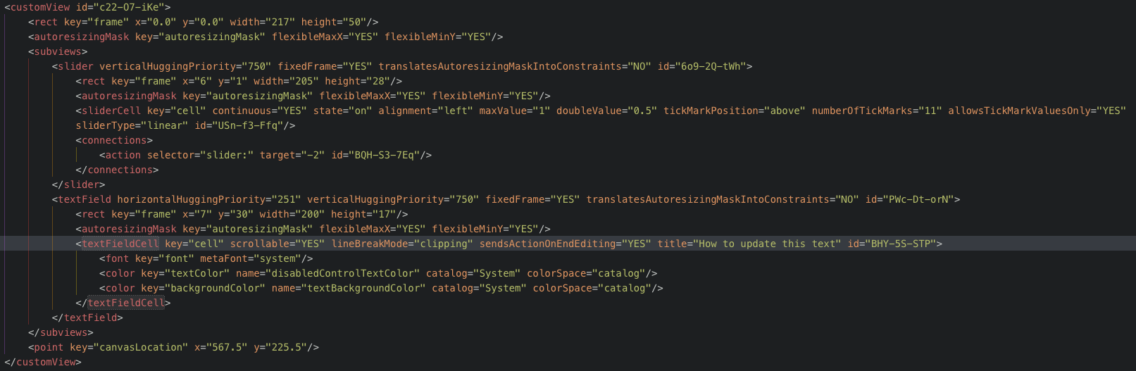
Select the text field (with title="How to update this text").
Control-drag from File’s Owner to the text field.
Select textField from the popup to connect the outlet.
When I do so, the connection line appears but the popup with options does not appear. I tried to connect it in opposite way – from text field to File’s Owner – but there are no option like textField to select because “Xcode doesn’t know about the textField outlet in the Python class”.