So I’ve just uploaded my free font family to Open Font Library and noticed two rendering problems on that website. I’m wondering whether that’s a problem of their webdesign, or whether there’s a problem in the hinting or vertical definition of my fonts.
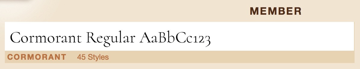
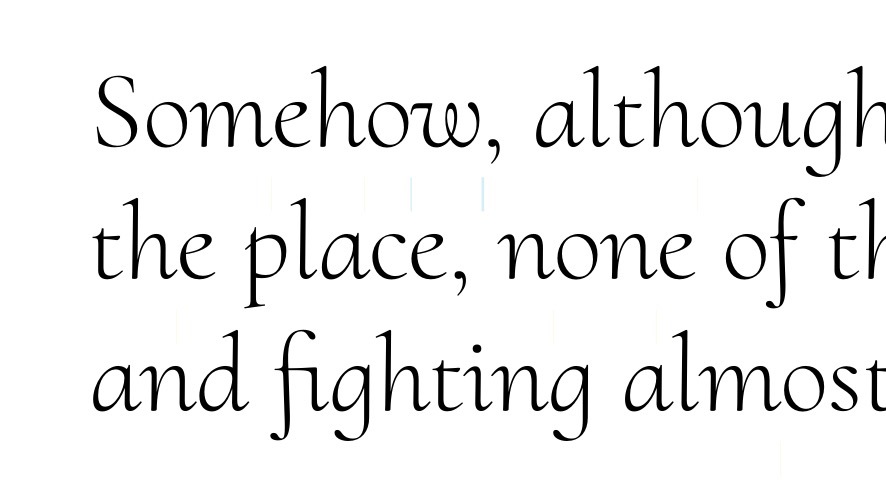
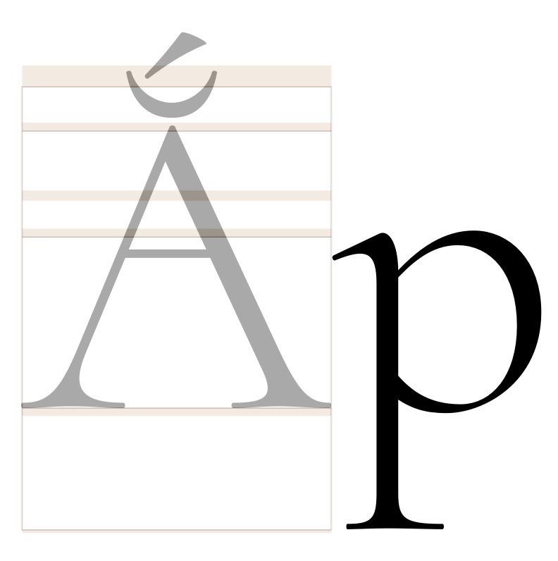
The first problem is that the family preview in my user home page looks crappily rendered. The stroke weights are very inconsistent, especially among the caps, and the arches of the /m are uneven in width and strangely top-heavy.
The Open Type Library staff told me that preview was not a webfont, but rather a bitmap image rendered with a piece of code from FontForge. Given that, I find it quite likely that the code is to blame. However, since I’m using the autohinter and lack any kind of experience with hinting, I can’t exclude a problem with my font either. How can I check this?
Secondly, some of the fonts are clipped at the bottom in the OpenType preview window. This is a webfont now, so at least the rendering works well otherwise (phew!).
Again, this could be bad programming of the web template, or the height of my fonts could be wrongly defined. Which is it…?
I haven’t had any rendering problems with the font in other circumstances so far, so I’m hoping all the problems are on their side. Has anyone else had similar experiences?
If you want to look into the Glyphs source files or the OTF files, you can get them here:
It might be a problem with the winDescender. It is set to 235 but does not include the overshot. add a custom parameter “winDescender=-240” and “winAscender=960” in both masters.
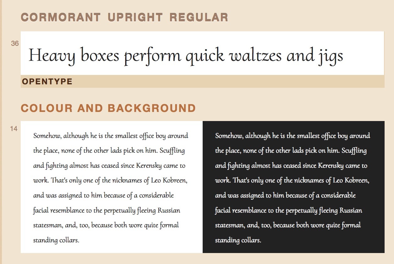
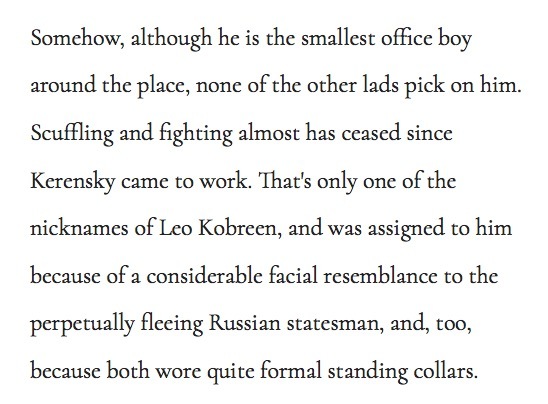
To tell you the truth, I don’t think it is so bad. Some irregularities are to be expected with thin stems in grayscale-only rendering, and considering that, it still comes out nicely. The Helvetica next to it renders much worse IMO.
To tell you the truth, I don’t think it is so bad. Some irregularities
are to be expected with thin stems in grayscale-only rendering, and
considering that, it still comes out nicely. The Helvetica next to it
renders much worse IMO.
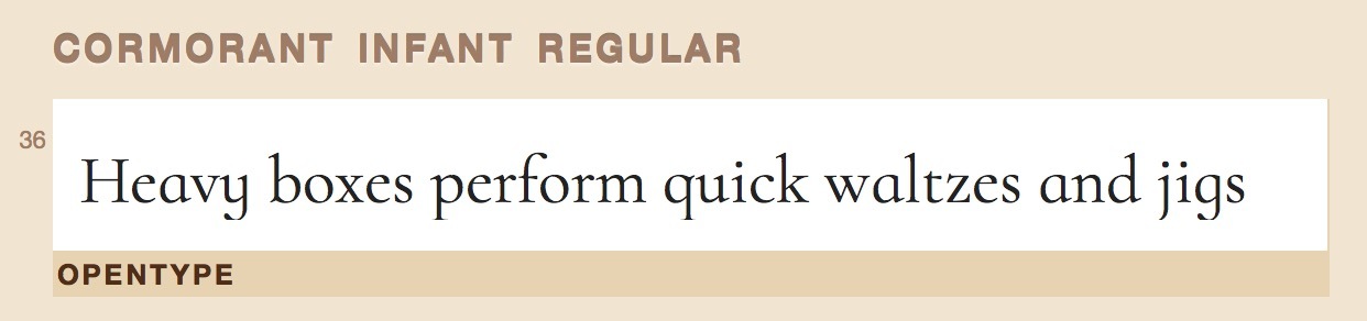
I find the sudden blobs of weight in the caps and in /3 rather jarring. I don’t think the resolution can be blamed; after all, the webfont samples on the project’s page are about the same size and render much better (cf. the Cormorant Infant Regular sample above). I’m not so worried about this effect, though; I’m pretty sure the FontForge rendering code is to blame. I remember how extremely much smoother everything looked when I switched to Glyphs!
Georg: The winDescent trick seems to have worked. Wheee! Although the line spacing seems a bit wide now. Did you mean to suggest 860 as the winAscent? That would be the difference between –240 and the ascender height.
So if I want my font to have tighter leading and look larger at a given point size, I have to reduce the units per UPM? It’s currently 1000, but the span between my descenders and ascenders is only 855 (I changed the proportions around a bit in the early stages, so it got stuck at a weird number). Can I lower that to something like 900, or will a non-standard value cause problems?
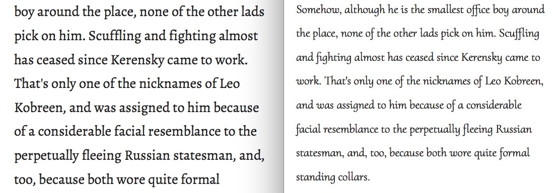
I much prefer the size and leading of Alegreya at the same point size:
Of course. Read the UPM value as the size in units that will be scaled to the font size.
But if you are having a UPM value other than 1000, I would still add a Scale to UPM to 1000 to the instance parameters. A renderer may expect the UPM to be 1000.
After interpolation the coordinates are most likely on floating point coordinates and the upscaling would be done with the higher precision. So that would only be a problem for the masters.
The sum of descender and ascender defaults to 1200 units. You need to include some space for accents on top of the upper case letters.
OK, I did try setting the UPM to 900 and rescaling to 1000, and the master glyphs turned out quite well (at first sight). I might go with that.
It’ll screw up the designs of people who’ve already downloaded and used my fonts, though. Do you think it might be better to leave the scaling as it is…? If not, I suppose I should change it now rather than later.
I’m not sure I understand that. A default Glyphs font has Descender –200, Ascender 800, which add up to 1000 = UPM.
You’ve downloaded the GitHub repo already, right? Just duplicate the Cormorant_Roman.glyphs, set its UPM to 855, then rescale it to 1000. The screenshot was from the onstroke of /n.
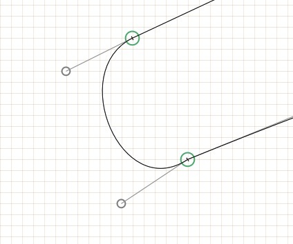
I suppose such things could happen more commonly in the Italic and Upright cuts, though, since they have more non-vertical/horizontal handles.
As for the algorithm: You already have a functional rounding algorithm implemented in alt-nudge. How about applying that to the shorter of the two handles after a transform? (That’s how I fix broken curve points: Alt-nudge the shorter handle up–down or left–right once.)
There is a fontbakery tool that will fix up TTFs according to this recommendation - which for this family is asc/descenders/linegaps of 802/-242/0. Here is the fb output: https://gist.github.com/davelab6/eb6e5468ba4f69723b9e
You can see that the bbox to upm ratio is 104%, but 120% is more typical; this means you have potential to scale the xheight on the upm, making the apparent size larger (ie similar to Alegreya)
I’m having trouble wrapping my mind around all these different keywords. I have made a rescaled version of the font that does look similar to Alegreya in terms of filling the page (see second Kerensky text above). Its in-Glyphs parameters are now –250, +750, UPM 1000, with winDescent = –285 and winAscent = 1020. However, its Vietnamese accents spill above the ascender height: