Ok, ok, I think I’m catching up here. Dave, if I understand you correctly, fontbakery checks for the highest and lowest point of ink in the fonts and sets all these different ascender and descender keywords to those values to ensure that nothing is clipped upon rendering. The actual dimensions of the ink within the em box are not changed. So you end up with an em of 1000 units and glyphs extending out over a range of 1200 units. So I can use my current rescaled fonts and just have to run fontbakery to ensure that the metadata are correctly set. Is that correct?
I suppose I could add fontbakery to the shell script that I’m using to regenerate the “download for dummies” ZIP file and the Open Font Library upload. Does fontbakery also work for OTF fonts? Or should I just offer TTFs anyway? Is there an advantage to also offering OTFs?
EDIT: I tried installing fontbakery, but started getting errors halfway through the process.
Alright, it took me a while to figure out that Scale to UPM was a custom parameter on the instance level, and that I didn’t have to rescale the masters in the source files… also, that winDescent should apparently be a positive number.
Anyway, I finally have a new version that looks more natural and doesn’t clip on Open Font Library. It’s on GitHub now.
Dave, I assume Cormorant will be piped through fontbakery upon ingestion into Google Fonts?
Good to know. I think the main problem in the end was that I had too large a winAscent value, as per Georg’s suggestion above. I now have 790 (rather than 960), which is basically (ascender – descender) * 1.2 + descender.
(Correct me if that doesn’t make sense!)
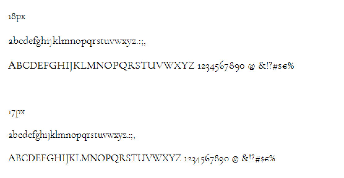
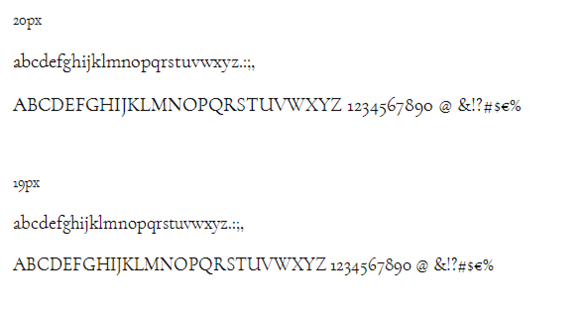
By the way, on Open Font Library, strangely enough, the Upright Medium still looks small while all other cuts look larger:
I’m using the same rescaling custom parameter there as for all other instances! Though I also note the cut appears twice on the page, so something must still be going wrong.
EDIT: Fixed that. There were outdated OTFs lying around in those directories with slightly different names, so they weren’t overwritten.
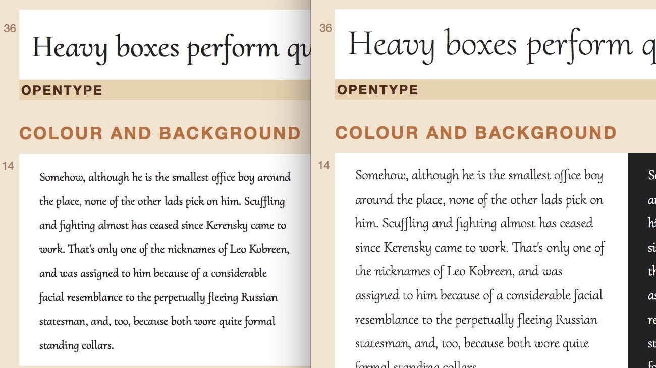
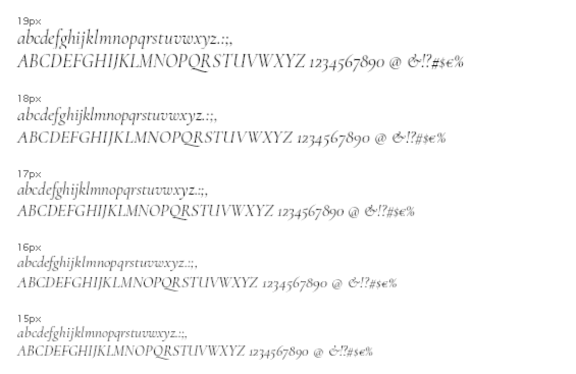
Argh — now that Cormorant looks right on Open Type Library, I’m running into new problems in FontSquirrel. Look at this failed hinting:
So far the fonts have looked nice everywhere else. Do you think the autohinter has failed, or are they just using a bad renderer? I saw EB Garamond also looks bad at that size on their site, although at least the baseline is not dancing around.
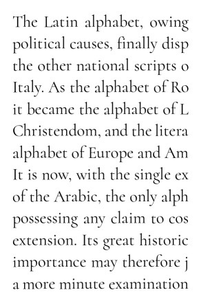
(I presume the alignment zones are scaled up along with “Scale to UPM”?)
EDIT: Dave Crossland pointed out to me that there are height differences between equal characters, e.g. the /m in “importance may”. I guess it’s not the hinting, then…?
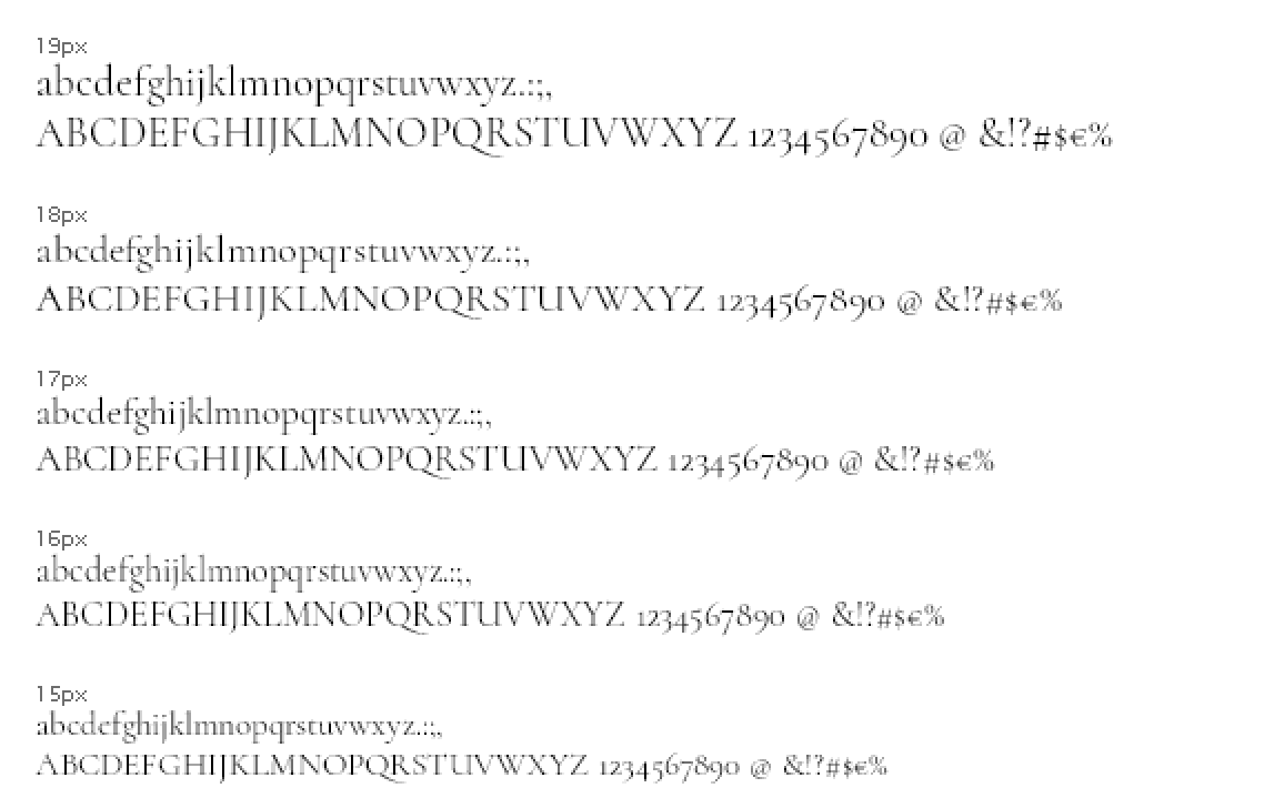
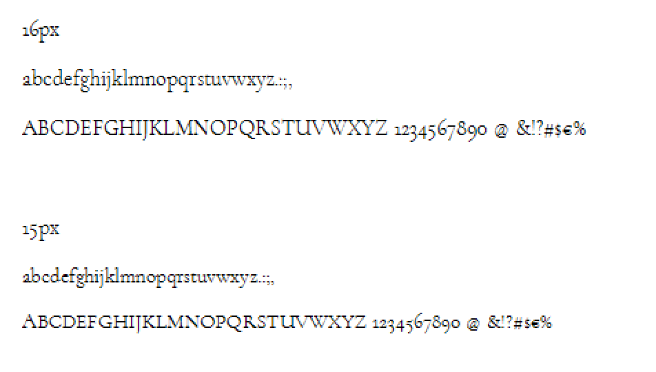
Frode Bo Helland kindly sent me a few screenshots of Cormorant in Windows Chrome and Windows IE. The hinting doesn’t strike me as particularly bad at sizes 15 and above, although there’s certainly room for improvement. Is this the usual performance of the Glyphs autohinter, or is something going wrong during the UPM rescaling here?
What I’m really worried about, though, is the clipping in the italic at 19 px. I thought we had sorted that out…? I hope that will at least resolve itself when the fonts are put through fontbakery before they’re ingested into Google Fonts.
Is there something I can do to improve Glyphs’ autohinting of these fonts, or would manual hinting be the only way?
Do you think the clipping problem could be fixed if I lowered the descender depth to the bottom of the bounding box and gave it a positive alignment zone?
Are those screenshots from ttf or otf outline? What version of Windows/Browser? The latest version of Chrome is supposed to use the same rasterizer (DirectWrite).
The clipping is controlled by the winDescend value.
The line spacing is odd. Quite OK on Chrome but way to big on IE.
I asked for the TrueType fonts to be tested, so I assume it’s that. I don’t know Frode’s OS, but the browsers were Chrome 44 and IE 8.
I do have winDescent = 245 as a custom parameter in all the masters. The nominal descent line is –235, and my overshoots are less than 10 units. (Should I lower my descent line and make the alignment zone positive?)
Frode also mentioned that my exported fonts are lacking some of the extreme points required for hinting. I thought Glyphs ran Add Extremes before exporting?
Then again, if I actively run Add Extremes, it will leave a lot of the offending glyphs untouched while adding some points at unimportant places. So maybe Add Extremes is, in fact, executed upon export, but it’s not doing its job well enough…?
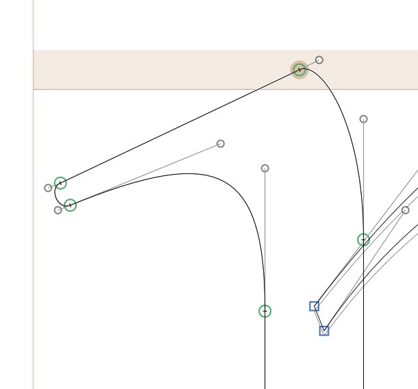
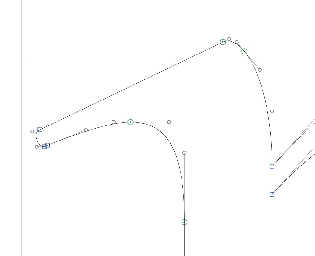
In any case, I have many fine structures in my font that I tried to make pretty at very close ranges, such as the top left of the /n (image below). When I try to add points to that endcap, it will turn ugly. Is that really necessary…? (This is one of the many missing extremes that Add Extremes doesn’t add.)
I’m wondering whether I’d rather have maximally pretty glyphs at large sizes rather than good hinting on small sizes.
Frode told me his rendering was with the Cleartype engine whereas most contemporary browsers use DirectWrite, so I guess the fonts will generally look better than shown above.
You can generally omit extremes on fine details. Extremes are for proper hinting, and those delicate details won’t be any good even with extremes (so you can do without).
Maybe Frode was referring to some other extremes of yours that were indeed essential for the case at hand.
He said “diagonal serifs”. I do note that the concave arch in that screenshot is missing its apex, so maybe that’s one of the troublesome omissions. I’ve corrected that now.
Well, you are missing a horizontal extrema on the last screenshot (if that is what you mean). And also you top extrema might need some help (it is not exactly horizontal).
Yeah, apparently Frode was referring to the very top of the stem. I suppose I can add a horizontal extremum there.
This is what the same area looks like after TrueType exporting, BTW. Pretty ugly! I’m wondering whether the UPM scaling is partly to blame. The OpenType exports are much closer to the Glyphs source.
Hi @davelab6, one think that I can tell you about the different metrics strategics if to avoid leave hheaLineGap = 0. If CoreText read a font with hheaLineGap of zero, it will add 20% of the embox as a LineGap, You can see this in Safari.
Best,
Nicolás
Georg, Rainer, could any of you confirm that the dancing baseline issue demonstrated above is a hinting problem, as opposed to something that could easily be fixed with other means in Glyphs? If I’m going to hire someone for this job, I’d like to be sure that’s going to fix the problem…
Will manual hinting inside Glyphs affect both OTF and TTF output?
It looks like a hinting problem, but really I don’t know. The screenshot does not say which system, which browser. This is essential information for questions like this.