I’ve re-read the autohinting tutorial and realized my ascender alignment zone had a size of +41, which was way beyond the recommended max of +25. Maybe that caused trouble? I’ve fixed that part, in any case; let’s see if the exported fonts behave any better.
Also, should I reduce my stem sizes from two verticals, two horizontals to one each?
Mekka: I believe it was an OTF file used in Firefox on a Windows machine, but I’m not sure.
BTW, I have Scale to UPM as a custom parameter in all of those instances. Are the alignment zones and stem widths scaled up accordingly before autohinting…?
My font is pretty well-behaved in terms of having vertical stems and serifs and such, for a change, so I’m really confused why autohinting shouldn’t work as advertised.
There is a mandatory restriction on the BlueScale value and the maximum height of an alignment zone that is best described in rela- tion to the 300-dpi point size discussed above. The product of (pointsize − 0.49) × (maximum alignment zone height) must be less than 240. For example, if the maximum alignment zone height is 23 in some font program, then the overshoot suppression turnoff point size at 300 dpi can be 10 but not 11. This restriction ensures that overshoot suppression will turn off before the overshoot reaches a full device pixel.
That means that in your case (41u for a zone), the extra pixel cannot be suppressed at 18 PPM (13pt on a Windows screen, 6pt at 300dpi) anymore.
(Though if I put that through BrowserStack, the Windows versions still look rather flimsy and ephemeral. Isn’t ClearType supposed to make solid strokes out of the letters there?)
CFF outlines do look a bit subpar on windows before Windows 8, and it was improved again in Windows 10. But anything bevor that ist mostly unusable at small sizes. Thats why we need to deal with TT hinting, as it is the only way to get decent rendering on Windows.
By the way, my current entries in the horizontal stems are (1) the serif height and (2) the height of the H-bar. Should I add a third width for the thickness of the /n’s shoulder and /t’s foot?
The TTFstems custom parameter is set at the Masters level. Some of those TTFautohint-related parameters have special pop-ups for entering values that might be helpful. Some parameters will be set at the instance level.
[ I know that’s not much help, at the moment. I haven’t yet played with the settings, so don’t have additional to offer, right now. ]
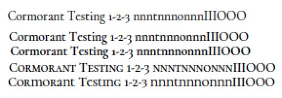
Alright, I added the horizontal width of /n’s shoulder and /t’s foot (averaged) as a TTFstem. The image below shows the output of that font as produced by Adobe Reader (I dropped the TTF into the Adobe/Fonts folder). Looks pretty good to me.
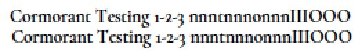
I replaced one of the lines by my pre-installed Cormorant Book version. It looks ever so slightly worse, especially where the top left serifs of /n etc. and the apex of /t are concerned (the old font is on top):
I’m not sure whether the extra TTFStem did the trick or whether that was the redefinition of alignment zones, but I feel we might finally have a workable solution! I’ll try to get some screen shots from other platforms with the new fonts.
I’ve received the following feedback on typografie.info:
Ich bin keine Experte für das Debugging von Hinting, aber mir war bei
den 0.4er Versionen aufgefallen, dass bei den OTF-Versionen Autohinting
unterbunden sowie die meisten Menüpunkte zum Hinten deaktiviert waren
(wenn ich sie mit FontForge geöffnet habe), während die TTF-Versionen
detaillierte Hinting-Informationen hatten.
Is it possible that there’s a problem in the export of autohinting when making OTF files? I’ve certainly kept the autohinting box checked during all my exports. Of course, it could also be that FontForge doesn’t know how to open OTF files properly…
Is this basically as good as it gets without manual intervention on the individual glyph level, or do I still need to tweak the master-level controls? Note that this is explicitly a display font, so I don’t expect it to work at arbitrarily small sizes.
Otherwise, is there a custom parameter to enter a ttfautohints controls file?
Christian: I took the liberty and edited your post to insert the images inline. It is difficult to follow multiple links, drill down on another website to have the original JPEGs displayed, and then somehow compare them. For future posts, you may want to take a look how I inserted the images in your post.
User Catfonts on typografie.info posted this nice bundle of screenshots from a Win 10 machine. The rendering looks much improved over Win 8.1 in all browsers. I suppose the Windows hinting problem will grow itself out in a matter of a few years, then…