I’ve got a problem with the interpolation in the version 1218. I’ve got a six masters setup. Instances are made in 5 widths and 10 weights. For the most part all instances look good and I’ve started adding additional masters for individual glyphs (the Brace Trick). The problem appears when i tried to fix the appearance of the number 2.
Any ideas what’s going on? I’ve tried the 1075 version and it doesn’t make this problem, but I really wouldn’t want to go back to old versions. I’ve checked all 6 masters and there are no kinks anywhere and the paths are compatible.
Adding new masters will not fix this. This is a kink. They usually appear where two curves connect diagonally. but also when a diagonal line and a curve connect. The proportions of the diagonal line and the tangent handle need to be the same in all masters.
I’m not sure I understand this. Do you mean (for example) if in one master the line is 10 points long and the tangent handle is 6 points long, in another master if the line is 20 points long, the tangent should be 12?
OK, although I’ve been using the dekink script many times I obviously did not understand fully how it works. Thank you @GeorgSeifert and @mekkablue, now I get it. And the MM tutorial explains it perfectly. Although I read it more than once in the past couple of years, this bit of information about keeping things proportional somehow eluded me.
If it is static fonts you are exporting, you could add the RMX Dekink Only function as custom parameter. Very short handles and segments will always be problematic though.
I know that, but I prefer to have full control of the final shape. Turning on that custom parameter kinda feels like “hey I can’t solve this problem but let’s click the auto button and hope for the best”.
The outcome of the parameter is predictable and verifiable. You can double check the resulting shape in the preview area, so you do not give up control over your shape. I would give it a try.
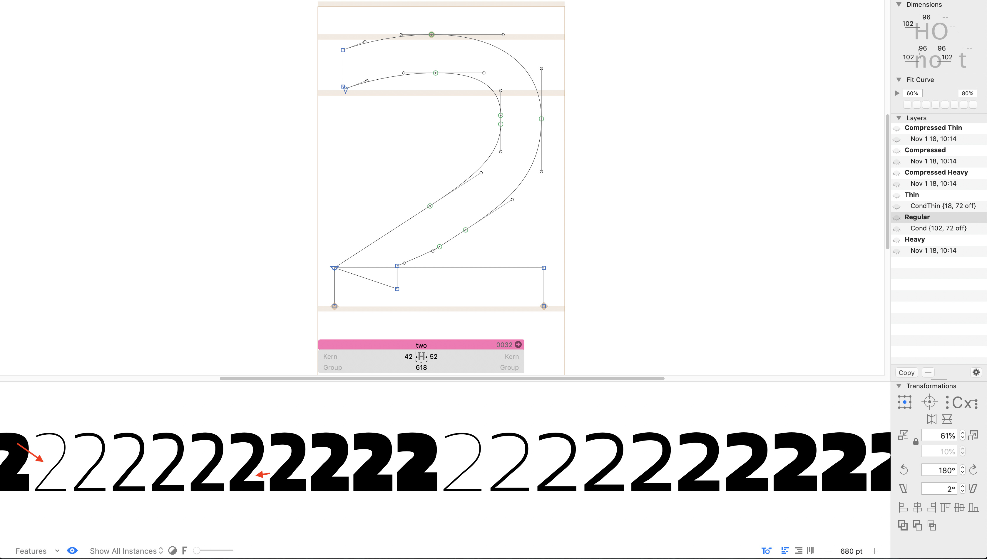
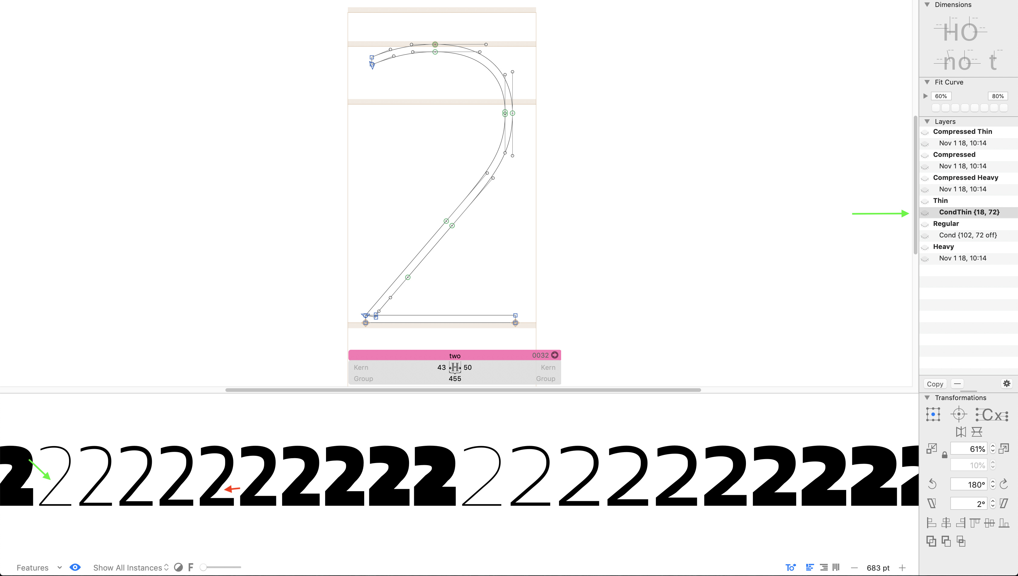
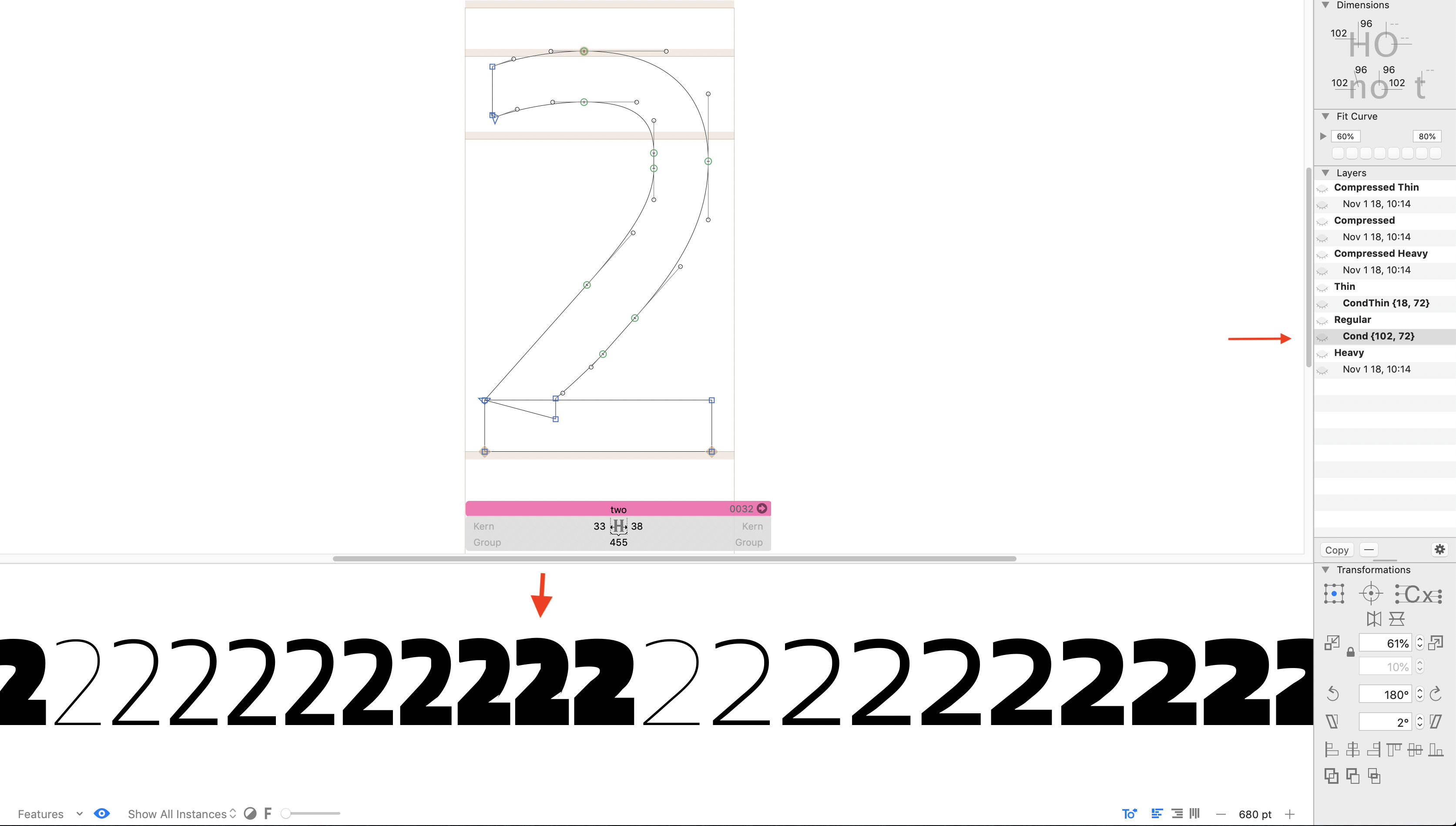
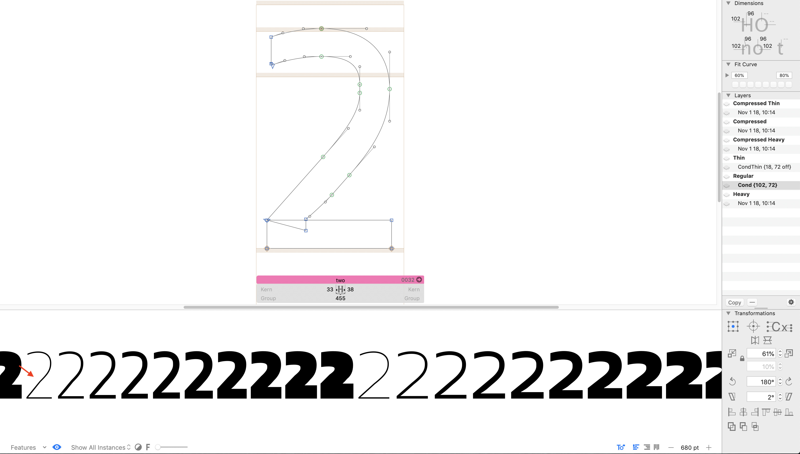
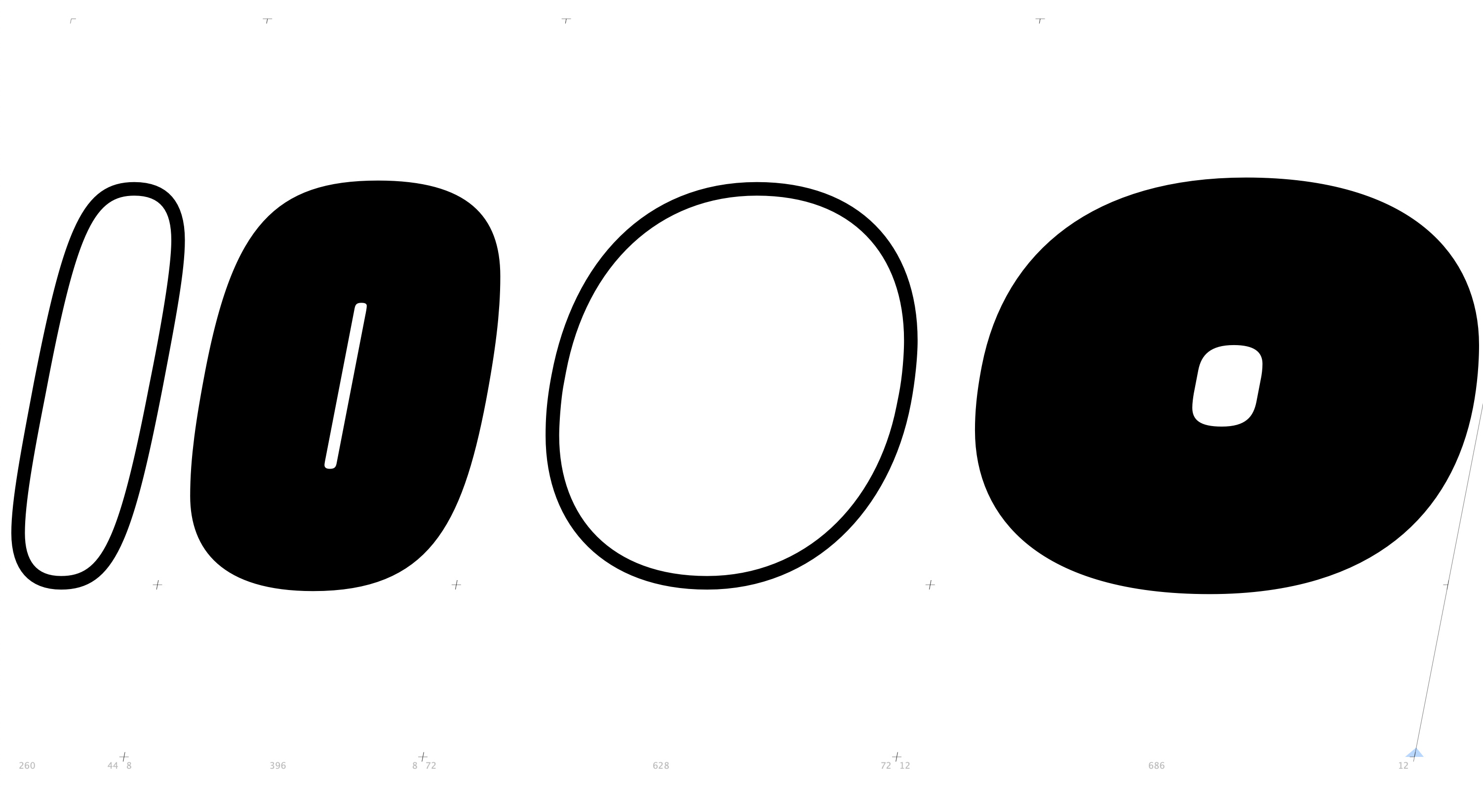
The Oblique I’m making is becoming a dekink nightmare. Is there another way to deal with the kinks? Because of the design, there’s no way to keep the nodes and BCP’s in the same proportions across masters (see picture). And I want to be able to export variable as well as static fonts.
Due to the high contrast in weight I have to keep more nodes than I like to in order to keep a decent shape in the Compressed style – this is causing many small kinks in a bunch of instances.
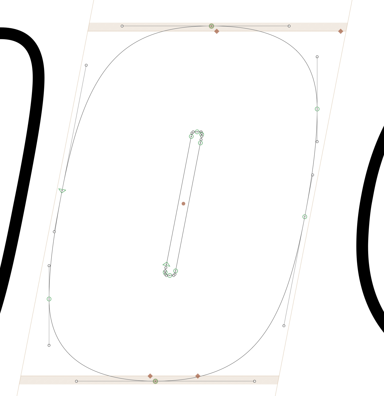
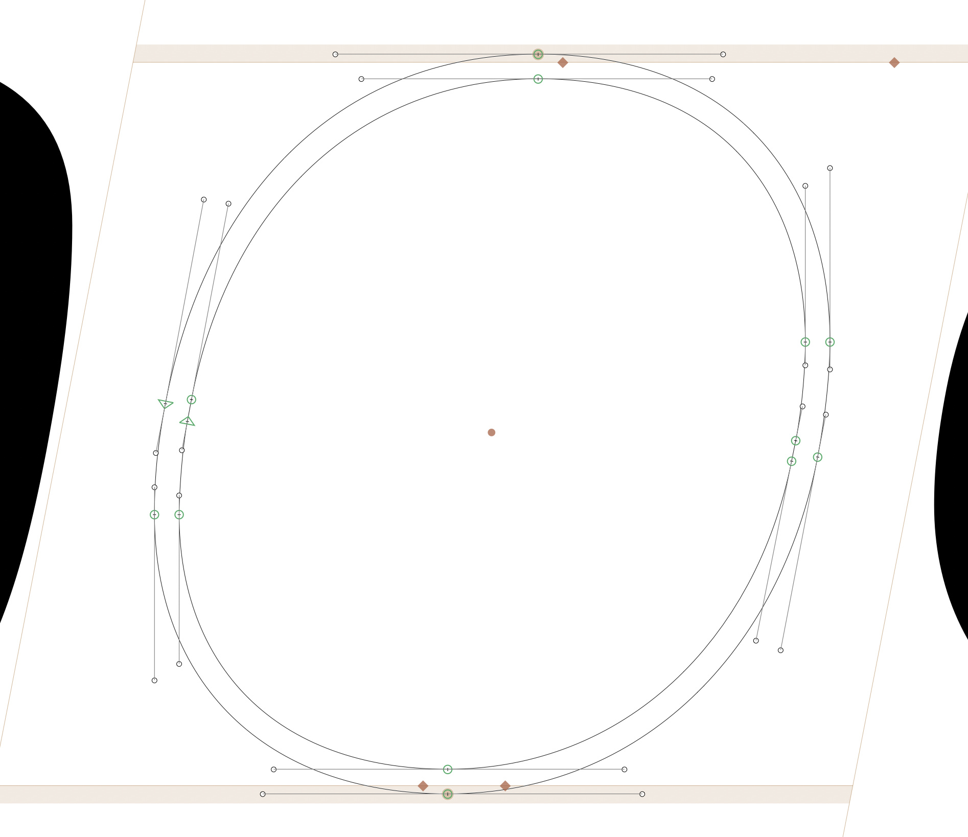
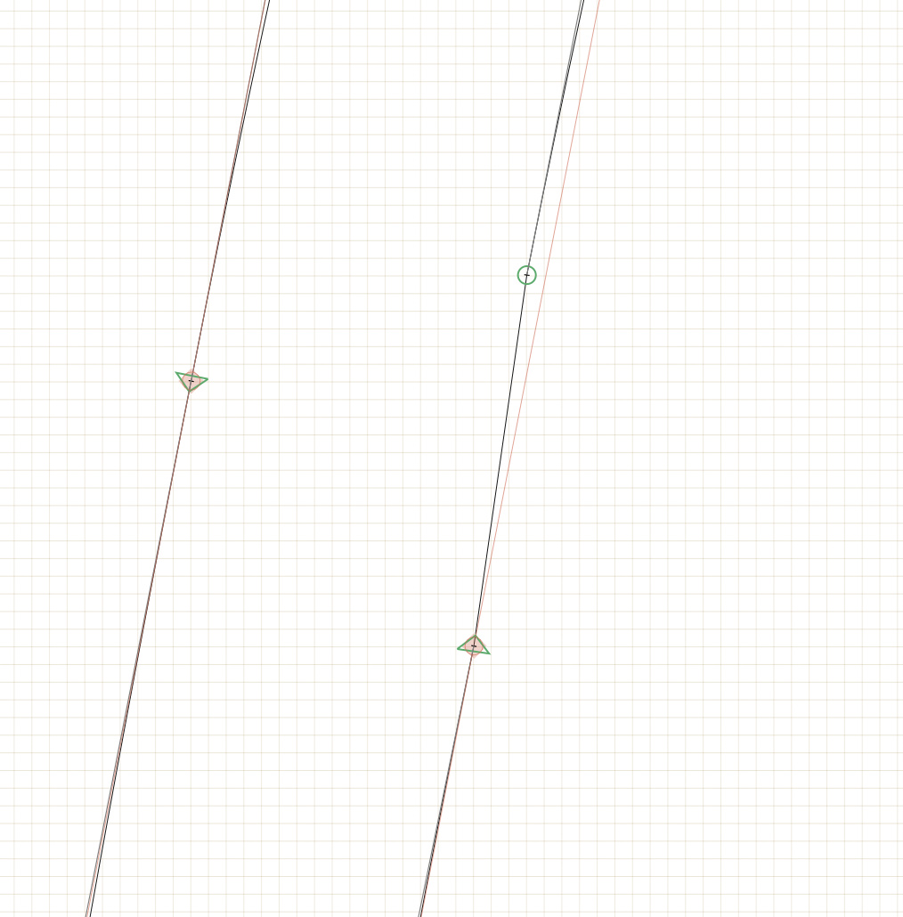
All the straight lines are set at the same 11° Italic angle, as precise as possible. I’ve been using the Dekink Script but in many glyphs it is forcing me to have ridiculous shapes. Adding masters with the brace trick does help in some cases. Most of the time kinks happen like this (this is an auto-interpolated instance):
The top right node should obviously be moved one point to the right in order to keep the 11° angle. Can Glyphs recognize this type of kinks and try to correct them automatically? I have set the Italic angle and stem width in the font info.
My other option could be to try and remove the extremum points, but I’m reluctant to do that because I want to have a crisp on-screen appearance. Any thoughts?
Is it for a static font family? You can add the extremums after interpolation. With an AddExtremes; include: o filter or prefilter parameter.
But do you really need the second on-curve point there? It creates a pretty short diagonal line segment. And that is always problematic in interpolation.
Well, yes I do need the second on-curve point, that’s why I posted three pictures above – to explain myself. Take a look at the Compressed Heavy O there. In order to have that shape I can’t avoid those straight lines for the counter. Could your Dekink Script be made to somehow prioritize the Italic angle when it makes corrections (while ignoring the proportions)?
And yes, I want to be able to export variable as well as static fonts.
All advice says to keep the UPM at 1000, which I am doing. I agree that changing the UPM seems like it could solve this problem, but I don’t know what other problems may arise from that.
Knikola, you would likely be safe with 3000 if it is a normal-width font, and 4000 if it is condensed. The biggest problem you might run into is if you have any glyphs that exceed 4096 in width. The higher UPM will definitely help you resolve inflection problems because you have those extra units to work with to maintain shape.
@George_Thomas While I could use extra units to work with, I can manage maintaining the shape at 1000 UPM. The problem is that I can’t retain the same proportions between points across masters because of such huge contrast in the design which results in auto-generated instances having many (mostly tiny) kinks. I’m surprised that @GeorgSeifert says a higher UPM would not improve the instances – it seems like a logical consequence.
So, what’s your advice? So far I’ve been using a combination of the Dekink Script (where possible) and adding individual masters with the brace trick. This way I managed to correct many kinks but it’s a lot of work and I’m afraid I’m missing some.