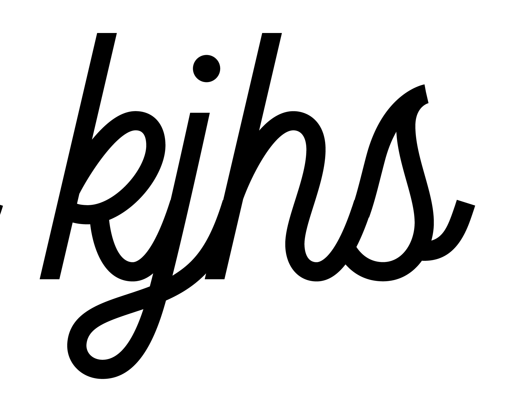
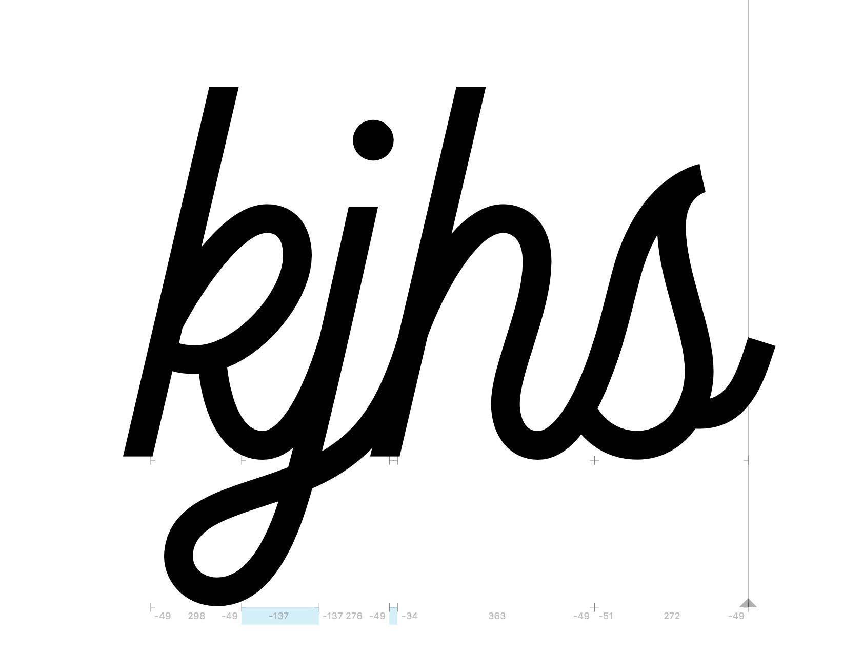
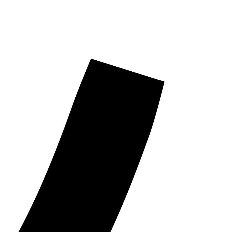
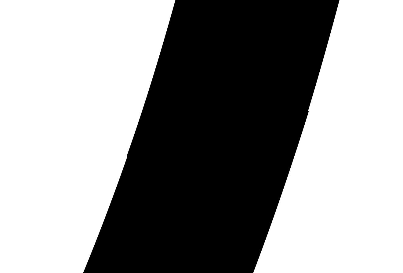
I’ve noticed when I export my typeface, the kerning gets altered in a very slight way. It’s not that the kerning isn’t working at all, like some people run into. It may be hard to see from the two images, but in one you may notice where the letters are supposed to connect, they are shifted a very small amount. You will see the photo where the same letters are typed out in glyphs and it looks correct. Very confused on how to fix this. Any thoughts?
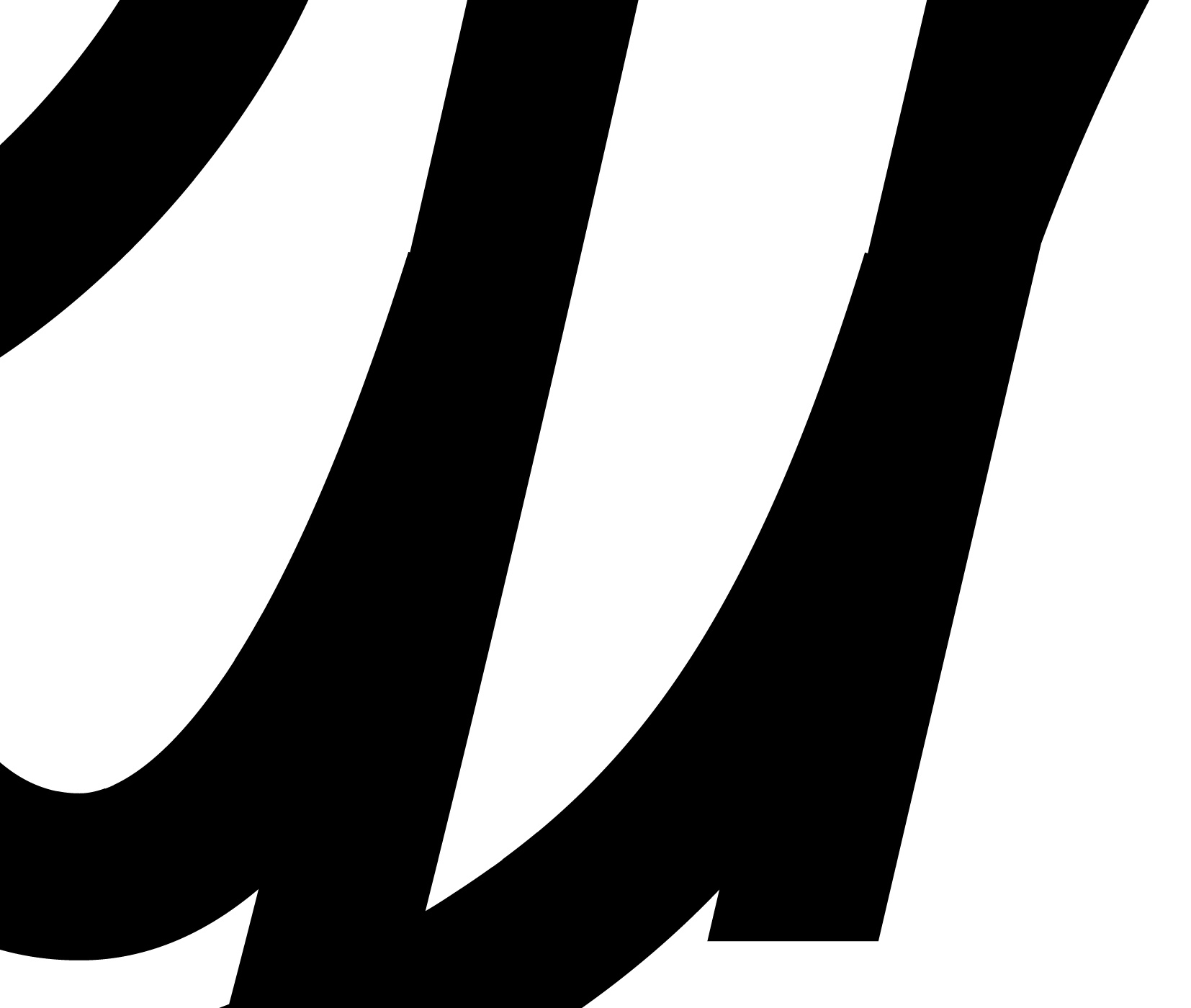
Just realized the image quality gets shrunk when I upload, so it really is hard to see what I’m talking about. An even more zoomed in view may help.
Is that what you meant? The trouble with this font, is that it is a single weight. By extending the stroke, it would push through the other side. This style calls for a pretty exact fit unlike some chunkier scripts where you can hide things. I suppose I can taper all of the connection points slightly, and it won’t be completely obvious. Not ideal but that’s probably the best route to take. Good to know for future reference when designing!
You shouldn’t have to kern a connected script (for letters that connect) at all. Spacing shoud be baked into the design of the letter and connecters themselves. if you have to kern it to make it work it usually means something is wrong.
That’s a fair point. I always try to get it as close as possible without needing to kern first. Though I disagree that the need for kerning means that something is wrong.
This is probably only my sixth typeface, but I feel each one gets closer and will aim for not needing to kern much at all as I continue to progress! Thanks!
@nick_fred – In a connecting script, @Jscruggs is correct; you should not use kerning. Consider that somewhere a user will have an app that doesn’t support kerning or allows them to turn kerning off. Then your font will not join correctly.
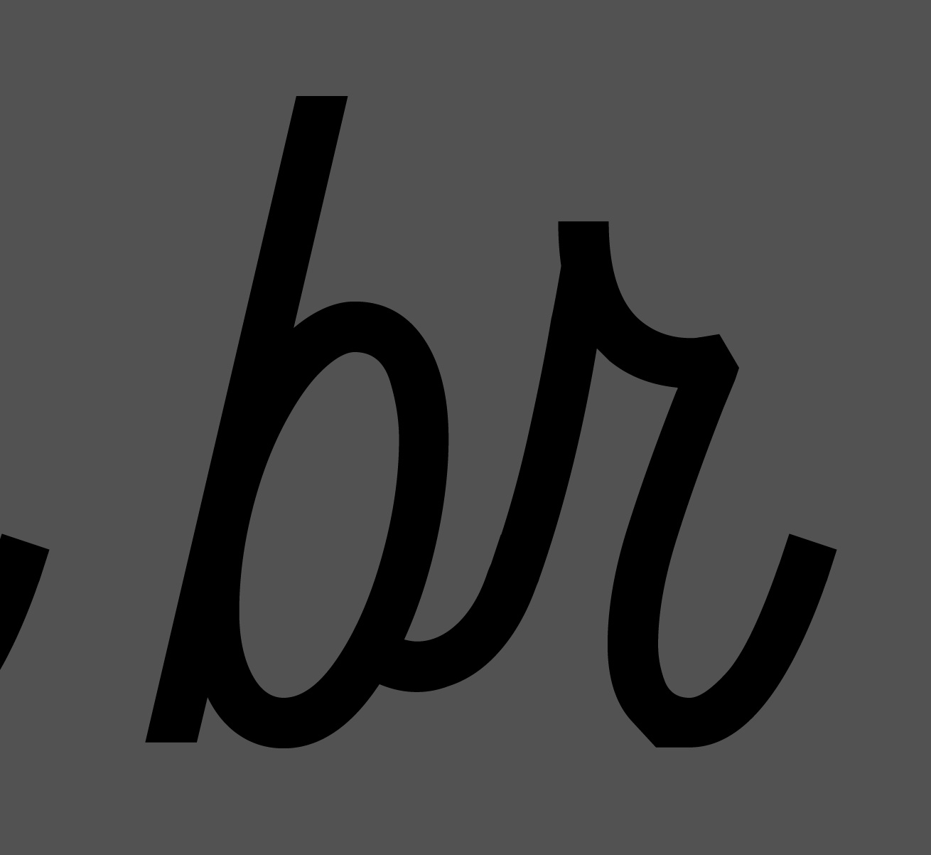
Ahh that’s a great point. Something I will strive for moving forward! I suppose the way to go about this is making all the letter ends exactly the same? That’s what I tried for the most part. Just had to adjust things slightly for a couple of letters. For example “e” and “c”. They looked quite odd using the same uprightness as the majority of the other letter connectors. I suppose that’s part of the challenge of typeface design. But I guess in the end there will always be cases where kerning is necessary. FA, WA, etc.
As already stated with a script like in your example there should be no need for any lowercase>lowercase kerning at all - Make all the exit strokes end at the same height and have the same width. Then space each letter so that the exit stroke joins flush to the stem. As you’re choosing to join the ‘s’ with an intro stroke, start by making this connection smooth with three s’s in a row and then use this connection as the basis for all your other letters. If done right it should leave you with smooth transitions and no need for lowercase kerning.
This is very helpful, thanks so much! I wish I there would’ve been more resources available when I first started learning so I’d know the do’s and don’t’s of typeface design. Happy to have learned some things here today, but definitely wish it was stuff I knew already haha!
So essentially kerning is a feature and deciding the letter width is more of a foundation. I didn’t realize the benefit of one over the other, but now see that kerning should be avoided. Thanks!
What about cases like the letter o, v, and w, for example? I have these exit strokes different than the other letters. Should I just figure out a way to rework them so they are the same as the other letters? I feel they may look a little funny but if that’s the best practice, I’d like to learn that now so I can get into a good habit.
What I’m currently doing is making ligatures out of ox, vx, wx, etc. when I run into this.
The most important stage in drawing a connected script is getting the connection system working and tailoring it to your specific design. I’d recommend studying some of the classic script designs developed for metal type. e.g Excoffon’s Mistral etc. Many of these typefaces contain great methods and tricks of getting a connected script to work well without the need for kerning and contextual alternates etc (While still looking fluid and natural).
With a connected script its always wise to consider the trickier connections (o, r, s, v, w, x, z) at the beginning of the design process so you can tailor the join height and angle etc to your typefaces connection system. Sometimes however it may be best to make use of ligatures/contextual alternates to achieve your goal. For your example above you have three options:
a) Rethink and restructure your connection system to work with the trickier letters - (making the intro strokes higher and the exit strokes dip lower on letters like o, w, v etc, giving you more room to manoeuvre and connect smoothly to letters with into strokes like x.
b) Make ligatures like you mentioned (put .liga on them to automatically generate them in the default ligature feature code)
c) As Georg mentions make use of the calt feature and make separate versions of x and all other letters with an intro stroke that with connect smoothly to the previous letters exit strokes. Then write the feature code to substitute the default x with your new x when it follows w, v, etc
Man this is so helpful! I really appreciate the practical tips such as studying classic script typefaces. I know I could benefit greatly from that. Also moving forward I will start by planning the harder connections early on.
UPDATE:
I deleted all the kerning pairs and started over by getting the exit strokes the exact same, and avoiding kerning all together. Immediately I noticed that when I export, I get a result when typing in Illustrator that is much better than when I joined all my letters through tediously kerning. However, it’s still slightly off though even less than I started with. This is way zoomed in, but necessary for critique.
It’s perfect in Glyphs, but not in Illustrator. Like I said, it’s much better. It was a lot more noticeable before I started the thread. I imagine to some extent, that’s just the way it is right? And maybe my best option is to taper the exit strokes in conjunction with avoiding kerning? It’s unfortunate that it’s not 100% accurate, and honestly it’s hardly noticeable but I’d just hate for someone to be using this typeface for their logo or something, and print it out in a very large size and then realize that it’s not right. Is there any easy thing I can do beyond this point? Perhaps there is a rounding feature that I need to uncheck in order to apply the exact measurements?
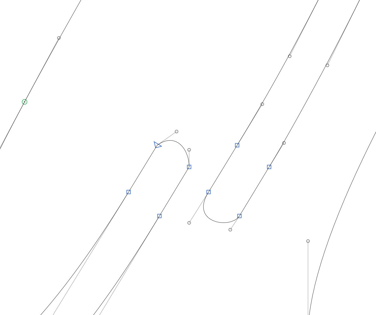
There’s a possibility its just a rendering error in illustrator. Have you tried printing it really large? Have you also tried mergeing the outlines, is it still there?
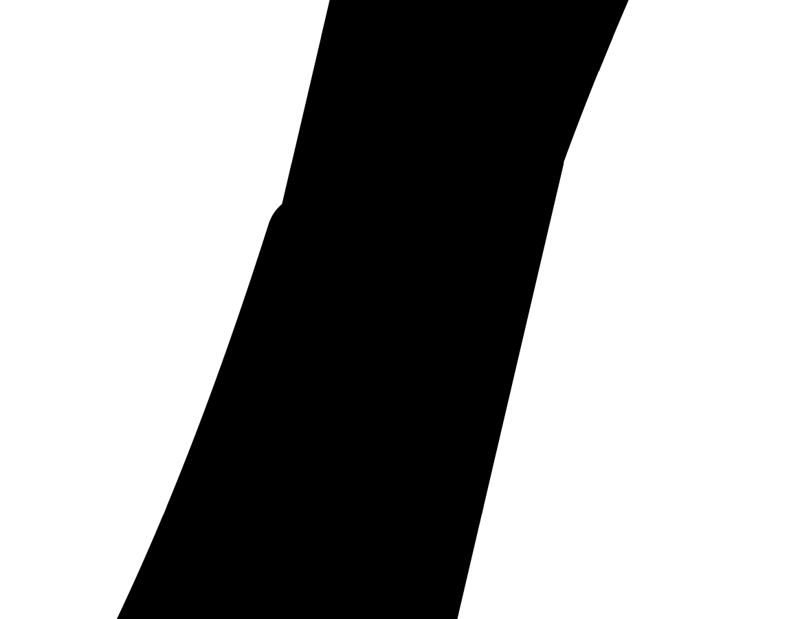
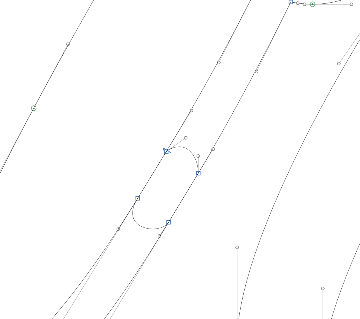
Most likely though is that your intro stroke and exit strokes aren’t transitioning completely smoothly. One method i’ve found to resolve this in the past is to overlap the nodes exactly and have a straight segment that is identical in the intro and exit stroke. e.g:
The above method may be a bit overkill - I would advise you to take a look at Richard Lipton’s Bickham script - Study how he makes the transitions smooth (between a_r etc ). You just have to make sure your transitions overlap is correct and works smoothly for all combinations.