Introduction: I’m a historian and linguist and, above all, the ultimate greenhorn in regard to font development. Aimed at the creation of a fully operational Unicode font for the Lepcha script, I explore the suitability of several font editors.
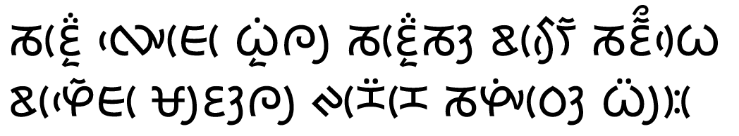
Lepcha is a complex script due to its structure: Vowel sigs and final consonants are grouped around basic letters to the left (up to two), on top (up to two), the right (up to three including ligatures) and/or at the bottom (up to one). As an illustration, see the first line in the attached screenshot.
Working with a trial version (1.4.5) in Mountain Lion, I - quite intuitionally - managed to place anchors to hook superscripts and subscripts to the basic letter. However, if combined, the component typed last is out of alignment. See two examples in the second line of the attachment: Basic letter combined with subscript, then with superscript, and with both.
Since this is only the beginning (one should be able to attach additional components, still), I were grateful for experts’ advice on wether and how this can be overcome. I’d appreciate simple language … as if speaking to a five-year-old child. Best thanks!
I just realize that, as a newbie, I cant post attachments. Instead, I’m trying with an external source:
www.blinkenlichten.info/pics/mainwaring.png
I just had a look at the Lepcha implementation (and improved it a bit on the way, Glyphs 2 will be help you with building components and feature code a bit).
Where are you testing? Indesign, MS Word, browser?
What did you use as names for the glyphs? The glyphs needed to the rightmost example in the second line should be: kha-lepcha, vowele-lepcha, consonantl-lepcha or uni1C02, uni1C2C, uni1C2F.
I’m using the ‘uni-codes’ for the glyphs and testing is done in Nisus Writer Express, a Unicode text editor working most reliably with Tibetan script (which has a lot of stacked marks as well).
If you tell me how this can be done (I can’t post attachments, yet), I’ll be glad to send you my experimental file. I won’t mind to update my system and invest 250 bucks for Glyphs 2 … provided I’m convinced this is the way to go.
@blinkenlichten Hi, I have made Lepcha font with Glyphs before and made initial contribution to its Lepcha support. I can help you with Lepcha font production. First of all, could you download Noto Sans Lepcha from [the link here][1] and see if the font works in Nisus Writer?
[1]: https://www.google.com/get/noto/
Hi Tosche, great to make your acquaintance. Infact, Noto Sans Lepcha is my favoured Lepcha font. As such, I used it in an experimental web page to demonstrate the display of Lepcha script even on a system without a corresponding font. See
The only issue in Noto is similar to the one discussed in this very thread. As soon as there are two stacked superscripts or a superscript combined with a subscript (mainly uni1C2C), proper alignment is lost. If you compare the two samples in the demo mentioned above, you’ll realize that I just omitted Ran (uni1C36) when appearing atop another superscript. I reported the matter at the GitHub noto-fonts page (issue #395) about two weeks back, but there has been no reponse so far.
Thus, any help you can provide will be highly welcome.
Can you post a text that contains some problematic combinations? I worked on it a bit yesterday and could fix the problem if you have a mark on top and below. For some reasons the mark to mark attachment didn’t work, yet.
@blinkenlichten Thanks for the interesting. I thought I made sure the mark attachment worked and it indeed the final font works as intended in my case. However, there is an intended sequence of typing characters, and otherwise you wouldn’t get the ideal stacking of marks or ligatures.
I am also interested to see the comment in that page that says Noto Sans Lepcha reverts to characters found in older Lepcha manuscripts. That is certainly true, and I wished I could see contemporary writing during development. For the sake of better understanding of the script, I’d love to see modern examples but perhaps elsewhere.
@GeorgSeifert I’d love to post examples, however, my status as a newbie forbids attachments while the two links I’m entitled to have already been used …
@Tosche Please, consider that just every Lepcha text printed so far (with the exception of old xylographs) used the typeface created by G.B. Mainwaring in the 1870s, with types cast at the Baptist Mission Press, Calcutta. The vectorized glyphs created by Jason Glavy for JG Lepcha and used for SIL Mingzat and XenoType Lepcha are still Mainwaring’s. Hence, the font you designed at Monotype is the first alternative look in a period of 140 years! Thanks and congrats!
I upgrade your account. But you can always post links to Dropbox or similar services.
What I would need is as many texts that are Unicode encoded. And especially with problematic combinations like stacking marks.
Are there rules what stacking combinations can occurs? Combinations with one on top and one at the bottom are not needed as they work fine now.
To illustrate the problem, I made a screenshot. This offers the advantage of manual arrangement for an expected version. In case you’d prefer strings of uni-codes, please, let me know.
this is how it looks now. The stacked marks in the ya are the wrong order. You example has the ran on top. Are they supposed to be in that order regardless of what order they are typed?
Are there rules what can occur together?
Input should, for practical purposes, follow spelling. The first two ‘words’ are romanized as Máyel Lyángká, so, input should be
LEPCHA LETTER MA
LEPCHA VOWEL SIGN AA
LEPCHA LETTER YA
LEPCHA VOWEL SIGN E
LEPCHA CONSONANT SIGN L
LEPCHA LETTER LA
LEPCHA SUBJOINED LETTER YA
LEPCHA VOWEL SIGN AA
LEPCHA CONSONANT SIGN KANG
LEPCHA LETTER KA
LEPCHA VOWEL SIGN AA
Lepcha sign RAN can only occur with the inherent vowel A (which means: no vowel sign) or Lepcha vowel sign I. Input should be immediately after the vowel sign and before final consonants. All the same, if present, RAN is always the topmost superscript.
And, in fact, the two documents linked to above contain all the basics required.
Since you’ve demonstrated it CAN be done, I carried on exploring the app and its potentials. One thing I could not figure out after lots of trials, searching the tutorials and EVEN reading the manual:
How do I get vowel signs placed to the right or to the left of the basic character? What I get is a positioning over the basic. I would really appreciate some advice. Best thanks.
Best thanks for your hint. I tried it in the list-view of Glyphs replacing ‘Letter’ with ‘Mark’, but that did not last. Though I immediately saved the changes, the category auto-reverted to ‘Letter’.
 Best thanks!