Hi,
I’ve read what I can find with tutorials and forum posts regarding mark to base positioning but am still confused and missing something. If you can point me to a tutorial on Mark to Base that is appreciated.
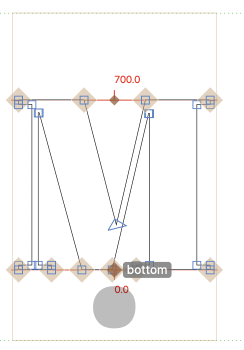
As a test I set up anchors for ‘M’, ‘dotbelowcmb’ and ‘commaabovecmb’. When I look at ‘M’ and click the bottom anchor I see the dotbelowcmb.
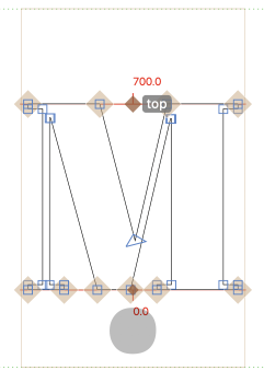
When I select the ‘M’ top anchor I don’t see the ‘commaabovecmb’.
Some additional things I don’t understand
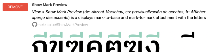
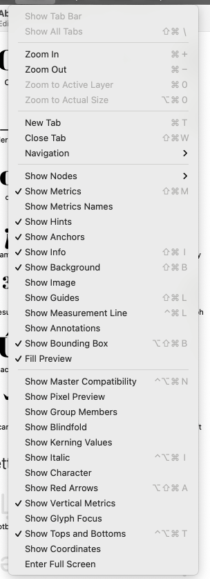
In the ‘View’ menu I don’t see the Show Mark Preview extension I installed
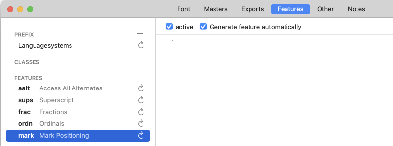
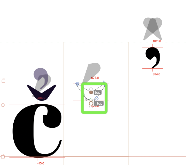
It may be more efficient to stay with CCMP rather than marks. I have only a dozen instances of glyphs I need to work with, and precise placement of the marks is important. I re-verified the top/_top and bottom/_bottom anchors and attached a screenshot. Can you point me to an example font with mark/mkmk in manually configured in Features?
I removed and reinstalled Show Mark Preview and no errors appeared in the macro window. I’m unsure if the Preview is contextually sensitive, but I don’t see it in the View menu.
It appears I’m not understanding how to properly place and configure anchors for mark positioning. I’m assuming, if I was doling it correctly, the marks would appear above/below the corresponding target glyphs.
In addition, not all mark combinations are appropriate for the glyphs with top/bottom anchors. I may want to constrain mark application. Or, I may want to configure various mark/base combinations differently (depending on Glyph, for instance M versus S)
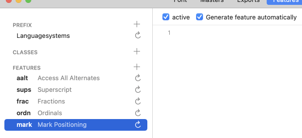
I like to learn more about the Features and how they are configured. Since I seem too be having problems with the auto functions, I’m hoping that programming the mark/mkmk in Features will better help me understand how they work.
I hope this makes sense. When I have problems I like to approach the issue from several directions to learn more how the software works.
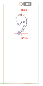
I’ve read both articles several times. I used the Glyph|Set Achors command for the primary glyphs (M, m, K, k, S, s, etc) and mark glyphs. For the commaabovecomb and commaabovecomb.case marks I needed to move the _top anchors to the bottom of the mark glyphs. I assumed, with all anchors set, I would see the commaabove* marks when I view the primary glyph (M, m, etc). However, I only see the dotbelow for the M and m, none of the others.
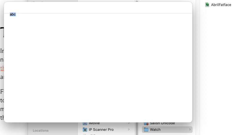
I downloaded TextPreview (I don’t have InDesign) but TP doesn’t show fonts I have placed in the watch folder. Here is a ss of TP and the Watch directory.
The appropriate names are commaabovecomb and dotbelowcomb, with an o.
commaabovecomb was not defined in the mark cloud of m yet. I added it to the Glyph Data. You should be able to see it in one of the upcoming beta versions.
It works fine with View > Show Mark Preview though:
Did you restart the app after installing the plug-in? Are there error messages in View > Show Macro Panel?
It looks like you put a .glyphs file in the watch folder instead of the exported OpenType binary. You need to export an OTF via File > Export, into that watch folder.
My typing error on cmb vs comb…the screenshots of the marks were spelled right but I screwed up typing the post. Also, my not so bright error with TextPreview and exporting the font, got that fixed too and TP works well.
As for Show Mark Preview, it took several installs of the plug-in, and restarts of Glyphs, to get it to show. It was complicated by some crashes from another plugin. I think I found the culprit and removed it. All seems to be okay now.
For anchors and marks, to prevent a mashup, is it better to position the top anchor above the glyph (whitespace) rather than on the x-height or position the mark anchor _top lower than the bottom of the mark glyph (hope that makes sense, more simply, where should the ‘whitespace’ be?)
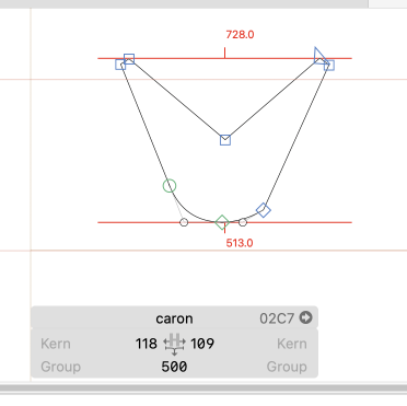
The double marks (caroncomb and commaabovecomb) create headaches for headspace/leading. If I increase the ascender then mixing with other fonts of the same point size looks bad (variations of apparent leading.) My solution was to reduce the vertical size of the problem cap glyphs (C, and to some extent Q, K and Lambda.) Is this a correct solution?
The wsuperior and Wsuperior (what the Salish call ‘rounded’), for the purposes of spell-checking and ‘character’ identification are always associated with the prior character glyphs (for instance a glottalized k/K or x/X) and never appear on their own. To make this feasible, I embed a unicode 034F before the w/W superiors. Is this a valid use of the combining grapheme joiner?
Thanks for the feedback, I have a lot of learning and mistakes ahead of me.
I recommend to put them at the xHeight. If there is a node nearby, you can select the node by dragging a small rect around it (drag select will ignore anchors) or click the anchor (clicking is preferring the anchor).
The same applies for Vietnamese. What you can do is to draw an extra glyph called caroncomb_commaabovecomb where both shapes are a bit smaller and closer together to save height.
I don’t think that is needed. And you can’t really enforce that from the font. You need to ask people to type it.
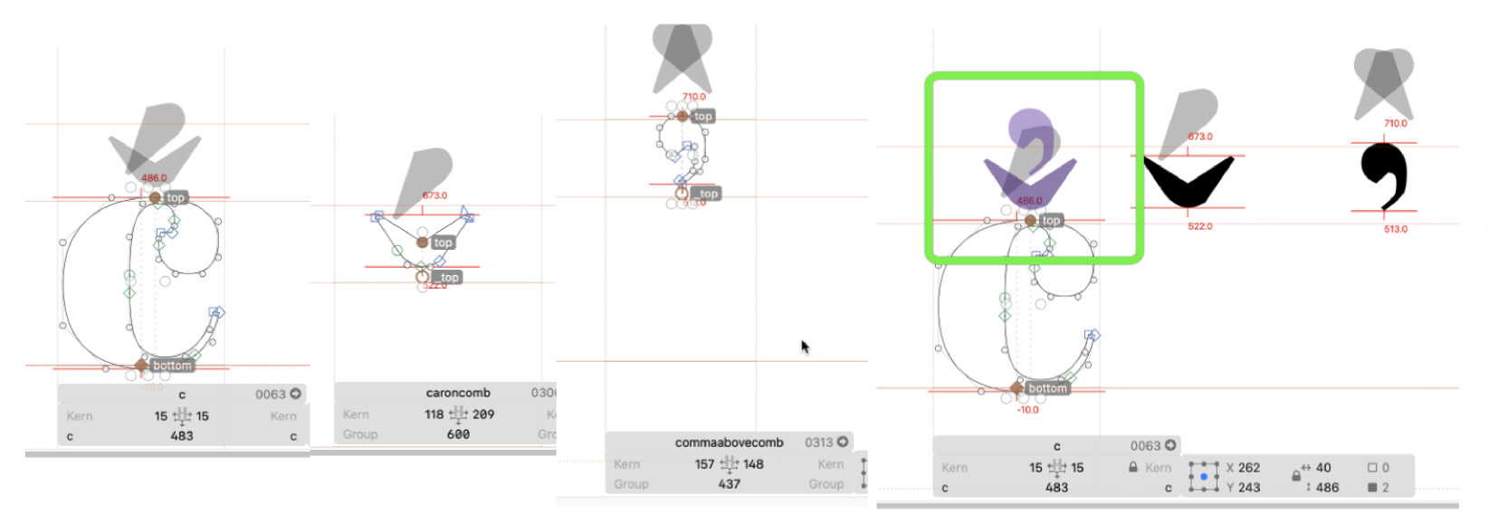
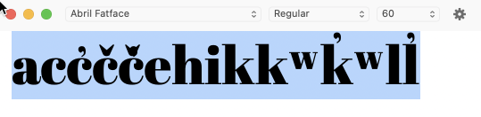
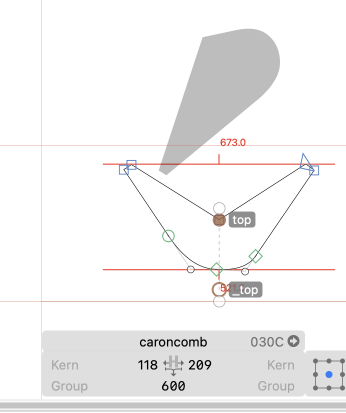
Here’s an example of a ‘glottalized wedge c’ (or c with caroncomb + commabovecomb). With ‘show mark preview’ enabled the marks look okay to my naive eye.
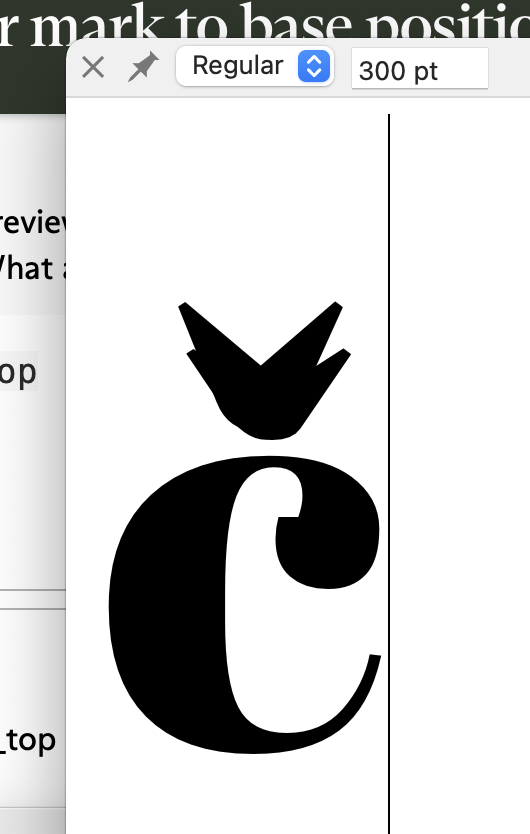
When I export the test font and open a TextPreview I’m not seeing the c+caroncomb+commaabovecomb properly. What am I missing?
I set mark positioning to auto and did an update (several times).
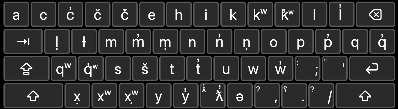
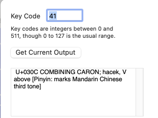
I must be making some very basic mistake I can’t seem to see/find. Seems to work fine with Show Mark Preview, but not other methods. Here is the keyboard edit for the caroncomb key (From my view, it’s sending a U030C (caroncomb))
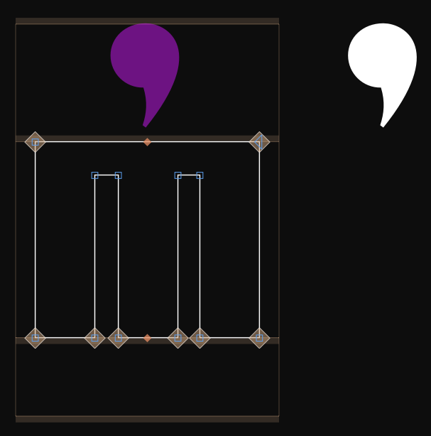
In Glyphs this is my caroncomb:
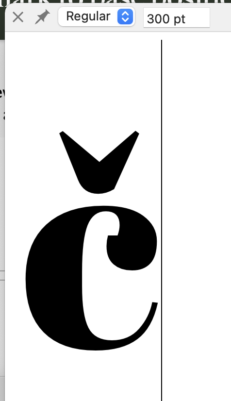
However, when I look at 300pt in TextPreview I see
For c+caroncomb it appears that TextPreview is showing a c+caron (even though I used the U+030C keypress)
BTW, I exported and installed the font (iMac Big Sur) and typed the alphabet in Mellel. The c+caroncmb+commaabovecomb works fine there. It also works well in MS OneNote and to a lesser degree in Affinity Publisher (the commaabovecomb _top doesn’t fit to the caroncomb top as well as with Mellel, the commaabovecomb just sits on top of the caroncomb, so isn’t using mark feature.). It doesn’t work in either Apple Pages, TextEdit or Apple Mail. I’m assuming it’s using the _top of the commaabovecomb and the c top (ignoring caroncomb). Thoughts?